 |

Project
Management MGMT627
VU
LESSON
38
QUALITY
IMPROVEMENT TOOLS
BROAD
CONTENTS
Seven
Basic Tools of Statistical Process
Control
38.1
Seven
Basic Tools of Statistical Process
Control (SPC):
They
are as follows:
1.
Data Tables
2.
Cause-and Effect
Analysis
3.
Histograms
4.
Pareto Analysis
5.
Scatter Diagrams
6.
Trend Analysis
7.
Process Control
Charts
Quality
Improvement Tools:
Over
the years, statistical methods have
become prevalent throughout
business, industry, and
science.
With the availability of advanced, automated
systems that collect,
tabulate, and analyze
data;
the practical application of these
quantitative methods continues to grow.
Statistics today
plays
a major role in all phases
of modern business.
More
important than the quantitative
methods themselves is their
impact on the basic
philosophy
of business. The statistical
point of view takes decision
making out of the
subjective
autocratic
decision-making arena by providing the
basis for objective decisions
based on
quantifiable
facts.
This
change provides some very
specific benefits:
�
Improved
process information
�
Better
communication
�
Discussion
based on facts
�
Consensus
for action
�
Information
for process changes
Statistical
Process Control (SPC) takes
advantage of the natural characteristics of
any process.
All
business activities can be
described as specific processes
with known tolerances
and
measurable
variances. The measurement of these
variances and the resulting
information
provide
the basis for continuous
process improvement. The
tools presented here provide
both a
graphical
and measured representation of process data.
The systematic application of
these tools
empowers
business people to control products
and processes to become
world-class
competitors.
The
basic tools of statistical
process control are data
figures, Pareto analysis,
cause-and-effect
analysis,
trend analysis, histograms, scatter diagrams, and
process control charts.
These basic
tools
provide for the efficient
collection of data, identification of
patterns in the data, and
measurement
of variability.
281
Project
Management MGMT627
VU
The
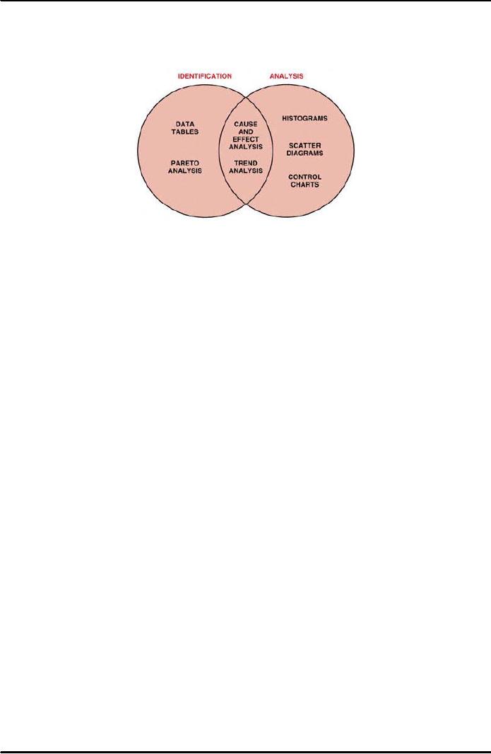
following Figure 38.1 shows
the relationships among these seven
tools and their use
for the
identification
and analysis of improvement opportunities. We
will review these tools
and
discuss
their implementation and
applications.
Figure
38.1: Seven
Quality Improvement
Tools
38.1.1
Data Tables:
Data
tables or data arrays
provide a systematic method
for collecting and
displaying
data.
In most cases, data tables
are forms designed for the
purpose of collecting
specific
data.
These tables are used most
frequently where data is available
from automated
media.
They provide a consistent, effective, and
economical approach to gathering
data,
organizing
them for analysis, and displaying them
for preliminary review. Data
tables
sometimes
take the form of manual check
sheets where automated data are
not
necessary
or available. Data figures and check
sheets should be designed to
minimize
the
need for complicated entries.
Simple-to-understand, straightforward tables
are a key
to
successful data
gathering.
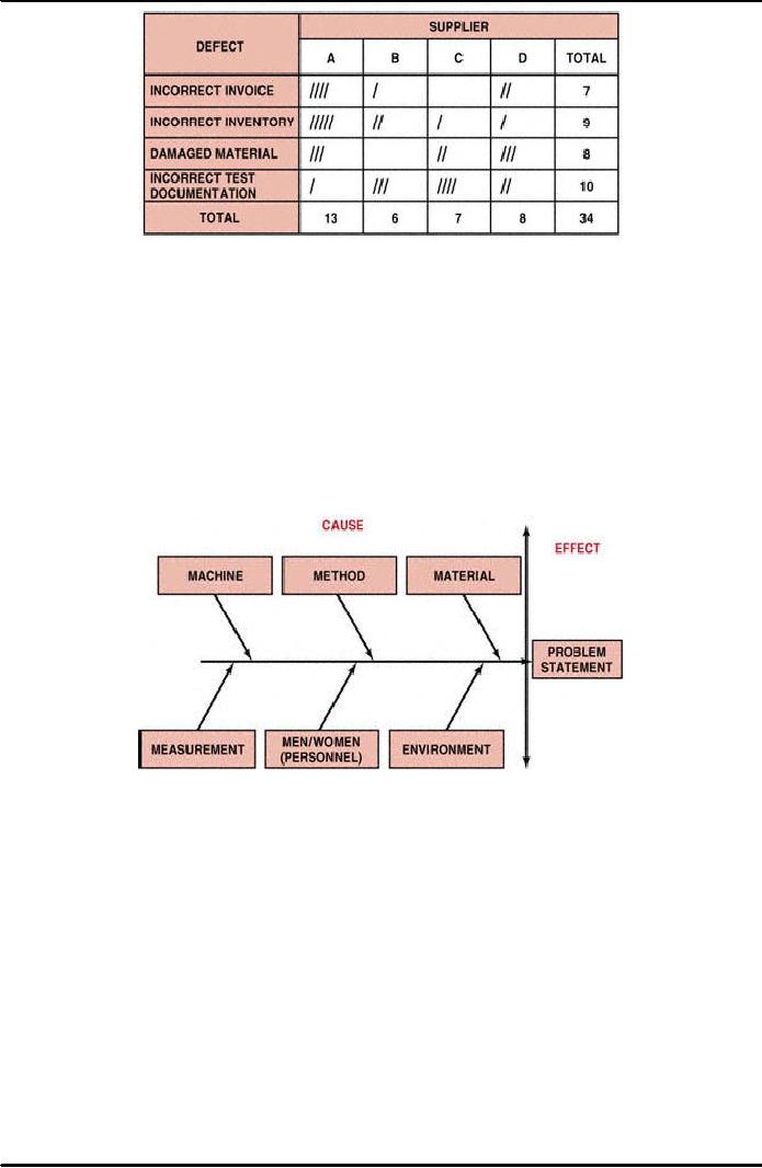
Figure
38.2 is an example of an attribute
(pass/fail) data figure for
the correctness of
invoices.
From this simple check
sheet several data points
become apparent. The
total
number
of defects is 34. The
highest number of defects is from
supplier A, and the
most
frequent
defect is incorrect test documentation.
We can subject this data to
further
analysis
by using Pareto analysis, control
charts, and other
statistical tools.
In
this check sheet, the
categories represent defects
found during the material
receipt
and
inspection function. The
following defect categories provide an
explanation of the
check
sheet:
�
Incorrect
invoices: The
invoice does not match the
purchase order.
�
Incorrect
inventory: The
inventory of the material does
not match the
invoice.
�
Damaged
material: The
material received was
damaged and rejected.
�
Incorrect
test documentation: The
required supplier test
certificate was not
received
and
the material was rejected.
282
Project
Management MGMT627
VU
Figure
38.2: Check
Sheet for "Material Receipt and
Inspection"
38.1.2
Cause-and -Effect Analysis (C
and EA)
"Fishbone":
After
identifying a problem, it is necessary to
determine its cause. The
cause-and-effect
relationship
is at times obscure. A considerable amount of analysis
often is required to
determine
the specific cause or causes of the
problem.
Cause-and-effect
analysis uses diagramming techniques to
identify the relationship
between
an effect and its causes.
Cause-and-effect
diagrams are also known
as
fishbone
diagrams.
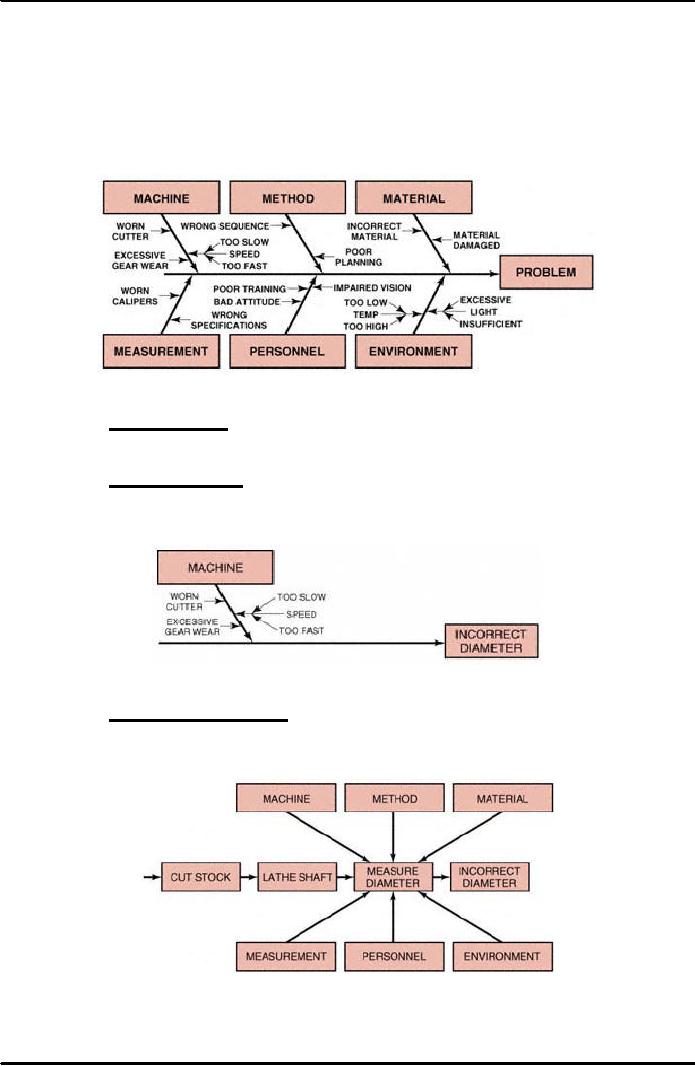
Figure 38.3 demonstrates the
basic fishbone diagram. Six
steps are
used
to perform a cause-and-effect analysis.
Figure
38.3: Cause-and-Effect
Diagram
Step
1 Identify the
problem:
This
step often involves the use
of other statistical process
control tools, such as
Pareto
analysis,
histograms, and control charts, as
well as brainstorming. The
result is a clear,
concise
problem statement.
Step
2 Select interdisciplinary brainstorming
team:
Select
an interdisciplinary team, based on the
technical, analytical, and
management
knowledge
required determining the causes of the
problem.
Step
3 Draw problem box and
prime arrow:
The
problem contains the problem statement
being evaluated for cause
and effect. The
prime
arrow functions as the foundation
for their major
categories.
Step
4 Specify major
categories:
Identify
the major categories contributing to the
problem stated in the problem
box. The
six
basic categories for the
primary causes of the problems are
most frequently
283
Project
Management MGMT627
VU
personnel,
method, materials, machinery,
measurements, and environment, as shown
in
Figure
38.3. Other categories may
be specified, based on the needs of the
analysis.
Step
5 Identify defect
causes:
When
you have identified the major
causes contributing to the problem,
you can
determine
the causes related to each of the
major categories. There are
three approaches
to
this analysis: the
random method, the systematic method, and
the process analysis
method.
Figure
38.4: Random
Method
Random
method: List
all six major causes
contributing to the problem at the same
time.
Identify
the possible causes related to each of
the categories, as shown in Figure
38.4.
Systematic
method: Focus
your analysis on one major category at a
time, in descending
order
of importance. Move to the next
most important category only
after completing
the
most important one. This
process is diagrammed in Figure
38.5.
Figure
38.5: Systematic
Method
Process
analysis method: Identify
each sequential step in the process and
perform
cause-and-effect
analysis for each step, one
at a time. Figure 38.6
represents this
approach.
Figure
38.6: Process
Analysis Methods
284
Project
Management MGMT627
VU
Step
6 Identify corrective
action:
Based
on (1) the cause-and-effect analysis of the problem
and (2) the determination of
causes
contributing to each major
category, identify corrective
action.
The
corrective action analysis is performed
in the same manner as the
cause-and-effect
analysis.
The cause-and-effect diagram is simply
reversed so that the problem
box
becomes
the corrective action box.
Figure 38.7 displays the method
for identifying
corrective
action.
Figure
38.7: Identify
Corrective Action
38.1.3
Histogram-(HG):
A
histogram is a graphical representation of
data as a frequency distribution.
This tool
is
valuable in evaluating both
attribute (pass/fail) and
variable (measurement)
data.
Histograms
offer a quick look at the
data at a single point in
time; they do not
display
variance
or trends over time. A
histogram displays how the
cumulative data looks
today.
It is useful in understanding the
relative frequencies (percentages) or
frequency
(numbers)
of the data and how that
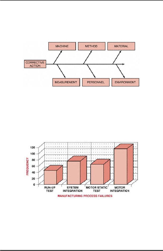
data are distributed. Figure
38.8 illustrates a
histogram
of the frequency of defects in a
manufacturing process.
Figure
38.8: Histogram
for Variables
38.1.4
Pareto Analysis
(PA):
A
Pareto diagram is a special type of
histogram that helps us to identify and
prioritize
problem
areas. The construction of a
Pareto diagram may involve
data collected from
data
figures, maintenance data, repair
data, parts scrap rates, or
other sources. By
identifying
types of nonconformity from any of
these data sources, the
Pareto diagram
directs
attention to the most frequently
occurring element.
285
Project
Management MGMT627
VU
There
are three uses and types of
Pareto analysis:
1.
The basic Pareto analysis
identifies the vital few
contributors that account
for most
quality
problems in any system.
2.
The comparative Pareto analysis
focuses on any number of program
options or
actions.
3.
The weighted Pareto analysis
gives a measure of significance to
factors that may
not
appear significant at first--
such additional factors as cost,
time, and criticality.
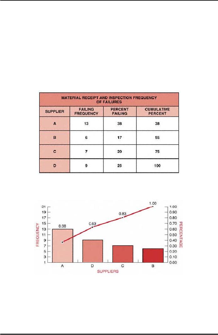
The
basic Pareto analysis chart provides an
evaluation of the most frequent
occurrences
for
any given data set. By
applying the Pareto analysis steps to the
material receipt and
inspection
process described in Figure 38.9, we
can produce the basic Pareto
analysis
demonstrated
in Figure 38.10. This basic
Pareto analysis quantifies and graphs
the
frequency
of occurrence for material
receipt and inspection and further
identifies the
most
significant, based on
frequency.
Figure
38.9: Material
Receipt and Inspection Frequency of
Failures
Figure
38.10: Basic
Pareto Analysis
A
review of this basic Pareto
analysis for frequency of occurrences
indicates that
supplier
A is experiencing the most rejections
with 37 percent of all the
failures.
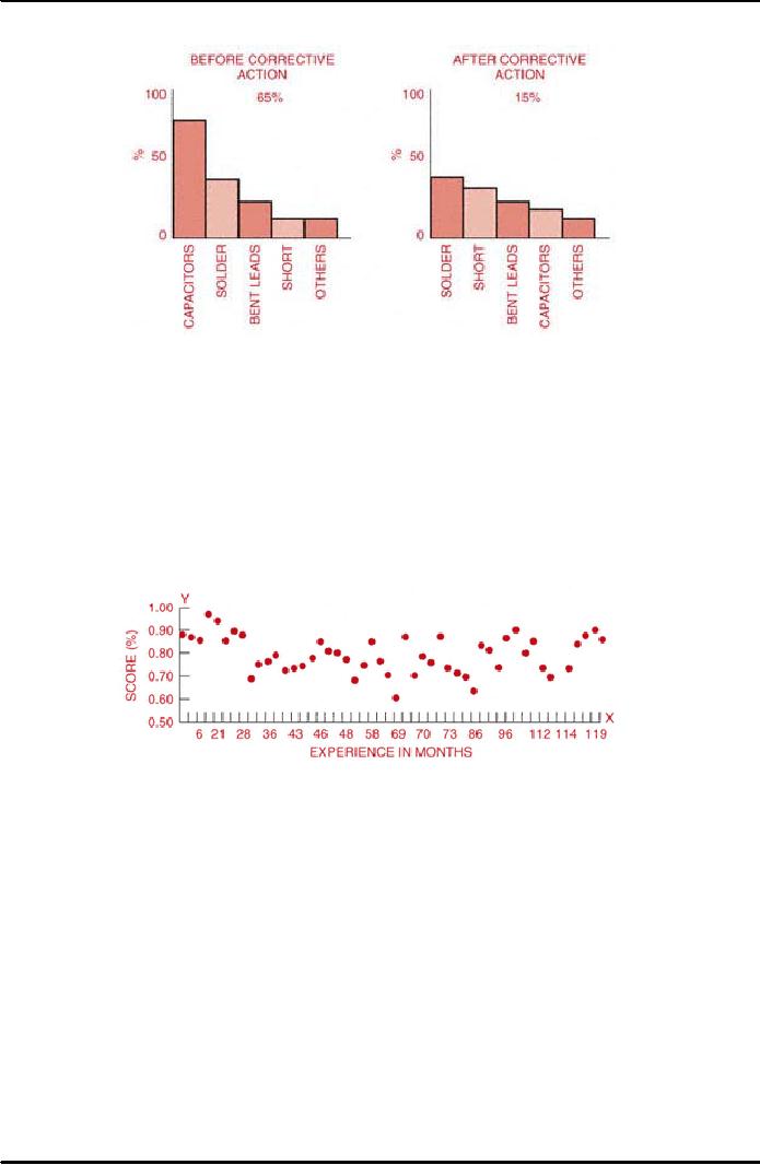
Pareto
analysis diagrams are also used to
determine the effect of corrective
action, or to
analyze
the difference between two or more
processes and methods. Figure
38.11
286
Project
Management MGMT627
VU
displays
the use of this Pareto method to
assess the difference in defects
after corrective
action.
Figure
38.11: Comparative
Pareto Analysis
38.1.5
Scatter Diagrams:
Another
pictorial representation of process
control data is the scatter
plot or scatter
diagram.
A scatter diagram organizes data
using two variables: an
independent variable
and
a dependent variable. These data
are then recorded on a simple
graph with X
and
Y
coordinates
showing the relationship between the
variables. Figure 38.12
displays the
relationship
between two of the data elements
from solder qualification test
scores. The
independent
variable, experience in months, is listed on the
X-axis.
The dependent
variable
is the score, which is recorded on the
Y-axis.
Figure
38.12: Solder
Certification Test
Score
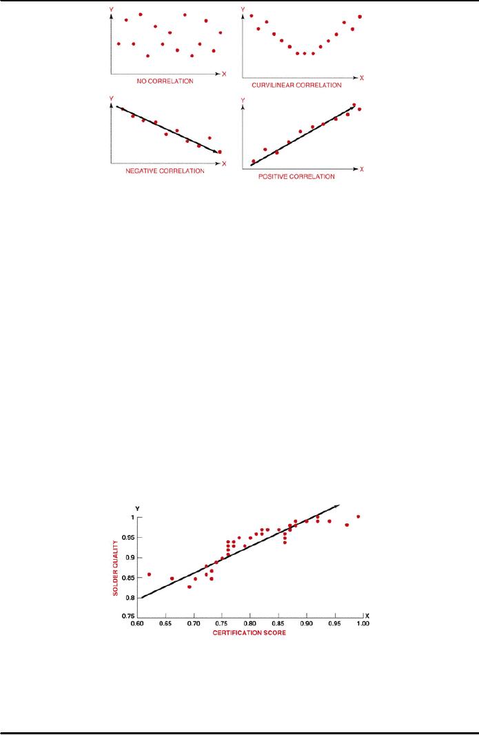
These
relationships fall into several
categories, as shown in Figure 38.13
below. In the
first
scatter plot there is no correlation--
the data points are widely
scattered with no
apparent
pattern.
287
Project
Management MGMT627
VU
Figure
38.13: Scatter
Plot Correlation
The
second scatter plot shows a
curvilinear correlation demonstrated by
the U shape
of
the graph. The third scatter
plot has a negative
correlation, as indicated by the
downward
slope. The final scatter
plot has a positive
correlation with an
upward
slope.
From
Figure 38.12 we can see
that the scatter plot for
solder certification testing is
somewhat
curvilinear. The least and
the most experienced employees scored
highest,
whereas
those with an intermediate
level of experience did relatively
poorly. The next
tool,
trend analysis, will help
clarify and quantify these
relationships.
38.1.6
Trend Analysis (T/A):
Trend
analysis is a statistical method for
determining the equation that
best fits the
data
in a scatter plot. Trend analysis
quantifies the relationships of the
data,
determines
the equation, and measures
the fit of the equation to the data.
This
method
is also known as curve
fitting or least
squares.
Trend
analysis can determine optimal
operating conditions by providing an
equation
that
describes the relationship between the dependent
(output) and independent
(input)
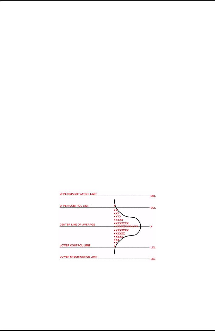
variables. An example is the data
set concerning experience and scores on
the
solder
certification test (see
Figure 38.14).
Figure
38.14: Scatter
Plot Solder Quality and
Certification Score
The
equation of the regression line, or
trend line, provides a clear and
understandable
measure
of the change caused in the output
variable by every incremental
change of the
input
or independent variable. Using
this principle, we can
predict the effect of
changes
in
the process.
288
Project
Management MGMT627
VU
One
of the most important contributions
that can be made by trend
analysis is
forecasting.
Forecasting enables us to predict what is
likely to occur in the future.
Based
on
the regression line we can
forecast what will happen as the
independent variable
attain
values beyond the existing data.
38.1.7
Process Control Charts
(C/C):
The
use of control charts
focuses on the prevention of defects,
rather than their
detection
and rejection. In business, government,
and industry, economy and
efficiency
are always best served by
prevention. It costs much more to produce
an
unsatisfactory
product or service than it does to
produce a satisfactory one. There
are
many
costs associated with
producing unsatisfactory goods
and services. These
costs
are
in labor, materials, facilities, and the
loss of customers. The cost
of producing a
proper
product can be reduced
significantly by the application of
statistical process
control
charts.
�
Control
Charts and the Normal
Distribution:
The
construction, use, and interpretation of
control charts is based on the
normal
statistical
distribution as indicated in Figure
38.15. The centerline of the
control
chart
represents the average or mean of the
data ( ). The upper
and lower control
limits
(UCL and LCL),
respectively, represent this
mean plus and minus
three
standard
deviations of the data either
the lowercase s
or
the Greek letter (sigma)
represents
the standard deviation for
control charts.
The
normal distribution and its
relationship to control charts
are represented on the
right
of the figure. The normal
distribution can be described
entirely by its mean
and
standard deviation. The
normal distribution is a bell-shaped
curve (sometimes
called
the Gaussian distribution) that is
symmetrical about the mean,
slopes
downward
on both sides to infinity,
and theoretically has an
infinite range. In the
normal
distribution 99.73 percent of all
measurements lie within and;
this is why
the
limits on control charts are
called three-sigma limits.
Figure
38.15: The
Control Chart and Normal
Curve
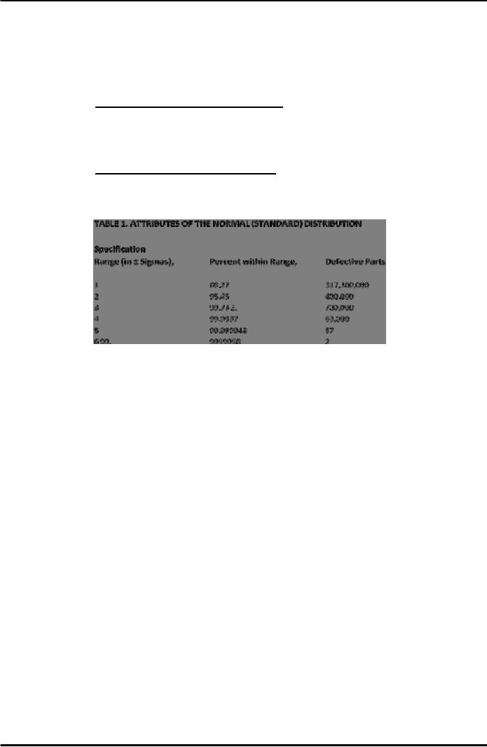
Companies
like Motorola have embarked upon a
six-sigma limit rather than
a three-
sigma
limit. The benefit is shown in
Table 38.1 below. With a
six-sigma limit, only
two
defects per billion are
allowed. The cost to
maintain a six-sigma limit
can be
extremely
expensive unless the cost
can be spread out over, say,
1 billion units
produced
Control
chart analysis determines whether the inherent
process variability and
the
process
average are at stable levels, whether
one or both are out of
statistical control
289
Project
Management MGMT627
VU
(not
stable), or whether appropriate action
needs to be taken. Another
purpose of
using
control charts is to distinguish between
the inherent, random variability of
a
process
and the variability attributed to an
assignable cause. The
sources of random
variability
are often referred to as common
causes. These are the
sources that
cannot
be changed readily, without
significant restructuring of the process.
Special
cause
variability, by contrast, is subject to correction
within the process
under
process
control.
Common
cause variability or variation:
This
source of random variation is
always
present
in any process. It is that
part of the variability inherent in the
process itself.
The
cause of this variation can
be corrected only by a management
decision to
change
the basic process.
Special
cause variability or variation:
This
variation can be controlled at the
local
or
operational level. Special
causes are indicated by a
point on the control chart
that
is
beyond the control limit or by a
persistent trend approaching the control
limit.
Table
38.1: Attributes
of the Normal (Standard)
Distribution
To
use process control
measurement data effectively, it is
important to understand
the
concept of variation. No two
product or process characteristics
are exactly alike,
because
any process contains many
sources of variability. The
differences between
products
may be large, or they may be
almost immeasurably small, but
they are
always
present. Some sources of
variation in the process can
cause immediate
differences
in the product, such as a change in
suppliers or the accuracy of an
individual's
work. Other sources of
variation, such as tool
wear, environmental
changes,
or increased administrative control,
tend to cause changes in the
product
or
service only over a longer
period of time.
To
control and improve a process, we
must trace the total
variation back to its
sources.
Again the sources are common
cause and special cause
variability.
Common
causes are the many sources
of variation that always
exist within a
process
that is in a state of statistical
control. Special causes (often
called assignable
causes)
are any factors causing
variation that cannot be adequately
explained by any
single
distribution of the process output, as
would be the case if the
process were in
statistical
control. Unless all the special causes of
variation are identified
and
corrected,
they will continue to affect
the process output in unpredictable
ways.
The
factors that cause the most
variability in the process are the
main factors found
on
cause-and-effect analysis charts: people,
machines, methodology, materials,
measurement,
and environment. These
causes can either result
from special causes
or
be common causes inherent in the
process.
290
Project
Management MGMT627
VU
The
theory of control charts
suggests that if the source of
variation is from
chance
alone,
the process will remain
within the three-sigma limits. When the
process goes
out
of control, special causes exist.
These need to be investigated and
corrective
action
must be taken.
�
Control
Chart Types:
Just
as there are two types of data,
continuous and discrete, there are
two types of
control
charts: variable charts for
use with continuous data and
attribute charts for
use
with discrete data. Each
type of control chart can be
used with specific types
of
data.
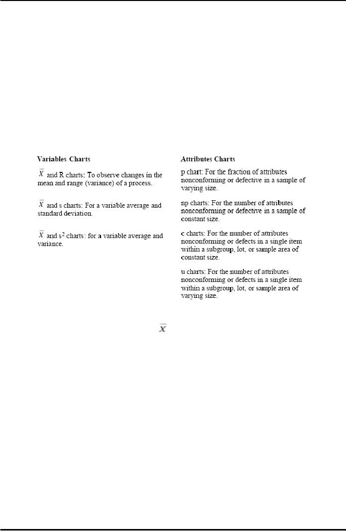
Table 38.2 provides a brief
overview of the types of control charts
and their
applications.
Variables
charts: Control
charts for variables are
powerful tools that we can
use
when
measurements from a process
are variable. Examples of variable
data are the
diameter
of a bearing, electrical output, or the
torque on a fastener.
Table
38.2: Types
of Control Charts and
Application
As
shown in Table 38.2, and R
charts are used to measure
control processes
whose
characteristics are continuous
variables such as weight,
length, ohms, time,
or
volume. The p and NP charts
are used to measure and
control processes
displaying
attribute characteristics in a sample. We
use p charts when the number
of
failures
is expressed as a fraction, or NP charts
when the failures are
expressed as a
number.
The c and u charts are used
to measure the number or portion of
defects in
a
single item. The c control
chart is applied when the sample
size or area is
fixed,
and
the u chart when the sample size or
area is not fixed.
Attribute
charts: Although
control charts are most
often thought of in terms
of
variables,
there are also versions for
attributes. Attribute data have
only two values
(conforming/nonconforming,
pass/fail, go/no-go, present/absent),
but they can
still
be
counted, recorded, and analyzed. Some
examples are: the presence of a
required
label,
the installation of all required
fasteners, the presence of solder drips,
or the
continuity
of an electrical circuit. We also
use attribute charts for
characteristics
that
are measurable, if the results
are recorded in a simple yes/no fashion,
such as
the
conformance of a shaft diameter when
measured on a go/no-go gauge, or
the
acceptability
of threshold margins to a visual or gauge
check.
It
is possible to use control charts
for operations in which attributes
are the basis for
inspection,
in a manner similar to that
for variables but with
certain differences. If
291
Project
Management MGMT627
VU
we
deal with the fraction rejected
out of a sample, the type of
control chart used is
called
a p chart. If we deal with the actual number rejected,
the control chart is
called
an NP chart. If articles can have more than one
nonconformity, and all
are
counted
for subgroups of fixed size,
the control chart is called a c chart.
Finally, if
the
number of nonconformities per unit is the
quantity of interest, the control
chart
is
called a u chart.
The
power of control charts (Shewhart
techniques) lies in their ability to
determine
if
the cause of variation is a special cause
that can be affected at the
process level,
or
a common cause that requires a change at
the management level.
The
information
from the control chart can
then be used to direct the
efforts of
engineers,
technicians, and managers to achieve preventive or
corrective action.
The
use of statistical control
charts is aimed at studying specific
ongoing processes
in
order to keep them in satisfactory control. By
contrast, downstream inspection
aims
to identify defects. In other words,
control charts focus on prevention
of
defects
rather than detection and
rejection. It seems reasonable, and it
has been
confirmed
in practice, that economy and efficiency
are better served by
prevention
rather
than detection.
�
Control
Chart Components:
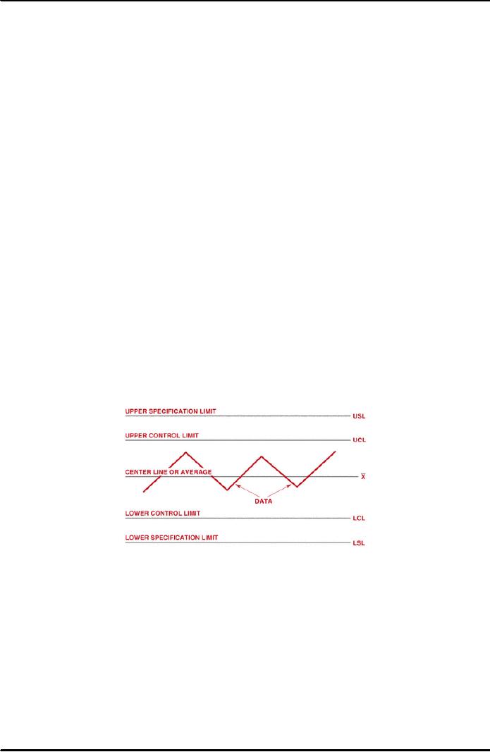
All
control charts have certain
features in common (Figure 38.16).
Each control
chart
has a centerline, statistical
control limits, and the calculated
attribute or
control
data. Additionally, some control
charts contain specification
limits.
The
centerline is a solid (unbroken)
line that represents the
mean or arithmetic
average
of the measurements or counts. This
line is also referred to as the X bar
line
(
). There are two statistical
control limits: the upper
control limit for values
greater
than
the mean and the lower control
limit for values less than
the mean.
Figure
38.16: Control
Chart Elements
Specification
limits are used when
specific parametric requirements exist
for a
process,
product, or operation. These
limits usually apply to the
data and are the
pass/fail
criteria for the operation.
They differ from statistical
control limits in
that
they
are prescribed for a process, rather
than resulting from the
measurement of the
process.
The
data element of control charts varies
somewhat among variable and
attribute
control
charts. We will discuss
specific examples as a part of the
discussion on
individual
control charts.
292
Project
Management MGMT627
VU
�
Control
Chart Interpretation:
There
are many possibilities for
interpreting various kinds of
patterns and shifts on
control
charts. If properly interpreted, a
control chart can tell us
much more than
simply
whether the process is in or out of
control. Experience and
training can lead
to
much greater skill in extracting
clues regarding process
behavior, such as
that
shown
in Figure 38.17. Statistical guidance is
invaluable, but an
intimate
knowledge
of the process being studied is
vital in bringing about
improvements.
A
control chart can tell us
when to look for trouble,
but it cannot by itself tell
us
where
to look, or what cause will
be found. Actually, in many
cases, one of the
greatest
benefits from a control chart is
that it tells when to leave
a process alone.
Sometimes
the variability is increased unnecessarily
when an operator keeps
trying
to
make small corrections, rather than
letting the natural range of
variability
stabilize.
The following paragraphs
describe some of the ways the
underlying
distribution
patterns can behave or misbehave.
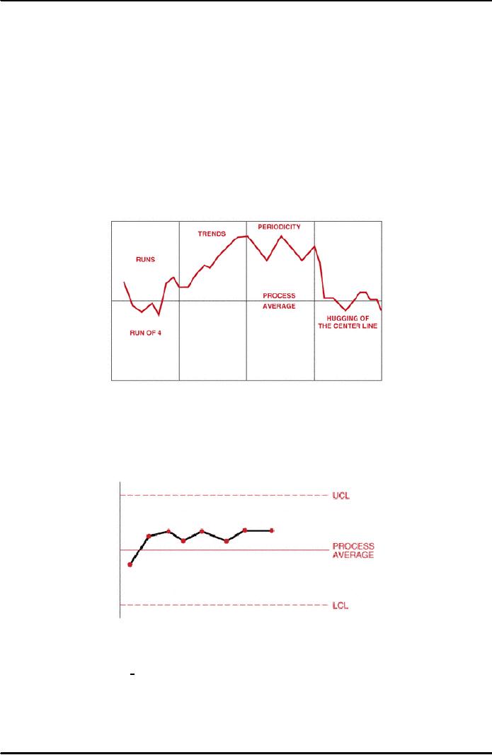
Figure
38.17: Control
Chart Interpretation
Runs:
When
several successive points line up on
one side of the central
line, this
pattern
is called a run. The number of
points in that run is called
the length of the
run.
As a rule of thumb, if the run
has a length of seven
points, there is an
abnormality
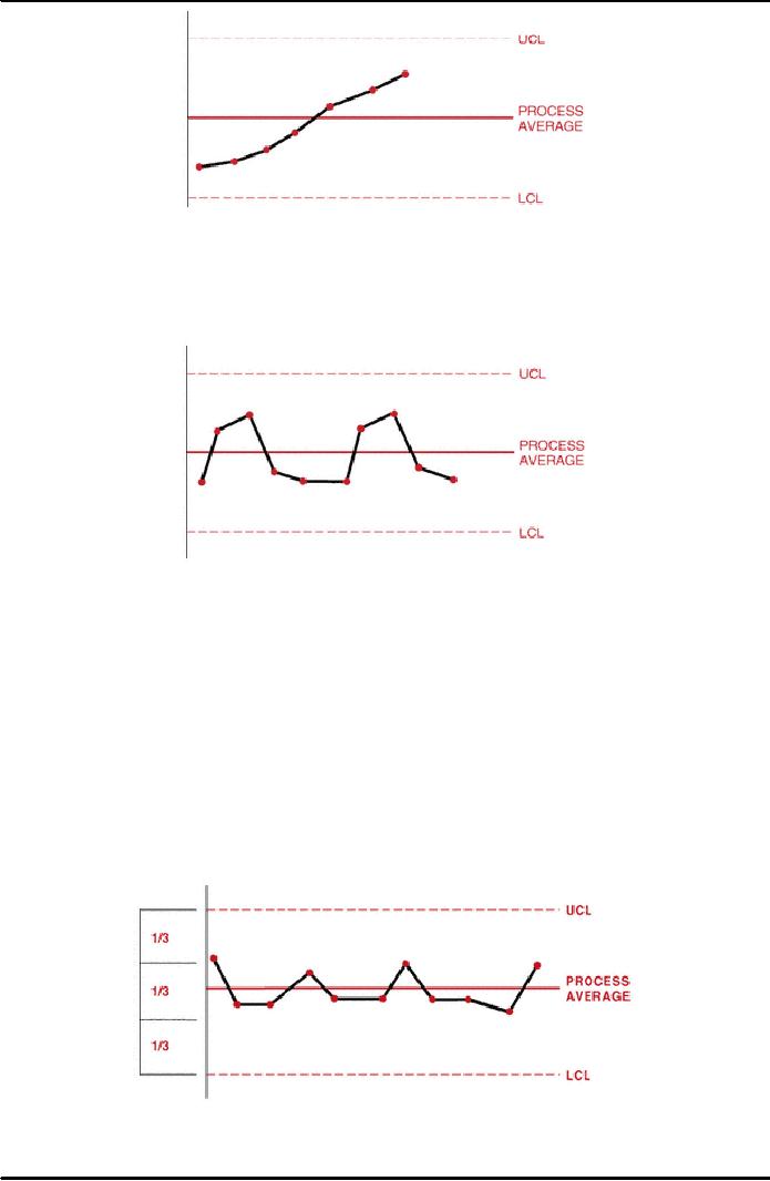
in the process. Figure 38.18
demonstrates an example of a
run.
Figure
38.18: Process
Run
Trends: If
there is a continued rise of all in a
series of points, this
pattern is called a
trend.
In general, if seven consecutive points
continue to rise or fall, there is
an
abnormality.
Often, the points go beyond one of the
control limits before
reaching
seven.
Figure 38.19 demonstrates an
example of trends.
293
Project
Management MGMT627
VU
Figure
38.19: Control
Chart Trends
Periodicity:
Points
that show the same pattern of
change (rise or fall)
over
equal
intervals denote periodicity. Figure
38.20 demonstrates an example
of
periodicity.
Figure
38.20: Control
Chart Periodicity
Hugging
the centerline or control limit.
Points on the
control chart that are close
to
the
central line or to the control
limit are said to hug the
line. Often, in this
situation,
different types of data or data
from different factors have been
mixed into
the
subgroup. In such cases it is necessary
to change the sub-grouping,
reassemble
the
data, and redraw the control chart. To decide
whether there is hugging of the
center
line, draw two lines on the
control chart, one between the centerline
and the
UCL
and the other between the center line and
the LCL. If most of the points
are
between
these two lines, there is an
abnormality. To see whether there is
hugging of
one
of the control limits; draw
line two-thirds of the distance between
the center
line
and each of the control lines.
There is abnormality if 2 out of 3
points, 3 out of
7
points, or 4 out of 10 points
lie within the outer
one-third zone. The
abnormalities
should
be evaluated for their
cause(s) ad the corrective action
taken. Figure 38.21
demonstrates
data hugging the LCL.
Figure
38.21: Hugging
the Centerline
294
Project
Management MGMT627
VU
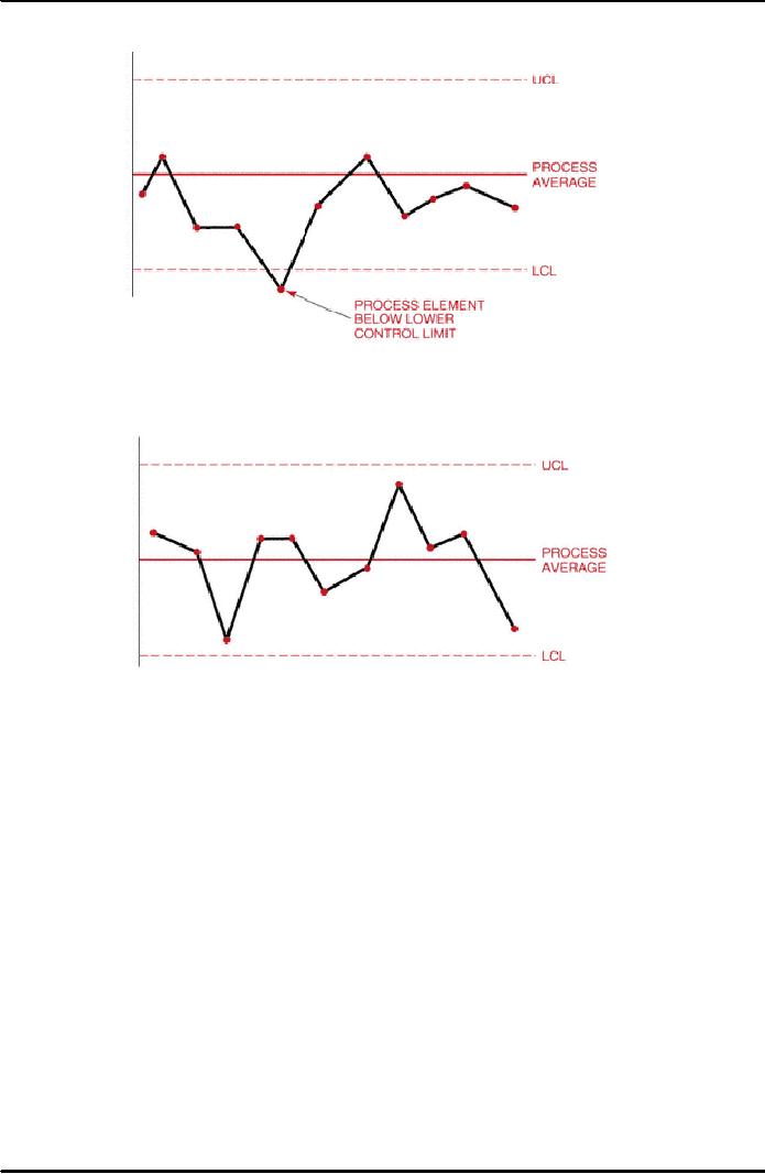
Out
of control: An
abnormality exists when data
points exceed either
the
upper
or lower control limits.
Figure 38.22 illustrates
this occurrence.
Figure
38.22: Control Chart Out of
Control
In
control: No
obvious abnormalities appear in the
control chart. Figure
38.23
demonstrates
this desirable process
state.
Figure
38.23: Process
in Control
295
Table of Contents:
- INTRODUCTION TO PROJECT MANAGEMENT:Broad Contents, Functions of Management
- CONCEPTS, DEFINITIONS AND NATURE OF PROJECTS:Why Projects are initiated?, Project Participants
- CONCEPTS OF PROJECT MANAGEMENT:THE PROJECT MANAGEMENT SYSTEM, Managerial Skills
- PROJECT MANAGEMENT METHODOLOGIES AND ORGANIZATIONAL STRUCTURES:Systems, Programs, and Projects
- PROJECT LIFE CYCLES:Conceptual Phase, Implementation Phase, Engineering Project
- THE PROJECT MANAGER:Team Building Skills, Conflict Resolution Skills, Organizing
- THE PROJECT MANAGER (CONTD.):Project Champions, Project Authority Breakdown
- PROJECT CONCEPTION AND PROJECT FEASIBILITY:Feasibility Analysis
- PROJECT FEASIBILITY (CONTD.):Scope of Feasibility Analysis, Project Impacts
- PROJECT FEASIBILITY (CONTD.):Operations and Production, Sales and Marketing
- PROJECT SELECTION:Modeling, The Operating Necessity, The Competitive Necessity
- PROJECT SELECTION (CONTD.):Payback Period, Internal Rate of Return (IRR)
- PROJECT PROPOSAL:Preparation for Future Proposal, Proposal Effort
- PROJECT PROPOSAL (CONTD.):Background on the Opportunity, Costs, Resources Required
- PROJECT PLANNING:Planning of Execution, Operations, Installation and Use
- PROJECT PLANNING (CONTD.):Outside Clients, Quality Control Planning
- PROJECT PLANNING (CONTD.):Elements of a Project Plan, Potential Problems
- PROJECT PLANNING (CONTD.):Sorting Out Project, Project Mission, Categories of Planning
- PROJECT PLANNING (CONTD.):Identifying Strategic Project Variables, Competitive Resources
- PROJECT PLANNING (CONTD.):Responsibilities of Key Players, Line manager will define
- PROJECT PLANNING (CONTD.):The Statement of Work (Sow)
- WORK BREAKDOWN STRUCTURE:Characteristics of Work Package
- WORK BREAKDOWN STRUCTURE:Why Do Plans Fail?
- SCHEDULES AND CHARTS:Master Production Scheduling, Program Plan
- TOTAL PROJECT PLANNING:Management Control, Project Fast-Tracking
- PROJECT SCOPE MANAGEMENT:Why is Scope Important?, Scope Management Plan
- PROJECT SCOPE MANAGEMENT:Project Scope Definition, Scope Change Control
- NETWORK SCHEDULING TECHNIQUES:Historical Evolution of Networks, Dummy Activities
- NETWORK SCHEDULING TECHNIQUES:Slack Time Calculation, Network Re-planning
- NETWORK SCHEDULING TECHNIQUES:Total PERT/CPM Planning, PERT/CPM Problem Areas
- PRICING AND ESTIMATION:GLOBAL PRICING STRATEGIES, TYPES OF ESTIMATES
- PRICING AND ESTIMATION (CONTD.):LABOR DISTRIBUTIONS, OVERHEAD RATES
- PRICING AND ESTIMATION (CONTD.):MATERIALS/SUPPORT COSTS, PRICING OUT THE WORK
- QUALITY IN PROJECT MANAGEMENT:Value-Based Perspective, Customer-Driven Quality
- QUALITY IN PROJECT MANAGEMENT (CONTD.):Total Quality Management
- PRINCIPLES OF TOTAL QUALITY:EMPOWERMENT, COST OF QUALITY
- CUSTOMER FOCUSED PROJECT MANAGEMENT:Threshold Attributes
- QUALITY IMPROVEMENT TOOLS:Data Tables, Identify the problem, Random method
- PROJECT EFFECTIVENESS THROUGH ENHANCED PRODUCTIVITY:Messages of Productivity, Productivity Improvement
- COST MANAGEMENT AND CONTROL IN PROJECTS:Project benefits, Understanding Control
- COST MANAGEMENT AND CONTROL IN PROJECTS:Variance, Depreciation
- PROJECT MANAGEMENT THROUGH LEADERSHIP:The Tasks of Leadership, The Job of a Leader
- COMMUNICATION IN THE PROJECT MANAGEMENT:Cost of Correspondence, CHANNEL
- PROJECT RISK MANAGEMENT:Components of Risk, Categories of Risk, Risk Planning
- PROJECT PROCUREMENT, CONTRACT MANAGEMENT, AND ETHICS IN PROJECT MANAGEMENT:Procurement Cycles