 |
BEYOND FUNDAMENTAL ANALYSIS |
| << FUNDAMENTAL STOCK ANALYSIS |
| What is Technical Analysis >> |

Investment
Analysis & Portfolio Management
(FIN630)
VU
Lesson
# 7
BEYOND
FUNDAMENTAL ANALYSIS
Few
facets of the investment discipline
generate as much controversy as
technical analysis.
Some
professional investors are
convinced the activity is a
complete waste of time and a
disservice
to brokerage clients. An equal number
are certain that technical
analysis is
mandatory
for every one who seeks
above average investment results.
Some fundamental
analysts
will say they use technical
analysis to confirm their
opinions but not as a
stand-
alone
technique.
CHARTING:
In
the mind of some people, elaborate
wall charts are the classic
symbol of the stock
picker's
art. The experience eye can
divine ups and down in the
same way a soothsayer
can
read
tea leaves are astrological signs or so
the folklore goes. Charting
is a controversial part
of
finance. Future research is
likely to uncover things
about charting that would
surprise us
today.
Still, even people who
vehemently oppose the
practice should be familiar
with the
basic
tents.
Much
about technical analysis
remains a puzzle.
The
Underlying logic:
Charts
are an important tool of the
technical analyst. He or she
believes the supply
and
demand
determine prices that changes in
supply or demand will change prices and
that
charts
can be used to predict changes in
supply and demand and in investor
behavior. This
logic
seems reasonable to many people,
but it is also why charting is a trouble
topic to the
fundamental
analyst.
The
weak link in this reasoning
lies in the last point:
charts can be used to predict
changes
in
supply and demand. The stock
market seldom waits for
things to completely
unfold.
Market
participants are continually
anticipating future events
are frequently err in
their
anticipation.
Imagine
an investment whose value is
determined by a prior series of
ten coins flips. A
person can
buy the investment at any
time, with the purchase
price a function of
the
previous
ten coin flips. Suppose a
large payoff is associated
with a series of five
consecutive
heads
followed five consecutive
tails. How will the
marketplace value the
investment if the
previous
eight flips were five
head followed by three
tails? Clearly, investors will
bid up the
price
because of the increased
likelihood of the windfall
gain. By so doing, they reduce
the
potential
profit, because a rising
price means a lower expected
return, everything else
being
equal.
An
interesting side note to
this example occurs if the
investment reaches a maximum
value
following
a series of five heads and
five tails. Once an
investment reaches its
maximum
possible
value, why would anyone buy
it? Logically it can only
decline from its peak
value.
Thus,
a interesting interplay takes place
between would-be sellers and
potential buyers as
the
pattern develops.
The
technical analyst believes
charts can be used to predict
changes in supply and
demand.
55

Investment
Analysis & Portfolio Management
(FIN630)
VU
Market
participants try to anticipate events
rather than merely react to
them.
Types
of Charts:
Three
principal types of charts
are used by the technical
analyst: line charts. Bar
charts and
point
and figure charts. A forth
type, the candlestick chart,
has recently gained favor
and
may
eventually become
common.
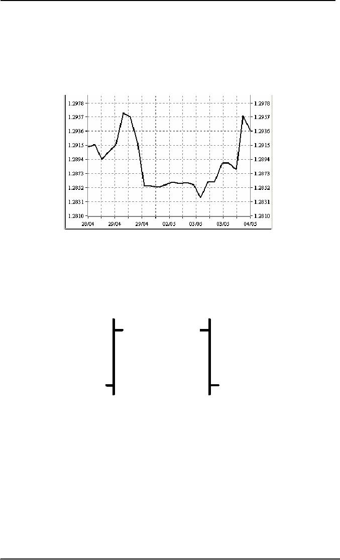
Line
Chart:
The
line chart is the simplest
and most familiar. It consists of a line
connecting a series of
data
points. It may be drawn on
either a linear or a logarithmic scale.
Logarithmic scales
are
appropriately
when the data move
through wide ranges. This
keeps the plot from
going off
the
chart.
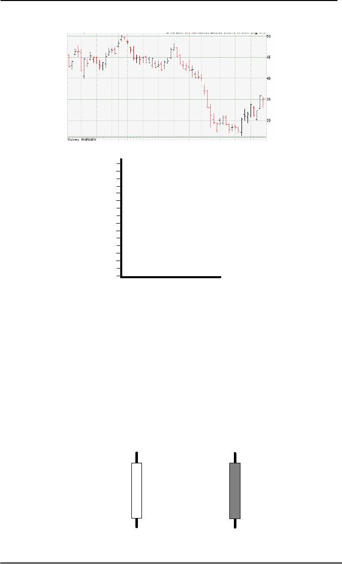
Bar
Charts:
High
High
Close
Open
Open
Close
Low
Low
Standard
Standard
Bar
Chart
Bar
Chart
The
technical analyst's bar chart is
different from the bar chart
commonly used to present
economic
data. This chart shows
the periodic high, low and
closing prices of a security. A
vertical
line connects the period's
high and low prices, with a
cross mark indicating
the
price
at the close of the period.
Bar charts are efficient in
showing more detail about
daily
trading
than just the closing prices
from a line chart.
56

Investment
Analysis & Portfolio Management
(FIN630)
VU
Point and
Figure Charts
X
X
X XO
X XO
XO O
XO O
This
exotic chart impresses many
a brokerage firm customer. The
scattered X's and O's
make
the document look like a
football coach's play
diagram. The layperson
typically does
not
understand what they present
but the chart attracts
attention.
Unlike
most other charts, only
significant price movement
appears. The X represents
the
prices
increase and the O represents
the price decline. Notice
that Xs and Os never occur
in
the
same column. Once a price
reversal of significant magnitude
occurs, the analyst moves
a
column
to the right for the
next entry.
An
old feature of this chart is
the fact that the
horizontal axis has no
units. Moving left to
right
reflects the passage of time
but data points are
not plotted at regular
interval. Only
when
the price change is sufficient
does a new data
appear.
Some
technical analyst will superimpose time
information the
chart.
The
horizontal axis on a point and figure
chart has no units.
Candlestick
Chart
Japanese
Japanese
Candlestick
Candlestick
57

Investment
Analysis & Portfolio Management
(FIN630)
VU
A
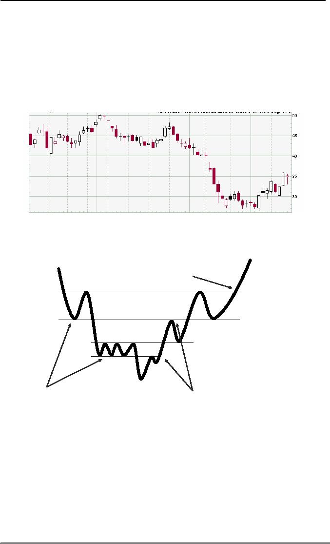
Candlestick Chart is an enhanced version
of bar chart. These charts
began to appear in
the
United
States in the mid 1980's
but have been used in
China for over 500 years.
Such a
chart
shows a stock's open, close,
high and low in a modified
three dimensional format.
The
vertical
axis shows the stock
price while a horizontal
axis reflects the passage of
time. The
principle
difference between a daily
candlestick chart and a bar chart is
the white and black
candles
augmenting the daily trading
range lines. White candles represent
stock advances,
with
black candle representing
declines. The thick portion
of an entry is called the
real
body,
with the vertical line
representing the wick.
Various clusters of candles have
exotic
names,
such as dark cloud cover,
doji star, hanging man,
harami cross, and two-day
tweezer
tops.
Other
Charts Annotations:
Support
Resistance
A support
level is a
subjective assessment of the
price level below which
the stock seems
disinclined
to fall. A
resistance level is an apparent
upper bound on stock prices or a
level
presenting
a barrier to further price
appreciation. Both concepts are
purely subjective and
cannot
be calculated. A
congestion area is a
region of the chart of the
chart where a great
many
data points appear. When
the stock price leaves the
congestion area and pierces
either
a
support level or a resistance
level, it is called breakout. A rise
through a resistance
level
is a
breakout on the upside; a
fall through a support level
is a breakout on the
downside.
When
someone says "the stock
broke" they often refer to a
decline through a support
level.
Breakout
on the upside are bullish;
breakout on the downside a bearish.
Once a breakout
occurs,
the technical analyst will
search for new resistance
and support level. The
institution
behind
these levels is easy to
develop.
Chartists
believe investors remember
missed opportunities and look
for them to
return.
58
Table of Contents:
- INTRODUCTION OF INVESTMENT
- THE ROLE OF THE CAPITAL MARKETS
- THE NASDAQ STOCK MARKET
- Blue Chip Stocks, Income Stock, Cyclical Stocks, Defensive Stocks
- MARKET MECHANICS
- FUNDAMENTAL STOCK ANALYSIS
- BEYOND FUNDAMENTAL ANALYSIS
- What is Technical Analysis
- Indicators with Economic Justification
- Dow Theory
- VALUATION PHILOSOPHIES
- Ratio Analysis
- INVESTMENT RATIOS
- Bottom-Up, Top-Down Approach to Fundamental Analysis
- The Industry Life Cycle
- COMPANY ANALYSIS
- Analyzing a Company’s Profitability
- Objective of Financial Statements
- RESEARCH PHILOSPHY
- What Is An Investment Company
- Exchange-Traded Funds (ETFs)
- COMMON STOCK: ANALYSIS AND STRATEGY
- THE EFFICIENT MARKET HYPOTHESIS (EMH)
- Behavioral Finance
- MARKET INDEXES
- POPULAR INDEXES
- BOND PRINCIPLES
- BOND PRICING AND RETURNS
- Accrued Interest
- BOND RISKS
- UNDERSTANDING RISK AND RETURN
- TYPES & SOURCES OF RISK
- Measuring Risk
- ANALYZING PORTFOLIO RISK
- Building a Portfolio Using Markowitz Principles
- Capital Market Theory: Assumptions, The Separation Theorem
- Risk-Free Asset, Estimating the SML
- Formulate an Appropriate Investment Policy
- EVALUATION OF INVESTMENT PERFORMANCE
- THE ROLE OF DERIVATIVE ASSETS
- THE FUTURES MARKET
- Using Futures Contracts: Hedgers
- Financial Futures: Short Hedges, Long Hedges
- Risk Management, Risk Transfer, Financial Leverage
- OVERVIEW