 |
WEB DESIGN FOR USABILITY |
| << DESIGN HEURISTICS. Rule of thumb learned through trial & error |
| ARRAYS >> |
Introduction
to Computing CS101
VU
LESSON
25
WEB
DESIGN FOR
USABILITY
During
the last Lesson ...:
We
looked at the role of heuristics in
architectural (or high-level)
design
We
also became familiar with a
few popular design heuristics
Heuristic:
Rule
of thumb learned through trial &
error
Common
sense Lesson drawn from
experience
Caution!
Caution!
Heuristics
don't always lead to the
best results
At times
they even lead to the wrong
ones, but mostly to results
that are good-enough
25.1
USABILITY
Today's
Goal:
25.1
Web Design for
Usability
To
become able to appreciate the role of
usability in Web design
To
become able to identify some
of the factors affecting the usability of a Web
page
What's
a Good Site?
The
one that achieves the result
that it was designed forGenerally,
that result can only be
achieved by
giving
the user what s/he wants, as
quickly as possible, without her/him
expending much
effortOne
definition
of usability: Let the user have
what s/he wants, quickly,
without much effort"Quickly"
is
important!
25.2
SPEED:
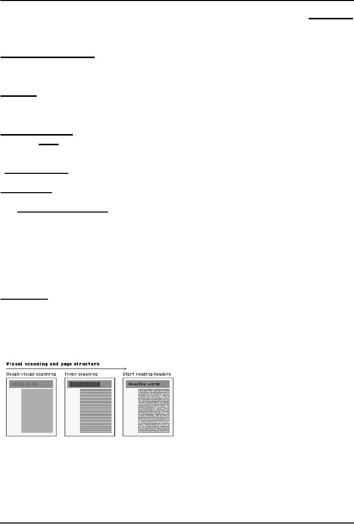
Users
don't read; they scan
Users
don't make optimal choices;
they look for the first
good-enough solution
Users
don't figure out how
things work; they muddle
through
Design
is Important!
62%
of shoppers gave up looking for the
item they wanted to buy
online (Zona
Research)
40%
visitors don't return to a site if
their first visit was a
-ive experience (Forrester
Research)
83%
of users have left sites in
frustration due to poor navigation,
slowness (NetSmart
Research)
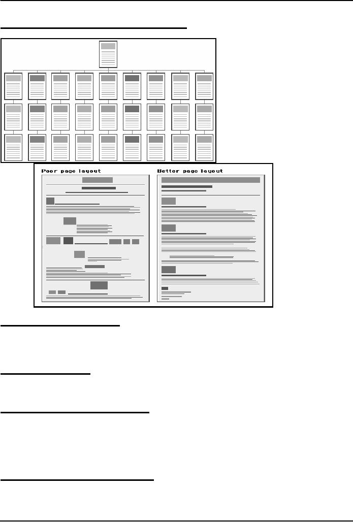
Simple
designs have greater impact: they
can be understood immediately!
(Mullet/Sano)
159
Introduction
to Computing CS101
VU
Designs
should be consistent & predictable
(unified)
25.3
Elements of Website Design:
Navigation
scheme
Layout
of information
Overall
look and feel
25.4
Website Navigation:
The
interface/controls that a Website
provides to the user for
accessing various parts of the
Website
It
probably is the most important
aspect of the design of a Website
25.5
A Few Navigation Design
Heuristics:
Put the
main navigation on the left of the
page
It
should be `invisible' until it is
wanted
It
should require an economy of action &
time
It
should remain
consistent
Use
text for navigation labels.
If you must use icons, put a
description underneath each
icon
25.6
Navigation Design Heuristics
(contd.):
Labels
should be clear, understandable
Labels
should be legible
Do
not play with standard
browser buttons & features
Provide
search capability
160
Introduction
to Computing CS101
VU
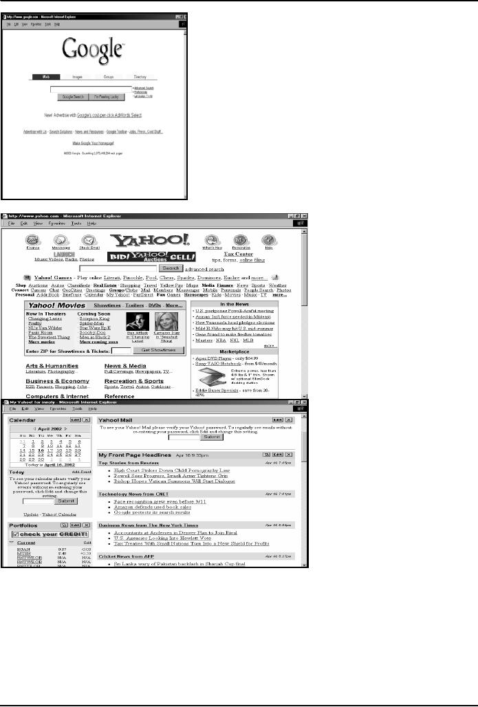
A
good
Solution
to
Problem
Is nice
and
elegent
161
Introduction
to Computing CS101
VU
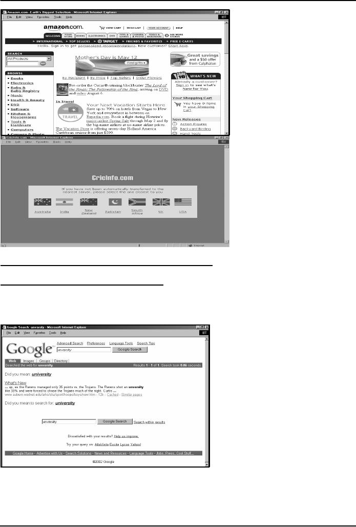
25.7
Good designs assist the
user in recovering from
errors
25.8
Assisting the User Recover
from Errors:
Location,
post code mismatch
Credit
card number errors
Phone
numbers
Spelling
errors
162
Introduction
to Computing CS101
VU
25.9
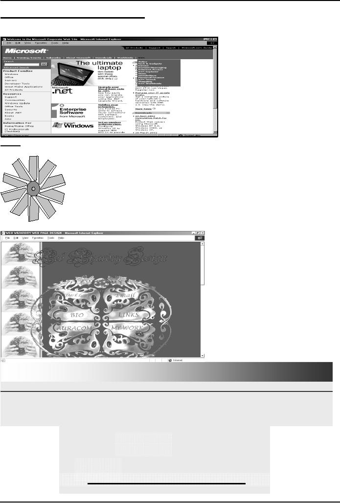
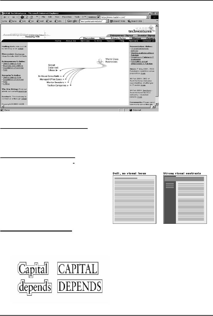
A few constructive
recommendations
Let's
look at a few Web sites and
see how we can improve
their usability
Enter
Dragon's
Lair
All
rights reserved, 2002.
LOADING
...
RESTAR
SKIP
T
Click
here to go to the main page
directly
163
Introduction
to Computing CS101
VU
25.10
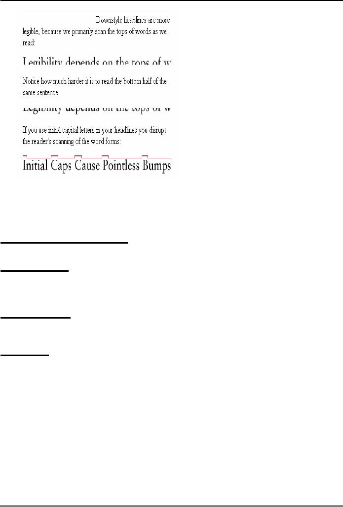
Making Display Elements
Legible:
1.
Designing (arranging) Display
Elements
Elements
must be large enough to be
processed visually
Elements
must contrast sufficiently
with their backgrounds
Making
Display Elements
Legible:
Related
elements should be visually
grouped through the use of
space, color, or graphical
boundaries
The
relative levels of importance among
elements in a display should be
revealed graphically
25.11
Ensuring Text is Readable:
Use
sans serif (e.g. Arial,
Helvetica, Verdana) typefaces for
display on screen
Display
type intended for continuous
reading at 10 to 14 points
Avoid
the overuse of bold and
italics
Avoid
setting type in all
caps
164
Introduction
to Computing CS101
VU
Arrange
type intended for extended
reading flush left, ragged
right
Avoid
lines of type shorter than 40
characters and longer than 60
characters
Mark
the boundaries between paragraphs with
blank lines rather than
indentation
Use
headings and subheadings to visually
reveal the relationships among text
elements they label
paragraphs
after paragraphs of text do
not work that well on the
Web
25.12
Using Pictures &
Illustrations:
Avoid
using pictures that are
strictly decorative
25.13
Using Motion
Use
motion to attract the viewer's
attention
Avoid
the use of motion for
"cosmetic" purposes
Success
is defined by the user, not
the builder
In
Today's Lecture:
We
looked at the role of usability in Web
site design
We
identified some of the factors affecting
the usability of a Web page
Next
Lecture:
Computer
Networks
We
will become able to appreciate the
role of networks in
computing
We
will familiarize ourselves with
various networking topologies and
protocols
165
Table of Contents:
- INTRODUCTION
- EVOLUTION OF COMPUTING
- World Wide Web, Web’s structure, genesis, its evolution
- Types of Computers, Components, Parts of Computers
- List of Parts of Computers
- Develop your Personal Web Page: HTML
- Microprocessor, Bus interface unit, Data & instruction cache memory, ALU
- Number systems, binary numbers, NOT, AND, OR and XOR logic operations
- structure of HTML tags, types of lists in web development
- COMPUTER SOFTWARE: Operating Systems, Device Drivers, Trialware
- Operating System: functions, components, types of operating systems
- Forms on Web pages, Components of Forms, building interactive Forms
- APPLICATION SOFTWARE: Scientific, engineering, graphics, Business, Productivity, Entertainment, Educational Software
- WORD PROCESSING: Common functions of word processors, desktop publishing
- Interactivity to Forms, JavaScript, server-side scripts
- ALGORITHMS
- ALGORITHMS: Pseudo code, Flowcharts
- JavaScript and client-side scripting, objects in JavaScript
- Low, High-Level, interpreted, compiled, structured & object-oriented programming languages
- Software Design and Development Methodologies
- DATA TYPES & OPERATORS
- SPREADSHEETS
- FLOW CONTROL & LOOPS
- DESIGN HEURISTICS. Rule of thumb learned through trial & error
- WEB DESIGN FOR USABILITY
- ARRAYS
- COMPUTER NETWORKS: types of networks, networking topologies and protocols
- THE INTERNET
- Variables: Local and Global Variables
- Internet Services: FTP, Telnet, Web, eMail, Instant messaging, VoIP
- DEVELOPING PRESENTATIONS: Effective Multimedia Presentations
- Event Handlers
- GRAPHICS & ANIMATION
- INTELLIGENT SYSTEMS: techniques for designing Artificial Intelligent Systems
- Mathematical Functions in JavaScript
- DATA MANAGEMENT
- DATABASE SOFTWARE: Data Security, Data Integrity, Integrity, Accessibility, DBMS
- String Manipulations:
- CYBER CRIME
- Social Implications of Computing
- IMAGES & ANIMATION
- THE COMPUTING PROFESSION
- THE FUTURE OF COMPUTING
- PROGRAMMING METHODOLOGY
- REVIEW & WRAP-UP of Introduction to Computing