 |
ARCHITECTURAL DRAWING |
| << PRACTICAL PROBLEMS |
| DECORATIVE DRAWING >> |
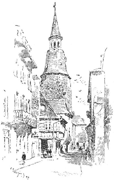
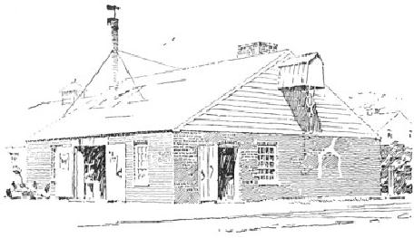
FIG.
40
C.
D. M.
To
add interest to the picture,
and more especially to give
life to the
shadows,
several figures are
introduced. It will be noticed that
the cart is
inserted
at the focal point of the
drawing to better assist the
perspective.
CHAPTER
VI
ARCHITECTURAL
DRAWING
It
is but a few years since architects'
perspectives were "built up"
(it
would
be a mistake to say "drawn") by means of
a T-square and the
ruling
pen; and if architectural drawing
has not quite kept
pace with that
for
general illustration since, a
backward glance over the
professional
magazines
encourages a feeling of comparative
complacency. That so
high
a standard or so artistic a character is
not observable in
architectural
as
in general illustration is, I
think, not difficult to
explain. Very few of
the
clever architectural draughtsmen
are illustrators by profession.
Few,
even
of those who are generally
known as illustrators, are
anything
more--I
should perhaps say anything
less--than
versatile architects; and
yet
Mr. Pennell, who would
appear to assume, in his
book on drawing,
that
the point of view of the
architect is normally pictorial,
seems at a
loss
to explain why Mr. Robert Blum,
for instance, can illustrate
an
architectural
subject more artistically
than any of the draughtsmen
in the
profession.
Without accepting his premises, it is
remarkably creditable to
architecture
that it counts among its
members in this country such
men as
Mr.
B. G. Goodhue and Mr. Wilson Eyre,
Jr., and in England
such
thorough
artists as Mr. Prentice and Mr.
Ernest George--men
known
even
to distinction for their
skill along lines of purely
architectural
practice,
yet any one of whom would, I
venture to say, cause
considerable
displacement did he invade
the ranks of magazine
illustrators.
Moreover (and the suggestion is
not unkindly offered),
were
the
architects and the illustrators to change
places architecture
would
suffer
most by the process.
That
the average architect should
be incapable of artistically illustrating
The
his
own design, ought, I think,
to be less an occasion for surprise
than Architects'
that
few painters, whose point of
view is essentially pictorial, can make
Case
even
a tolerable interpretation in line of
their own paintings. Be
it
remembered
that the pictures made by
the architect are seldom
the
records
of actualities. The
buildings themselves
are merely
contemplated,
and the illustrations are
worked up from
geometrical
elevations
in the office, very, very
far from Nature. Moreover,
the
subjects
are not infrequently such as
lend themselves with an ill
grace to
picturesque
illustration. The structure to be
depicted may, for
instance,
be
a heavy cubical mass with a
bald uninteresting sky-line; or it
may be a
tall
office building, impossible to
reconcile with natural
accessories
either
in pictorial scale or in composition.
These natural accessories,
too,
the
draughtsman must, with an
occasional recourse to his
photograph
album,
evolve out of his inner
consciousness. When it is further
considered
that such structures,
even when actualities,
are
uncompromisingly
stiff and immaculate in their
newness, presenting
absolutely
none of those interesting accidents so
dear to the artist,
and
perhaps
with nothing whatever about
them of picturesque suggestion,
we
have
a problem presented which is
somewhat analogous to that
presented
by
the sculpturesque possibilities of
"fashionable trousering." That,
with
such
uninspiring conditions, architectural
illustration does not
develop so
interesting
a character nor attain to so
high a standard as distinguishes
general
illustration is not to be wondered
at. It is rather an occasion
for
surprise
that it exhibits so little of
the artificiality of the
fashion-plate
after
all, and that the better
part of it, at least, is not
more unworthy than
figure
illustration would be were it denied
the invaluable aid of the
living
model.
So much by way of
apology.
The
architectural perspective, however, is
not to be regarded purely
The
from
the pictorial point of view.
It is an illustration first, a picture
Architects'
afterwards,
and almost invariably deals
with an individual building,
Point of
View
which
is the essential subject. This
building cannot, therefore, be
made a
mere
foil for interesting
"picturesqueries," nor subordinated to
any scenic
effect
of landscape or chiaroscuro. Natural
accessories or interesting
bits
of
street life may be added to
give it an appropriate setting; but
the result
must
clearly read "Building, with
landscape," not "Landscape,
with
building."
Much
suggestion for the
sympathetic handling of particular
subjects
may
be found in the character of
the architecture itself. The
illustrator
ought
to enter into the spirit of
the designer, ought to feel
just what
natural
accessories lend themselves
most harmoniously to this or
that
particular
type. If the architecture be
quaint and picturesque it must
not
have
prosaic surroundings. If, on the other
hand, it be formal or
monumental,
the character and scale of
the accessories should
be
accordingly
serious and dignified. The rendering
ought also to vary
with
the
subject,--a free picturesque
manner for the one, a
more studied and
responsible
handling for the other.
Technique is the language of
art, and
a
stiff pompous phraseology will accord ill
with a story of quaint
humor
or
pathos, while the homely
diction that might answer
very well would
be
sure to struggle at a disadvantage with
the stately meanings
and
diplomatic
subtleties of a state
document.
It
would be well for the
student, before venturing
upon whole subjects,
Rendering
of
to
learn to render details,
such as windows, cornices,
etc. Windows are a Detail
most
important feature of the
architectural drawing, and the
beginner
must
study them carefully,
experimenting for the method
which will best
represent
their glassy surfaces. No material
gives such play of light
and
shade
as glass does. One window is
never absolutely like
another; so that
while
a certain uniformity in their
value may be required for
breadth of
effect
in the drawing of a building,
there is plenty of opportunity
for
incidental
variety in their
treatment.
A
few practical hints on the
rendering of windows may
prove
serviceable.
Always emphasize the sash.
Where there is no recess, as
in
wooden
buildings, strengthen the
inner line of sash, as in
Fig. 41. In
masonry
buildings the frame and
sash can be given their
proper values,
the
area of wood being treated
broadly, without regard to the
individual
members.
The wood may, however, be
left white if required, as
would be
the
case in Colonial designs. In either
case the dark shadow
which the
sash
casts on the glass should be
suggested, if the scale of
the drawing be
such
as to permit of it. Do not
try to show too much.
One is apt to make a
fussy
effect, if, for instance,
one insists on always shading
the soffit of
the
masonry opening, especially if
the scale of the drawing be
small.
Besides,
a white soffit is not a
false but merely a forced
value, as in
strong
sunlight the reflected light
is considerable. If the frame be
left
white,
however, the soffit ought to
be shaded, otherwise it will be
difficult
to keep the values distinct.
In respect of wooden buildings
there
is
no need to always complete
the mouldings of the
architrave. Notice in
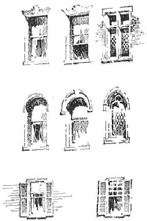
Fig.
41 that, in the window
without the muntins, the
mouldings have
been
carried round the top to
give color, but that in
the other they
are
merely
suggested at the corners so as to
avoid confusion. Care should
be
taken
to avoid mechanical rendering of
the muntins. For the
glass itself, a
uniformly
flat tone is to be avoided.
The tones should soften
vaguely. It
will
be found, too, that it is
not advisable to have a
strong dark effect at
the
top of the window and
another at the bottom; one
should
predominate.
FIG.
41
C.
D. M.
The
student after careful study
of Fig. 41 should make from it
enlarged
drawings,
and afterwards, laying the
book aside, proceed to
render them
in
his own way. When he
has done so, let him compare
his work with
the
originals.
This process ought to be
repeated several times, the
aim being
always
for similarity,
not for literalness
of
effect. If he can get
equally
good
results with another method
he need not be disconcerted at the
lack
of
any further resemblance.
The
cornice with its shadow is
another salient feature. In
short
shadows,
such as those cast by cornices, it is
well, if a sunny effect
be
desired,
to accent the bottom edge of
the shadow. The shadow
lines
ought
to be generally parallel, but
with enough variation to
obviate a
mechanical
effect. They need not be
vertical lines,--in fact it is
better
that
they should take the same
slant as the light. If they
are not absolutely
perpendicular,
however, it is well to make them
distinctly oblique,
otherwise
the effect will be unpleasant. A
clever sketch of a cornice
by
Mr.
George F. Newton is shown in Fig.
42. Notice how well
the texture
of
the brick is expressed by
the looseness of the pen
work. Some of the
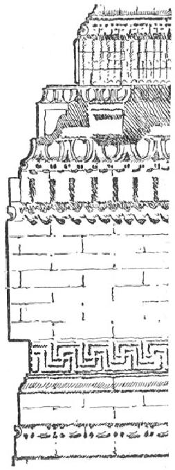
detail,
too, is dexterously handled,
notably the bead and
button
moulding.
The
strength of the cornice
shadow should be determined by
the tone
of
the roof above it. To obtain
for this shadow the
very distinct value
which
it ought to have, however,
does not require that
the roof be kept
always
much lighter than it. In
the gable roof in Fig. 57,
the tone of the
roof
is shaded lighter as it approaches
the eaves, so that the
shadow may
count
more emphatically. This
order may be reversed, as in the
case of a
building
with dark roof and light
walls, in which case the
shadow may be
grayer
than the lower portion of
the roof, as in "B" in Fig.
44.
FIG.
42
GEORGE
F. NEWTON
But
the beginner should not
yet hurry on to whole
subjects. A church
porch,
as in Fig. 35, or a dormer
with its shadow cast on a
roof, as in Fig.
43,
will be just as beneficial a study
for him as an entire
building, and
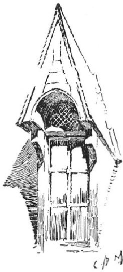
will
afford quite as good an opportunity
for testing his knowledge of
the
principles
of pen drawing, with the
added advantage that either of
the
subjects
mentioned can be mapped out
in a few minutes, and that
a
failure
or two, therefore, will not
prove so discouraging as if a
more
intricate
subject had to be re-drawn. I have
known promising
beginners
to
give up pen and ink drawing
in despair because they
found themselves
unequal
to subjects which would have
presented not a few
difficulties to
the
experienced illustrator. When the
beginner grows faint-hearted,
let
him
seek consolation and encouragement in
the thought that were
pen
drawing
something to be mastered in a week or a
month there would be
small
merit in the
accomplishment.
FIG.
43
C.
D. M.
It
is a common fault of students to
dive into the picture
unthinkingly, A
General
beginning
anywhere, without the
vaguest plan of a general
effect, System
whereas
it is of the utmost importance
that every stroke of the pen
be
made
with intelligent regard to the
ultimate result. The
following general
method
will be found valuable.
Pencil
the outline of the entire
subject before beginning the
pen work.
It
will not do to start on the
rendering as soon as the building
alone is
pencilled
out, leaving the accessories
to be put in as one goes along.
The
adjacent
buildings, the foliage, and
even the figures must be
drawn--
carefully
drawn--before the pen is taken
up. The whole subject
from the
very
beginning should be under
control, and to that end it
becomes
necessary
to have all the elements of
it pre-arranged.
Next
scheme out the values.
This is the time to do the
thinking. Do not Arrangement
start
out rashly as soon as everything is
outlined in pencil, confident in
of the
Values
the
belief that all windows,
for instance, are dark, and
that you may as
well
make them so at once and be done with
them. This will be only
to
court
disaster. Besides, all windows
are not dark; they
may be very light
indeed.
The color value of nothing
is absolute. A shadow may
seem
almost
black till a figure passes
into it, when it may
become quite gray
by
comparison. So a window with
the sun shining full upon
it, or even
one
in shade, on which a reflected
light is cast, may be
brilliantly light
until
the next instant a cloud
shadow is reflected in it,
making it densely
black.
Arrange the values,
therefore, with reference to one
general effect,
deciding
first of all on the
direction of the light.
Should this be such as
to
throw
large areas of shadow, these
masses of gray will be
important
elements
in the color-scheme. An excellent
way to study values is
to
make
a tracing-paper copy of the
line drawing and to experiment on
this
for
the color with charcoal,
making several sketches if necessary.
After
having
determined on a satisfactory scheme, put
fixatif on the rough
sketch
and keep it in sight.
Otherwise, one is liable, especially if
the
subject
is an intricate one, to be led
astray by little opportunities
for
interesting
effects here and there, only to
discover, when too late,
that
these
effects do not hang together
and that the drawing
has lost its
breadth.
The rough sketch is to the
draughts man what manuscript
notes
are
to the lecturer.
Do
not be over-conscious of detail. It is a
common weakness of the
Treatment
of
architectural
draughts man to be too sophisticated in
his pictorial Detail
illustration.
He knows so much about the
building that no matter
how
many
thousand yards away from it
he may stand he will see things
that
would
not reveal themselves to
another with the assistance
of a field-
glass.
He is conscious of the fact
that there are just so
many brick
courses
to the foot, that the
clapboards are laid just so
many inches to the
weather,
that there are just so
many mouldings in the belt
course,--that
everything
in general is very, very
mathematical. This is not
because his
point
of view is too big, but
because it is too small. He
who sees so much
never
by any chance sees the
whole
building. Let
him try to think
broadly
of things. Even should he
succeed in forgetting some of
these
factitious
details, the result will
still be stiff enough, so
hard is it to re-
adjust
one's attitude after
manipulating the T-square. I
strongly
recommend,
as an invaluable aid toward such a
re-adjustment, the
habit
of
sketching from Nature,--from
the figure during the
winter evenings,
and
out of doors in summer.
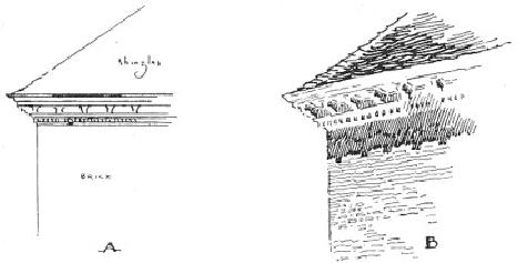
FIG.
44
C.
D. M.
The
beginner is apt to find his
effects at first rather hard
and
mechanical
at the best, because he has
not yet attained that
freedom of
handling
which ignores unimportant
details, suggests rather
than states,
gives
interesting variations of line
and tone, and differentiates
textures. A
good
part of the unpleasantness of effect will
undoubtedly be found to be
due
to a mistaken regard for accuracy of
statement, individual
mouldings
being
lined in as deliberately as in the
geometrical office drawings,
and
not
an egg nor a dart slighted.
Take, for example, the
case of an old
Colonial
building with its white
cornice, or any building
with white
trimmings.
See the effect of such a one
in an "elevation" where all
the
detail
is drawn, as in "A," Fig. 44.
Observe that the amount of
ink
necessary
to express this detail has
made the cornice darker
than the rest
of
the drawing, and yet
this is quite the reverse of
the value which it
would
have in the actual building,
see "B." To obtain the
true value the
different
mouldings which make up the
cornice should be
merely
suggested.
Where it is not a question of
local color, however, this
matter
of
elimination is largely subject to
the exigencies of reproduction;
the
more
precisely and intimately one attempts to
render detail, the
smaller
the
scale of the technique
requires to be, and the greater
the difficulty.
Consequently,
the more the reduction
which the drawing is likely
to
undergo
in printing, the more one will be
obliged to disregard the
finer
details.
These finer details need
not, however, be absolutely
ignored.
Notice,
for instance, the clever
suggestion of the sculpture in
the
admirable
drawing by Mr. F. E. Wallis, Fig.
45. The conventional
drawing
of the fa�ade, Fig. 46, is a
fine illustration of the
decorative
effect
of color obtainable by emphasizing
the organic lines of the
design.
FIG.
45
FRANK
E. WALLIS
The
elements in a perspective drawing which
present most difficulties Foliage
and
to
the architectural draughtsman
are foliage and figures. These are,
Figures
however,
most important accessories, and
must be cleverly handled. It
is
difficult
to say which is the harder to
draw, a tree or a human figure;
and
if
the student has not sketched
much from Nature either will
prove a
stumbling-block.
Presuming, therefore, that he
has already filled a
few
sketch-books,
he had better resort to these, or to his
photograph album,
when
he needs figures for his
perspective. Designing figures and
trees
out
of one's inner consciousness is slow
work and not very
profitable;
and
if the figure draughtsman
may employ models, the
architect may be
permitted
to use photographs.
FIG.
46
HARRY
ALLAN JACOBS
Unhappily
for the beginner, no two
illustrators consent to
render
foliage,
or anything else for that
matter, in quite the same
way, and so I
cannot
present any authoritative formula
for doing so. This
subject has
been
treated, however, in a previous chapter,
and nothing need be
added
here
except to call attention to an
employment of foliage peculiar
to
architectural
drawings. This is the broad
suggestive rendering of
dark
leafage
at the sides of a building, to
give it relief. The example
shown in
Fig.
47 is from one of Mr. Gregg's
drawings.
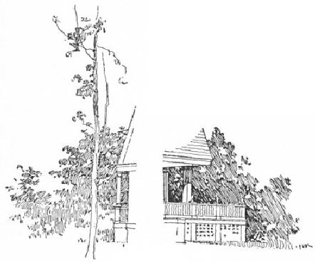
FIG.
47
D.
A. GREGG
The
rendering of the human
figure need not be dealt
with under this
head,
as figures in an architectural subject
are of necessity
relatively
small,
and therefore have to be rendered very
broadly. Careful drawing
is
none
the less essential, however, if
their presence is to be justified;
and
badly
drawn figures furnish a
tempting target for the
critic of
architectural
pictures. Certainly, it is only
too evident that the
people
usually
seen in such pictures are
utterly incapable of taking
the slightest
interest
whatever in architecture, or in anything
else; and not infrequently
they
seem to be even more
immovable objects than the
buildings
themselves,
so fixed and inflexible are
they. Such figures as these
only
detract
from the interest of the
drawing, instead of adding to it, and
the
draughtsman
who has no special aptitude is
wise in either omitting
them
altogether,
or in using very few, and is
perhaps still wiser if he
entrusts
the
drawing of these to one of his
associates more accomplished in
this
special
direction.
The
first thing to decide in the
matter of figures is their
arrangement
and
grouping, and when this has
been determined they should
be
sketched
in lightly in pencil. In this
connection a few words by
way of
suggestion
may be found useful. Be
careful to avoid anything
like an
equal
spacing of the figures. Group
the people interestingly. I have
seen
as
many as thirty individuals in a
drawing, no two of whom
seemed to be
acquainted,--a
very unhappy condition of
affairs even from a
purely
pictorial
point of view. Do not
over-emphasize the base of a
building by
stringing
all the figures along
the sidewalks. The lines of
the curbs would
thus
confine and frame them in
unpleasantly. Break the
continuity of the
street
lines with figures or
carriages in the roadway, as in
Fig. 55. After
the
figures have been
satisfactorily arranged, they ought to be
carefully
drawn
as to outline. In doing so, take pains to
vary the postures,
giving
them
action, and avoiding the
stiff wooden, fashion-plate
type of person
so
common to architectural drawings.
When the time comes to
render
these
accessories with the pen
(and this ought, by the
way, to be the last
thing
done) do not lose the
freedom and breadth of the
drawing by
dwelling
too long on them. Rise
superior to such details as
the patterns of
neckties.
We
will now consider the
application to architectural subjects of
the
remarks
on technique and color contained in
the previous chapters.
To
learn to render the
different textures of the
materials used in Architectural
architecture,
the student would do well to
examine and study the
Textures
methods
of prominent illustrators, and then
proceed to forget
them,
developing
meanwhile a method of his
own. It will be instructive
for
him,
however, as showing the
opportunity for play of
individuality, to
notice
how very different, for
instance, is Mr. Gregg's manner of
rendering
brick work to that of Mr.
Railton. Compare Figs. 48 and
49.
One
is splendidly broad,--almost
decorative,--the other intimate
and
picturesque.
The work of both these
men is eminently worthy of
study.
For
the sophisticated simplicity and directness of
his method and the
almost
severe conscientiousness of his drawing,
no less than for
his
masterly
knowledge of black and white, no safer
guide could be
commended
to the young architectural
pen-man for the study
of
principles
than Mr. Gregg. Architectural
illustration in America owes
much
to his influence and,
indeed, he may be said to
have furnished it
with
a grammar. Take his drawing
of the English cottages, Fig.
50. It is a
masterly
piece of pen work. There is
not a feeble or tentative
stroke in
the
whole of it. The color is
brilliant and the textures
are expressed with
wonderful
skill. The student ought to
carefully observe the rendering
of
the
various roofs. Notice how
the character of the thatch
on the second
cottage
differs from that on the
first, and how radically the
method of
rendering
of either varies from that
used on the shingle roof at
the end of
the
picture. Compare also the two gable
chimneys with each other
as
well
as with the old ruin
seen over the tree-tops.
Here is a drawing by an
architectural
draughtsman of an architectural actuality
and
not of an
artificial
abstraction. This is a fairer
ground on which to meet
the
illustrators
of the picturesque.
FIG.
48
D.
A. GREGG
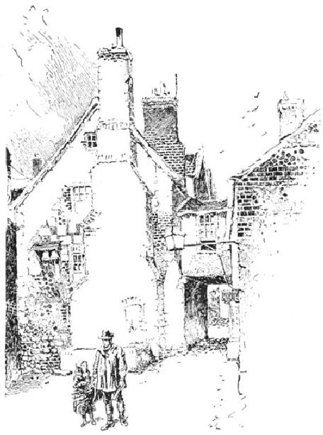
FIG.
49
HERBERT
RAILTON
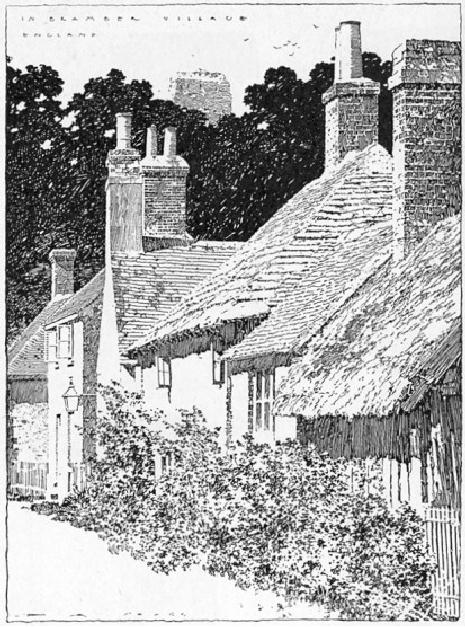
FIG.
50
D.
A. GREGG
FIG.
51
WALTER
M. CAMPBELL
FIG.
52
HERBERT
RAILTON
FIG.
53
FIG.
54
C.
F. BRAGDON
FIG.
55
Mr.
Campbell's drawing, Fig. 51,
is a very good example of the
Examples
rendering
of stone textures. The old
masonry is capitally expressed
by
the
short irregular line. The
student is advised to select some portion
of
this,
as well as of the preceding
example to copy, using, no
matter how
small
the drawings he may make, a pen
not smaller than number
303. I
know
of no architectural illustrator who
hits stonework off quite
so
cleverly
as Mr. Goodhue. Notice, in his
drawing of the masonry, in
Fig.
8,
how the stones are
picked out and rendered
individually in places and
how
this intimate treatment is
confined to the top of the
tower where it
tells
against the textures of the
various roofs and how it is
then merged in
a
broad gray tone which is
carried to the street. Mr. Railton's
sketches are
full
of clever suggestion for the
architectural illustrator in the
way of
texture.
Figs. 7 and 52 show his free
rendering of masonry. The
latter is
an
especially very good subject
for study. Observe how
well the texture
tells
in the high portion of the
abutment by reason of the
thick, broken
lines.
For a distant effect of stone
texture, the drawing by Mr.
Jaccaci,
Fig.
53, is a fine example. In
this the rendering is
confined merely to
the
organic
lines of the architecture, and
yet the texture is capitally
expressed
by
the quality of the stroke,
which is loose and much
broken. The
general
result is extremely crisp
and pleasing. For broad
rendering of
brick
textures, perhaps there is no one
who shows such a
masterly
method
as Mr. Gregg. As may be seen in
his sketch of the
blacksmith
shop,
Fig. 48, he employs an
irregular dragging line with
a great deal of
feeling.
The brick panel by Mr.
Bragdon, Fig. 54, is a neat
piece of work.
There
is excellent texture, too, in
the picturesque drawing by Mr.
Harvey
Ellis,
Fig. 55:--observe the
rendering of the rough brick
surface at the
left
side of the building. A more
intimate treatment is that
illustrated in
the
detail by Mr. C. E. Mallows, the
English draughts man, Fig.
56. In
this
drawing, however, the edges
of the building are
unpleasantly hard,
and
are somewhat out of
character with the quaint
rendering of the
surfaces.
Mr. Goodhue uses a similar
treatment, and, I think,
rather more
successfully.
On the whole, the broader
method, where the texture
is
carried
out more uniformly, is more
to be commended, at least for
the
study
of the beginner. Some
examples of shingle and slate
textures are
illustrated
by Fig. 57. It is advisable to
employ a larger pen for
the
shingle,
so as to ensure the requisite coarseness
of effect.
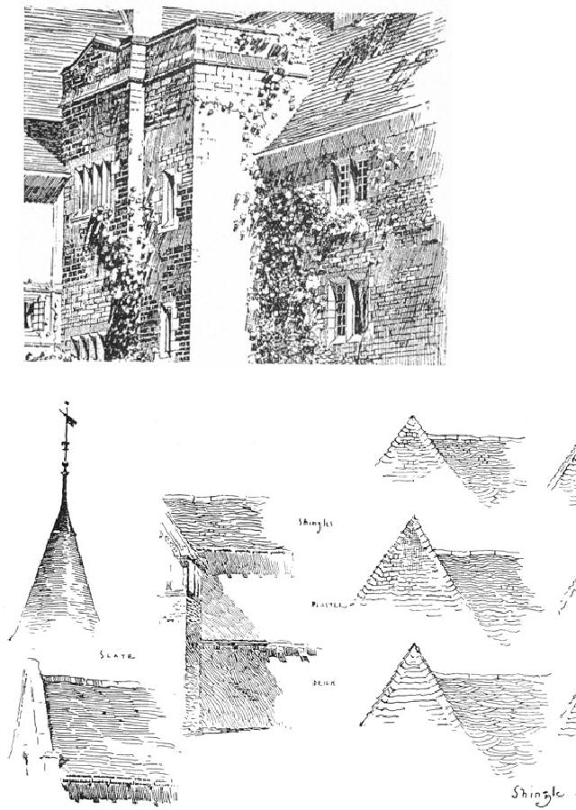
FIG.
56
C.
E. MALLOWS
FIG.
57
FIG.
58
C.
D. M.
To
favorably illustrate an architectural
subject it will be found An
generally
expedient to give prominence to one
particular elevation in the
Architectural
perspective,
the other being permitted to
vanish sharply. Fig. 58 may
be Problem
said
to be a fairly typical problem
for the architectural
penman. The old
building
on the right, it must be
understood, is not a mere accessory,
but
is
an essential part of the picture.
The matter of surroundings is
the first
we
have to decide upon, and
these ought always to be
disposed with
reference
to the particular form of
composition which the
subject may
suggest.
Were we dealing with the
foreground building alone
there
would
be no difficulty in adjusting the
oval or the diamond form
of
composition
to it.* As it is, the
difficulty lies in the long
crested roof-line
which
takes the same oblique
angle as the line of the
street, and the
influence
of this line must be, as
far as possible, counteracted. Now
the
heavy
over-hang of the principal
roof will naturally cast a
shadow which
will
be an important line in the
composition, so we arrange our
accessories
at the right of the picture
in reference to this. Observe
that
the
line of the eaves, if
continued, would intersect
the top of the gable
chimney.
The dwelling and the tree
then form a focus for
the converging
lines
of sidewalk and roof, thus
qualifying the vertical
effect of the
building
on the right. As the
obliquity of the composition is
still
objectionable,
we decide to introduce a foreground
figure which will
break
up the line of the long
sidewalk, and place it so that it will
increase
the
influence of some contrary
line, see Fig. 59. We
find that by putting
it
a little to the right of the
entrance and on a line with
that of the left
sidewalk,
the picture is pleasingly
balanced.
[Footnote
*: See footnote on page
62.]
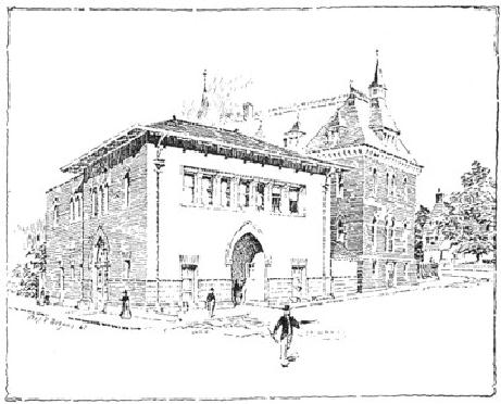
FIG.
59
C.
D. M.
We
are now ready to consider
the disposition of the
values. As I have
said
before, these are determined
by the scheme of light and
shade. For
this
reason any given subject
may be variously treated. We do
not
necessarily
seek the scheme which will
make the most pictorial
effect,
however,
but the one which will serve to
set off the building to
the best
advantage.
It is apparent that the most
intelligible idea of the
form of the
structure
will be given by shading one side; and,
as the front is the
more
important
and the more interesting
elevation, on which we need
sunlight
to
give expression to the
composition, it is natural to shade
the other,
thus
affording a foil for the
bright effects on the front.
This bright effect
will
be further enhanced if we assume that
the local color of the
roof is
darker
than that of the walls, so
that we can give it a gray
tone, which
will
also make the main building stand
away from the other. If,
however,
we
were to likewise assume that
the roof of the other
building were
darker
than its walls, we should be
obliged to emphasize the
objectionable
roof line, and as, in any
case, we want a dark effect
lower
down
on the walls to give relief
to our main building, we will
assume
that
the local color of the
older walls is darker than
that of the new.
The
shadow
of the main cornice we will make
quite strong, emphasis
being
placed
on the nearer corner, which is
made almost black. This
color is
repeated
in the windows, which,
coming as they do in a group,
are some
of
them more filled in than
others, to avoid an effect of
monotony. The
strong
note of the drawing is then
given by the foreground
figure.