 |
PRACTICAL PROBLEMS |
| << VALUES |
| ARCHITECTURAL DRAWING >> |
CHAPTER
V
PRACTICAL
PROBLEMS
I
have thought it advisable in
this chapter to select, and to work
out in
some
detail, a few actual
problems in illustration, so as to
familiarize the
student
with the practical
application of some of the
principles
previously
laid down.
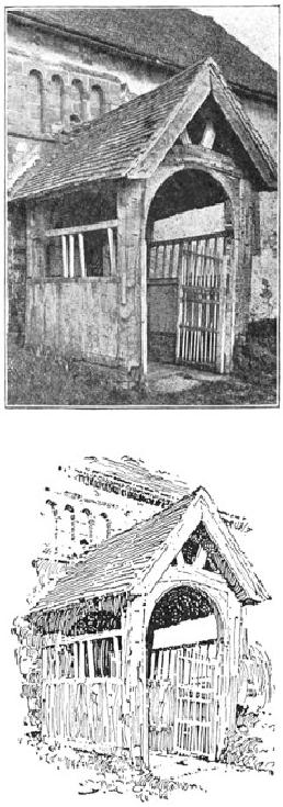
FIG.
35
FROM
A PHOTOGRAPH
FIG.
36
D.
A. GREGG
In
the first example the
photograph, Fig. 35, shows
the porch of an old
First
English
country church. Let us see
how this subject has
been interpreted Problem
in
pen and ink by Mr. D. A. Gregg, Fig.
36. In respect to the lines,
the
original
composition presents nothing
essentially unpleasant. Where
the
strong
accent of a picture occurs in the
centre, however, it is
generally
desirable
to avoid much emphasis at
the edges. For this
reason the pen
drawing
has been "vignetted,"--that is to
say, permitted to fade
away
irregularly
at the edges. Regarding the
values, it will be seen that
there is
no
absolute white in the
photograph. A literal rendering of
such low
color
would, as we saw in the preceding
chapter, be out of the
question;
and
so the essential values which
directly contribute to the
expression of
the
subject and which are
independent of local color or
accidental effect
have
to be sought out. We observe, then,
that the principal note of
the
photograph
is made by the dark part of
the roof under the
porch relieved
against
the light wall beyond.
This is the direct result of
light and shade,
and
is therefore logically adopted as
the principal note of Mr.
Gregg's
sketch
also. The wall at this point
is made perfectly white to
heighten the
contrast.
To still further increase
the light area, the
upper part of the
porch
has been left almost
white, the markings
suggesting the
construction
of the weather-beaten timber
serving to give it a faint
gray
tone
sufficient to relieve it from
the white wall. The
low color of the
grass,
were it rendered literally, would make
the drawing too heavy
and
uninteresting,
and this is therefore only
suggested in the sketch. The
roof
of
the main building, being
equally objectionable on account of
its mass
of
low tone, is similarly treated. Mr.
Gregg's excellent handling of
the
old
woodwork of the porch is
well worthy of study.
Let
us take another example. The
photograph in Fig. 37 shows a
moat- Second
house
in Normandy; and, except
that the low tones of the
foliage are Problem
exaggerated
by the camera, the
conditions are practically those
which we
would
have to consider were we
making a sketch on the spot.
First of all,
then,
does the subject, from
the point of view at which
the photograph is
taken,
compose well?* It cannot be
said that it does. The
vertical lines
made
by the two towers are
unpleasantly emphasized by the trees
behind
them.
The tree on the left were
much better reduced in height
and placed
somewhat
to the right, so that the
top should fill out the
awkward angles
of
the roof formed by the
junction of the tower and
the main building.
The
trees on the right might be
lowered also, but otherwise
permitted to
retain
their present relation. The
growth of ivy on the tower
takes an ugly
outline,
and might be made more
interestingly irregular in
form.
[Footnote
*: The student is advised to
consult "Composition," by Arthur W. Dow.
[New
York,
1898]]
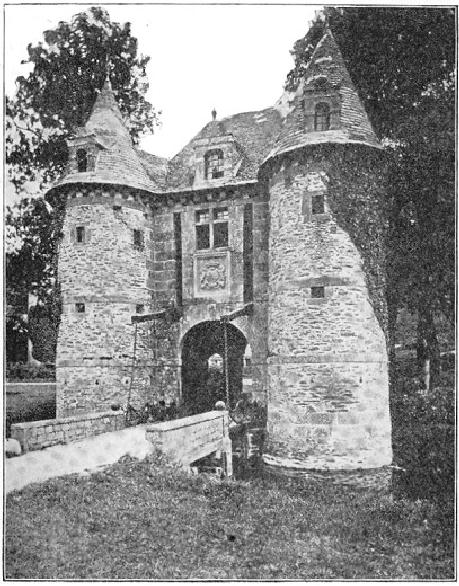
FIG.
37
FROM
A PHOTOGRAPH
The
next consideration is the
disposition of the values. In
the
photograph
the whites are confined to
the roadway of the bridge
and the
bottom
of the tower. This is
evidently due, however, to
local color rather
than
to the direction of the
light, which strikes the
nearer tower from the
right,
the rest of the walls being
in shadow. While the black
areas of the
picture
are large enough to carry a
mass of gray without
sacrificing the
sunny
look, such a scheme would be
likely to produce a labored
effect.
Two
alternative schemes readily
suggest themselves: First, to make
the
archway
the principal dark, the
walls light, with a light
half-tone for the
roof,
and a darker effect for the
trees on the right. Or,
second, to make
these
trees themselves the
principal dark, as suggested by
the
photograph,
allowing them to count against
the gray of the roof and
the
ivy
of the tower. This latter
scheme is that which has
been adopted in the
sketch,
Fig. 38.
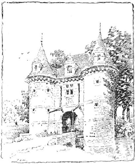
FIG.
38
C.
D. M.
It
will be noticed that the
trees are not nearly so
dark as in the
photograph.
If they were, they would be
overpowering in so large an
area
of
white. It was thought better,
also, to change the direction of
the light,
so
that the dark ivy, instead of
acting contradictorily to the
effect, might
lend
character to the shaded
side. The lower portion of
the nearer tower
was
toned in, partly to qualify
the vertical line of the
tower, which would
have
been unpleasant if the
shading were uniform, and
partly to carry the
gray
around to the entrance. It was
thought advisable, also, to cut
from
the
foreground, raising the
upper limit of the picture
correspondingly. (It
is
far from my intention,
however, to convey the
impression that any
liberties
may be taken with a subject
in order to persuade it into
a
particular
scheme of composition; and in this
very instance an
artistic
photographer
could probably have discovered a
position for his
camera
which
would have obviated the
necessity for any change
whatever;--a
nearer
view of the building, for
one thing, would have
considerably
lowered
the trees.)
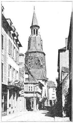
FIG.
39
FROM
A PHOTOGRAPH
We
will consider still another
subject. The photograph,
Fig. 39, shows Third
a
street in Holland. In this case,
the first thing we have to
determine is Problem
where
the interest of the subject
centres. In such a perspective the
salient
point
of the picture often lies in
a foreground building; or, if
the street be
merely
a setting for the
representation of some incident, in a
group of
foreground
figures. In either case the
emphasis should be placed in
the
foreground,
the distant vanishing lines
of the street being rendered
more
or
less vaguely. In the present
subject, however, the
converging sky and
street
lines are broken by the
quaint clock-tower. This and
the buildings
underneath
it appeal to us at once as the most
important elements of
the
picture.
The nearer buildings present nothing
intrinsically interesting,
and
therefore serve no better purpose than to
lead the eye to the centre
of
interest.
Whatever actual values these
intermediate buildings have
that
will
hinder their usefulness in
this regard can, therefore, be changed
or
actually
ignored without affecting
the integrity of the sketch
or causing
any
pangs of conscience.
The
building on the extreme left
shows very strong contrasts
of color in
the
black shadow of the eaves
and of the shop-front below.
These
contrasts,
coming as they do at the
edge of the picture, are
bad. They
would
act like a showy frame on a
delicate drawing, keeping
the eye
from
the real subject. It may be
objected, however, that it is
natural that
the
contrasts should be stronger in
the foreground. Yes; but in
looking
straight
at the clock-tower one does
not see any such
dark shadow at the
top
of the very uninteresting
building in the left
foreground. The
camera
saw
it, because the camera
with its hundred eyes
sees everything, and
does
not interest itself about
any one thing in particular.
Besides, if the
keeper
of the shop had the bad
taste to paint it dark we
are not bound to
make
a record of the fact; nor
need we assume that it was
done out of
regard
to the pictorial possibilities of
the street. We decide, therefore,
to
render,
as faithfully as we may, the
values of the clock-tower
and its
immediate
surroundings, and to disregard the
discordant elements; and
we
have no hesitation in selecting
for principal emphasis in
our drawing,
Fig.
40, the shadow under
the projecting building.
This dark accent will
count
brilliantly against the foreground
and the walls of the
buildings,
which
we will treat broadly as if white,
ignoring the slight
differences in
value
shown in the photograph. We
retain, however, the literal
values of
the
clock-tower and the buildings
underneath it, and express as
nearly as
we
can their interesting variations of
texture. The buildings on
the right
are
too black in the photograph,
and these, as well as the shadow
thrown
across
the street, we will considerably lighten.
After some
experiment,
we
find that the building on
the extreme left is a
nuisance, and we omit
it.
Even then, the one with
the balcony next to it
requires to be toned
down
in its strong values, and so
the shadows here are made
much
lighter,
the walls being kept
white. It will be found that
anything like a
strong
emphasis of the projecting
eaves of the building would
detract
from
the effect of the tower, so
that the shadow under
the eaves is,
therefore,
made grayer than in the
photograph, while that of
the balcony
below
is made stronger than the
shadow of the eaves, but is
lightened at
the
edge of the drawing to throw
the emphasis toward the
centre.