 |
EVALUATION: SCENE FROM A MALL, WEB NAVIGATION |
| << EVALUATION |
| EVALUATION: TRY THE TRUNK TEST >> |
Human
Computer Interaction
(CS408)
VU
Lecture
32
Lecture
32. Evaluation
IV
Learning
Goals
As the
aim of this lecture is to
introduce you the study of
Human Computer
Interaction,
so that after studying this
you will be able to:
� Understand
the significance of
navigation
People
won't use your Web site if
they can't find their way
around it.
You
know this from your
own experience as a Web
user. If you go to a site
and can't
find
what you're looking for or
figure out how the
site is organized, you're
not likely
to stay
long--or come back. So how
do you create the proverbial
"clear, simple, and
consistent"
navigation?
Scene
from a mall
32.1
Picture
this: It's Saturday
afternoon and you're headed
for the mall to buy a
chainsaw.
As you
walk through the door at
Sears, you're thinking,
"Hmmm. Where do they
keep
chainsaws?"
As soon as you're inside, you start
looking at the department
names, high
up on the
walls. (They're big enough
that you can read
them from all the
way across
the
store.)
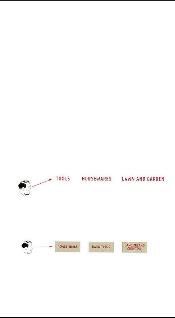
"Hmmm,"
you think, 'Tools? Or Lawn
and Garden?" Given that
Sears is so heavily
tool-oriented,
you head in the direction of
Tools.
When
you reach the Tools
department, you start looking at
the signs at the end of
each
aisle.
294
Human
Computer Interaction
(CS408)
VU
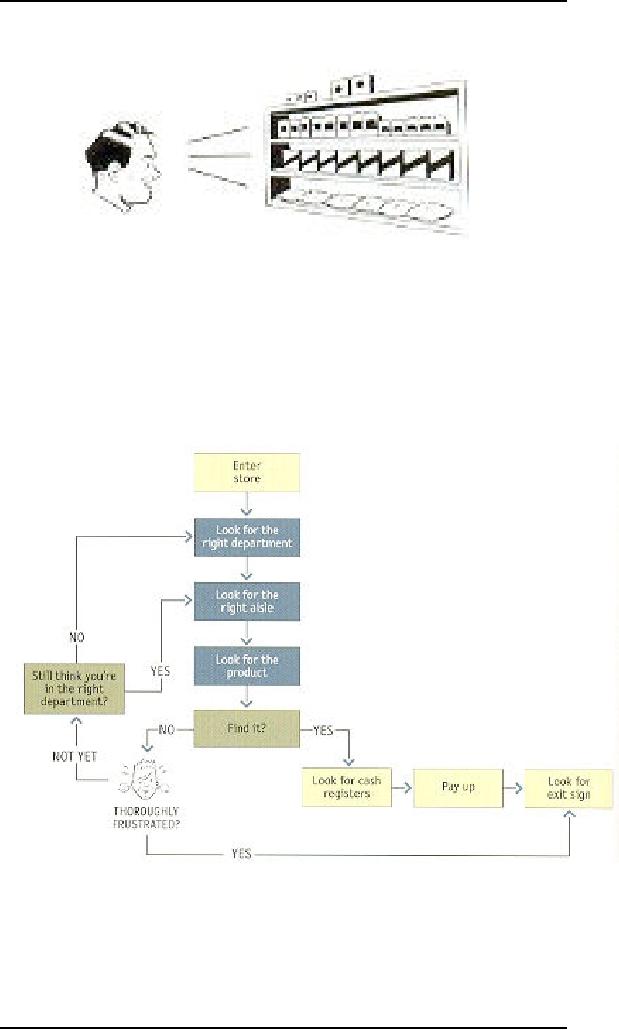
When you
think you've got the
right aisle, you start
looking at the individual
products.
If it rums
out you've guessed wrong,
you try another aisle, or
you may back up
and
start
over again in the Lawn
and Garden department. By
the time you're done,
the
process
looks something like
this:
Basically,
you use the store's
navigation systems (the signs
and the organizing
hierarchy
that the signs embody) and
your ability to scan shelves
full of products to
find
what you're looking
for.
295
Human
Computer Interaction
(CS408)
VU
Of
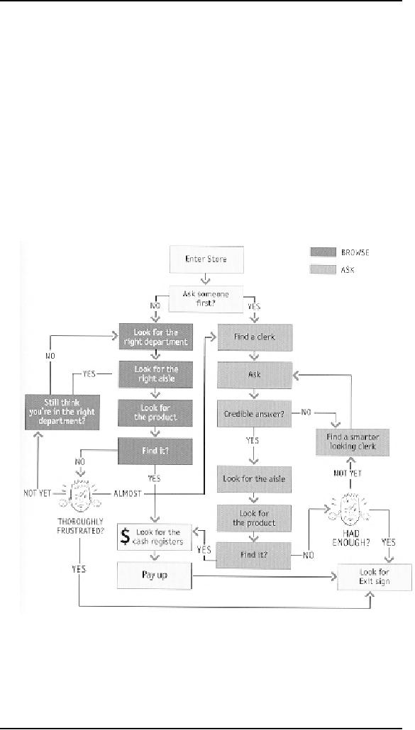
course, the actual process is a little
more complex. For one thing, as
you walk in the
door
you usually devote a few
microseconds to a crucial decision:
Are you going to
start
by
looking for chainsaws on
your own or are you
going to ask someone where
they are?
It's a
decision based on a number of
variables--how familiar you
are with the store,
how
much you trust their
ability to organize things
sensibly, how much of a
hurry
you're
in, and even how sociable
you are.
When we
factor this decision in,
the process looks something
like shown in figure
on
next
page:
Notice
that even if you start
looking on your own, if
things don't pan out there's
a
good
chance that eventually
you'll end up asking someone
for directions
anyway.
Web
Navigation
32.2
In many
ways, you go through the
same process when you
enter a Web site.
� You're
usually trying to find
something.
296
Human
Computer Interaction
(CS408)
VU
In the
"real" world it might be the
emergency room or a can of
baked beans. On
the
Web, it might be the
cheapest 4-head VCR with
Commercial Advance or
the
name of
the actor in Casablanca who
played the headwaiter at
Rick's.
�
You
decide whether to ask first
or browse first.
The
difference is that on a Web site there's no one
standing around who can
tell
you
where things are. The Web
equivalent of asking directions is
searching--
typing a
description of what you're looking
for in a search box and
getting back a
list of
links to places where it might
be.
Some
people (Jakob Nielsen calls
them "search-dominant" users) will
almost always
look
for a search box as soon as
they enter a site. (These
may be the same people
who
look
for the nearest clerk as
soon as they enter a
store.)
Other
people (Nielsen's "link-dominant"
users) will almost always
browse first,
searching
only when they've run
out of likely links to click
or when they have
gotten
sufficiently
frustrated by the site.
For
everyone else, the decision
whether to start by browsing or searching
depends on
their
current frame of mind, how
much of a hurry they're in,
and whether the
site
appears
to have decent, browsable
navigation.
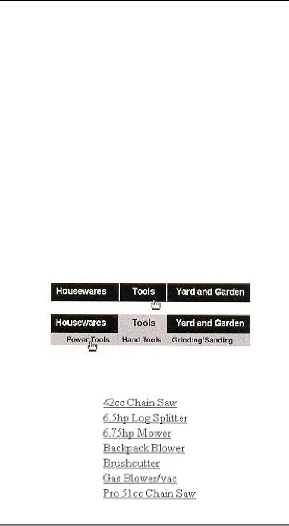
� If
you choose to browse, you
make your way through a
hierarchy, using
signs to
guide you.
Typically
you'll look around on the
Home page for a list of
the site's main
sections
(like
the store's department signs)
and elide on the one
that seems right.
Then
you will choose from the
list of subsections.
With
any luck, after another
click or two you'll end up
with a list of the kind of
thing
you're
looking for:
297
Human
Computer Interaction
(CS408)
VU
Then
you can click on the
individual links to examine
them in detail, the same
way
you'd
take products off the
shelf and read the
labels.
�
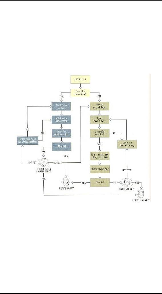
Eventually,
if you can't find what
you're looking for, you'll
leave.
This is
as true on a Web site as it is at
Sears. You'll leave when
you're
convinced
they haven't got it, or
when you're just too
frustrated to keep
looking.
Here is
what the process looks
like:
The
unbearable lightness of
browsing
Looking
for things on a Web site
and looking for them in
the "real" world have a
lot
of
similarities. When we're
exploring the Web, in some
ways it even feels like
we're
moving
around in a physical space.
Think of the words we use to
describe the
experience--like
"cruising," "browsing," and
"surfing." And clicking a
link doesn't
"load" or
"display" another page--it "takes
you to" a page.
But the
Web experience is missing many of the
cues we've relied on all
our lives to
negotiate
spaces. Consider these oddities of
Web space:
No sense
of scale.
Even
after we've used a Web
site extensively, unless it's a
very small site we tend
to
have
very little sense of how
big it is (50 pages? 1,000?
17,000?). For all we
know,
there
could be huge corners we've
never explored. Compare this to a
magazine, a
298
Human
Computer Interaction
(CS408)
VU
museum,
or a department store, where
you always have at least a
rough sense of the
seen/unseen
ratio.
The
practical result is that
it's very hard to know
whether you've seen
everything of
interest
in a site, which means it's
hard to know when to stop
looking.
No sense
of direction.
In a Web
site, there's no left and
right, no up and down. We
may talk about moving
up
and
down, but we mean up and
down hi the hierarchy--to a more general
or more
specific
level.
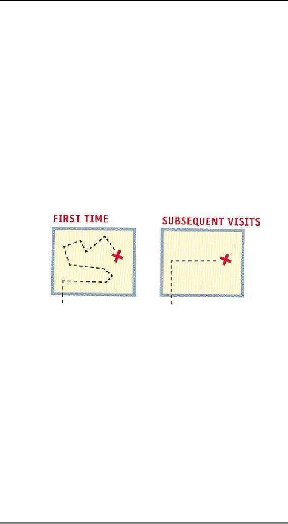
No sense
of location.
In
physical spaces, as we move
around we accumulate knowledge
about the space.
We
develop a sense of where
things are and can
take shortcuts to get to
them.
We may
get to the chainsaws the
first time by following the
signs, but the next
time
we're
just as likely to
think,
"Chainsaws?
Oh, yeah, I remember where
they were: right rear
corner,
near
the refrigerators."
And
then head straight to
them.
But on
the Web, your feet
never touch the ground;
instead, you make your way
around
by
clicking on links. Click on
"Power Tools" and you're
suddenly teleported to
the
Power
Tools aisle with no
traversal of space, no glancing at
things along the
way.
When we
want to return to something on a
Web site, instead of relying
on a physical
sense of
where it is we have to remember
where it is in the conceptual
hierarchy and
retrace
our steps.
This is
one reason why
bookmarks--stored personal shortcuts--are
so important, and
why
the Back button accounts
for somewhere between 30 and 40
percent of all Web
clicks.
It also
explains why the concept of
Home pages is so important.
Home pages are--
comparatively--fixed
places. When you're in a
site, the Home page is like
the North
Star.
Being able to click Home
gives you a fresh
start.
This
lack of physicality is both
good and bad. On the
plus side, the sense
of
weightlessness
can be exhilarating, and
partly explains why it's so
easy to lose track
of time
on the Web--the same as when
we're "lost" in a good
book.
On the
negative side, I think it
explains why we use the
term "Web navigation"
even
though we
never talk about "department
store navigation" or "library
navigation." If
you
look up navigation
in a
dictionary, it's about doing
two things: getting from
one
place to
another, and figuring out
where you are.
299

Human
Computer Interaction
(CS408)
VU
We talk
about Web navigation because
"figuring out where you
are" is a much more
pervasive
problem on the Web than in
physical spaces. We're
inherently-lost when
we're on
the Web, arid we can't peek
over the aisles to see where
we are. Web
navigation
compensates for this missing
sense of place by embodying
the site's
hierarchy,
creating a sense of
"there."
Navigation
isn't just a feature
of a
Web site; it is the Web site, in the
same way that the
building,
the shelves, and die cash
registers are
Sears.
Without it, there's no there
there.
The
moral? Web navigation had
better be good.
The
overlooked purposes of
navigation
Two of
the purposes of navigation
are fairly obvious: to help
us find whatever it is
we're
looking for, and to tell us
where we are.
And
we've just talked about a
third:
It gives
us something to hold on
to.
As a
rule, it's no fun feeling
lost. (Would you rather
"feel lost" or "know your
way
around?"}
Done right, navigation puts
ground under our feet
(even if it's virtual
ground)
and gives us handrails to
hold on to-- to make us feel
grounded.
But
navigation has some other
equally important--and easily
overlooked--functions:
It tells
us what's here.
By making
the hierarchy visible,
navigation tells us what the
site contains.
Navigation
reveals
content! And revealing the
site may be even more
important than guiding
or
situating
us.
It tells
us how to use the
site.
If the
navigation is doing its job,
it tells you implicitly
where to
begin and what
your
options
are. Done correctly, it
should be all the
instructions you need.
(Which is good,
since most
users will ignore any other
instructions anyway.)
It gives
us confidence in the people
who built it.
Every
moment we're in a Web site,
we're keeping a mental
running tally: "Do
these
guys
know what they're doing?"
It's one of the main
factors we use in
deciding
whether
to bail out and deciding
whether to ever come back.
Clear, well-thought-out
navigation
is one of the best
opportunities a site has to
create a good
impression.
Web
navigation conventions
Physical
spaces like cities and
buildings (and even
information spaces like
books and
magazines)
have their own navigation
systems, with conventions
that have evolved
over
time like street signs, page numbers,
and chapter titles. The
conventions specify
(loosely)
the appearance and location of
the navigation elements so we know
what to
look
for and where to look
when we need them.
Putting
them in a standard place lets us locate
them quickly, with a minimum
of effort;
standardizing
their appearance makes it
easy to distinguish them
from everything else.
For
instance, we expect to find street
signs at street corners, we expect to
find them by
looking
up (not down), and we expect
them to look like street signs
(horizontal, not
vertical).
300
Human
Computer Interaction
(CS408)
VU
We also
take it for granted that the
name of a building will be above or
next to its front
door. In
a grocery store, we expect to find
signs near the ends of each
aisle. In a
magazine,
we know there will be a
table of contents somewhere in the
first few pages and
page
numbers somewhere in the margin of
each page--and that they'll
look like a table of
contents
and page numbers.
Think of
how frustrating it is when
one of these conventions is
broken (when
magazines
don't put page numbers on advertising
pages, for instance).
Navigation
conventions for the Web
have emerged quickly, mostly adapted
from
existing
print conventions. They'll
continue to evolve, but for
the moment these are
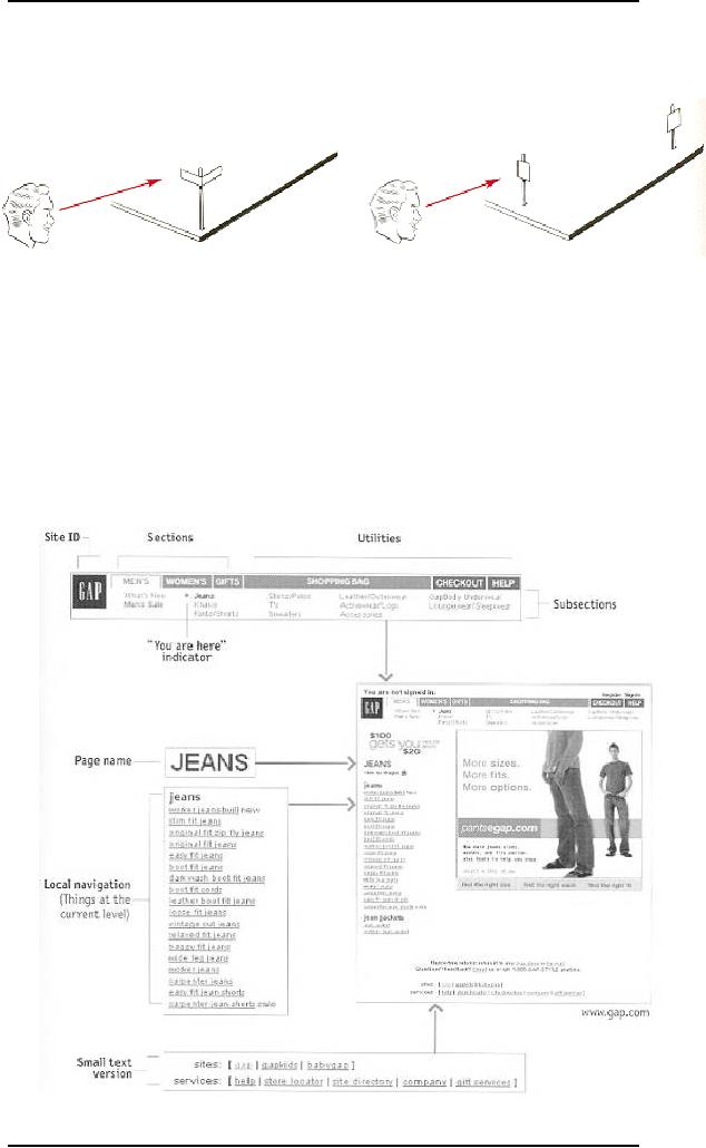
the basic
elements:
301

Human
Computer Interaction
(CS408)
VU
Don't
look now, but it's following
us
Web
designers use the term penitent
navigation (or
global
navigation) to describe
the
set of
navigation elements that appear on every
page of a site.
Done
right, persistent navigation
should say--preferably in a calm,
comforting voice:
"The
navigation is over here.
Some parts will change a little depending
on where you
are, but
it will always be here, and it will
always work the same
way."
Just
having the navigation appear in
the same place on every page
with a consistent
look
gives you instant
confirmation that you're
still in the same
site--which is more
important
than you might think.
And keeping it the same
throughout the site means
that
(hopefully)
you only have to figure
out how it works
once.
Persistent
navigation should include
the five elements you most need to
have on
hand at
all times.
We'll
look at each of them in a
minute. But first...
Some
Exceptions
There are
two exceptions to the
"follow me everywhere"
rule:
The
Home page.
The
Home page is not like the
other pages--it has
different burdens to bear,
different
promises to
keep. As we'll see in the
next chapter, this sometimes
means that it makes
sense
not to use the persistent
navigation there.
Forms.
On pages
where a form needs to be
filled in, the persistent
navigation can sometimes
be an
unnecessary distraction. For
instance, when I'm paying
for my purchases on an
e-commerce
site you don't really
want me to do anything but
finish filling in the
forms.
The same is true when I'm
registering, giving feedback, or
checking off
personalization
preferences.
For
these pages, it's useful to
have a minimal version of
the persistent
navigation
with
just the Site ID, a link to
Home, and any Utilities
that might help me fill out
the
form.
Site
ID
The
Site ID or logo is like the
building name for a Web
site. At Sears, I really
only
need to
see the name on my way
in; once I'm inside, I know
I'm
still in Sears until
I
leave.
But on the Web--where my
primary mode of travel is
teleportation--I need to
see it on
every page.
In the
same way that we expect to
see the name of a building
over the front
entrance,
we expect
to see the Site ID at the
top of the page--usually in
(or at least near]
the
upper
left corner/
Why?
Because the Site ID
represents the whole site,
which means it's the
highest
thing in
the logical hierarchy of the
site.
302
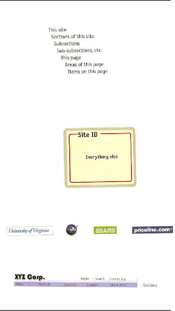
Human
Computer Interaction
(CS408)
VU
And
there are two ways to get
this primacy across in the
visual hierarchy of the
page:
either
make it the most prominent
thing on the page, or make it
frame everything
else.
Since
you don't want the ID to be
the most prominent element on the
page (except,
perhaps,
on the Home page), the
best place for it--the
place that is least likely to
make me
think--is
at the top, where it frames
the entire page.
And in
addition to being where we
would expect it to be, the
Site ID also needs to look
like
a
Site
ID. This means it should
have the attributes we would
expect to see in a
brand
logo or the sign outside a
store: a distinctive typeface, and a
graphic that's
recognizable
at any size from a button to
a billboard.
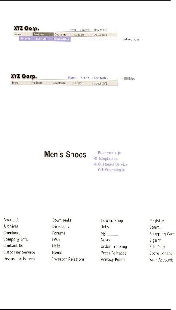
The
Sections
The
Sections--sometimes called the
primary
navigation--are
the links to the
main
sections of
the site: the fop
level of the site's
hierarchy
303
Human
Computer Interaction
(CS408)
VU
In most
cases, the persistent navigation
will also include space to
display the secondary
navigation:
the list of subsections in the
current section.
The
Utilities
Utilities
are the links to important
elements of the site that
aren't reajiy part of
the
content
hierarchy.
These are
things that either can
help me use the site
(like Help, a Site Map, or
a
Shopping
Cart} or can provide
information about its
publisher (like About Us
arid
Contact
Us).
Like
the signs for the facilities
in a store, the Utilities list
should be slightly less
prominent
than the Sections.
Utilities
will vary for different
types of sites. For a
corporate or e-commerce site,
for
example,
they might include any of
the following:
As a
rule, the persistent navigation
can accommodate only four or
five Utilities--the
tend to
get lost in the crowd.
The less frequently used
leftovers can be
grouped
together
on the Home page.
304
Human
Computer Interaction
(CS408)
VU
Low Level
Navigation
It's
happened so often I've come to
expect it: When designers I
haven't worked with
before
send me preliminary page designs so I can
check for usability issues.
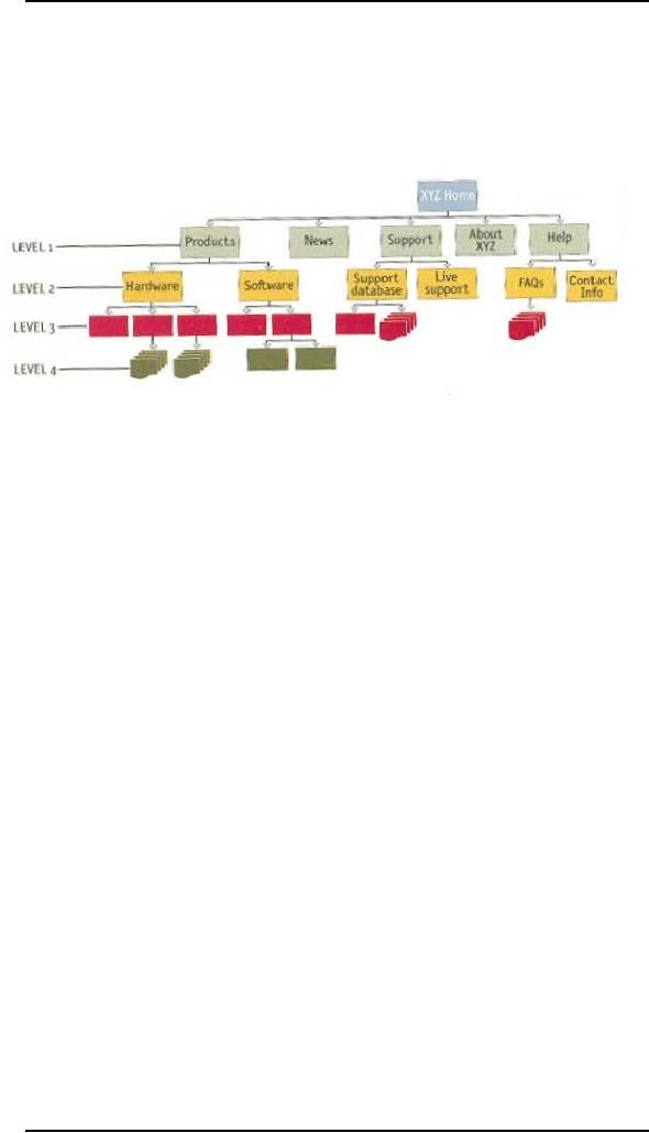
I almost
inevitably
get a flowchart that shows a
site four levels deep...
...and
sample pages for the Home
page and the top
two
levels.
I keep
flipping the pages looking
for more, or at least for
the place where
they've
scrawled,
"Some magic happens here,"
but I never find even
that. I think this is one
of
the most
common problems in Web
design (especially in larger sites):
failing to give
the
lower-level navigation the
same attention as the top.
In so many sites, as soon as
you
get past the second
level, the navigation breaks
down and becomes ad hoc.
The
problem
is so common that it's
actually hard to find good
examples of third-level
navigation.
Why
does this happen?
Partly,
because good multi-level
navigation is just plain
hard to figure out-- given
the
limited
amount of space on the page,
and the number of elements
that have to be
squeezed
in.
Partly
because designers usually don't
even have enough time to
figure out the first
two
levels.
Partly
because it just doesn't seem
that important. (After all,
how important can it
be?
It's
not primary. It's not
even secondary.) And there's a
tendency to think that by
the
time
people get that far
into the site, they'll
understand how it works.
And
then there's the problem of
getting sample content and
hierarchy examples
for
lower-level
pages. Even if designers
ask, they probably won't get
them, because the
people
responsible for the content
usually haven't thought
things through that
far,
either.
But
the reality is that users
usually end up spending as
much time on
lower-level
pages as
they do at the top. And
unless you've worked out
top-to-bottom navigation
from
the beginning, it's very
hard to graft it on later
and come up with
something
consistent.
The
moral? It's vital to have
sample pages that show the
navigation for all
the
potential
levels of the site before
you start arguing about the
color scheme for
the
Home
page.
305
Human
Computer Interaction
(CS408)
VU
Page
names
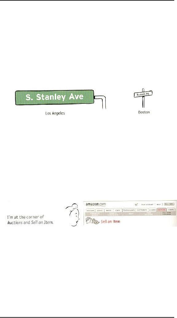
If you've
ever spent time in Los
Angeles, you understand that
it's not just a song
lyric--L.A.
really is a great big freeway.
And because people in LA.
take driving
seriously,
they have the best street
signs I've ever seen. In
L.A.,
� Street
signs are big. When you're
stopped at an intersection, you
can read the
sign
for the next cross
street.
� They're
in the right place--hanging ovsr
the
street you're driving on, so
all
you
have to do is glance
up.
Now,
I'll admit I'm a sucker for
this kind of treatment
because I come from
Boston,
where
you consider yourself lucky
if you can manage to read the street
sign while
there's
still time to make the
turn.
The
result? When I'm driving in
LA., I devote
less energy and attention to
dealing
with
where I am and more to
traffic, conversation, and
listening to All
Things
Considered.
Page
names are the street signs of
the Web. Just as with street
signs, when things are
going
well I may not notice page
names at all. But as soon as I start to
sense that I
may
not be headed in the right
direction, I need to be able to spot the
page name
effortlessly
so I can get my
bearings.
There
are four things you need to
know about page
names:
� Every
page needs a name. Just as
every corner should have a
street sign, every
page
should have a name.
Designers
sometimes think, "Well, we've
highlighted the page name in
the
navigation.
That's good enough." It's a
tempting idea because it can
save space, and
it's
one less element to work
into the page layout, but
it's not enough. You need
a
page name,
too.
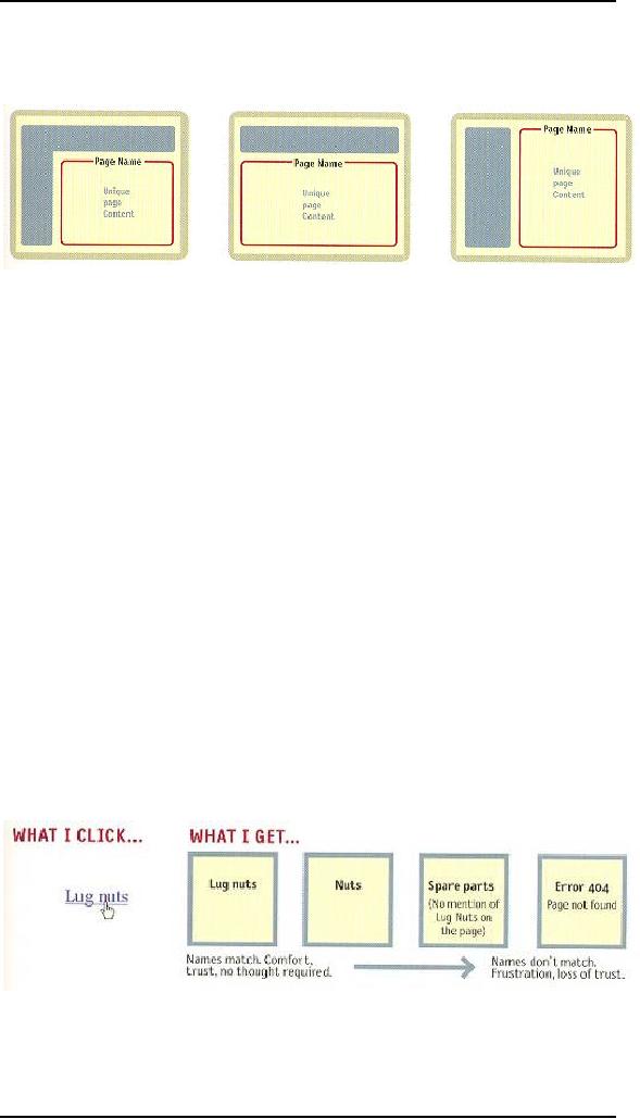
The
name needs to be in the
right place. In the
visual hierarchy of the
page,
�
the page
name should appear to be framing
the content that is unique
to this
page.
(After all, that's what it's
naming--not the navigation or
the ads, which
are
just the
infrastructure.)
306
Human
Computer Interaction
(CS408)
VU
The
name needs to be prominent. You
want the combination of
position,
�
size,
color, an d typeface to make
the name say "This is the
heading for the
entire
page." In most cases, it will be
the largest text on the
page.
The
name needs to match what I
clicked. Even
though nobody ever
�
mentions
it, every site makes an
implicit social contract with its
visitors:
In other
words, if" I click on a link or button
that says "Hot mashed
potatoes,"
the
site will take me to a page named "Hot
mashed potatoes."
It may
seem trivial, but it's
actually a crucial agreement.
Each time a site
violates
it, I'm
forced to think, even if
only for milliseconds, "Why
are those two things
different?"
And if there's a major discrepancy
between the link name and
the
page
name or a lot of minor discrepancies, my
trust in the site--and
the
competence
of the people who publish
it--will be diminished.
Of
course, sometimes you have to compromise,
usually because of space
limitations. If
the
words I click on and the
page name don't match
exactly, the important thing
is
that
(a)
they match as closely as
possible, and (b) the
reason for the difference is
obvious.
For
instance, at Gap.com if I dick
the buttons labeled "Gifts
for Him" and "Gifts
for
Her," I
get pages named "gifts for
men" and "gifts for
women." The wording
isn't
identical,
but they feel so equivalent
that I'm not even
tempted to think about
the
difference.
307
Human
Computer Interaction
(CS408)
VU
"You
are here"
One of
the ways navigation can counteract the
Web's inherent "lost in
space" feeling is by
showing
me where I am in the scheme of
things, the same way
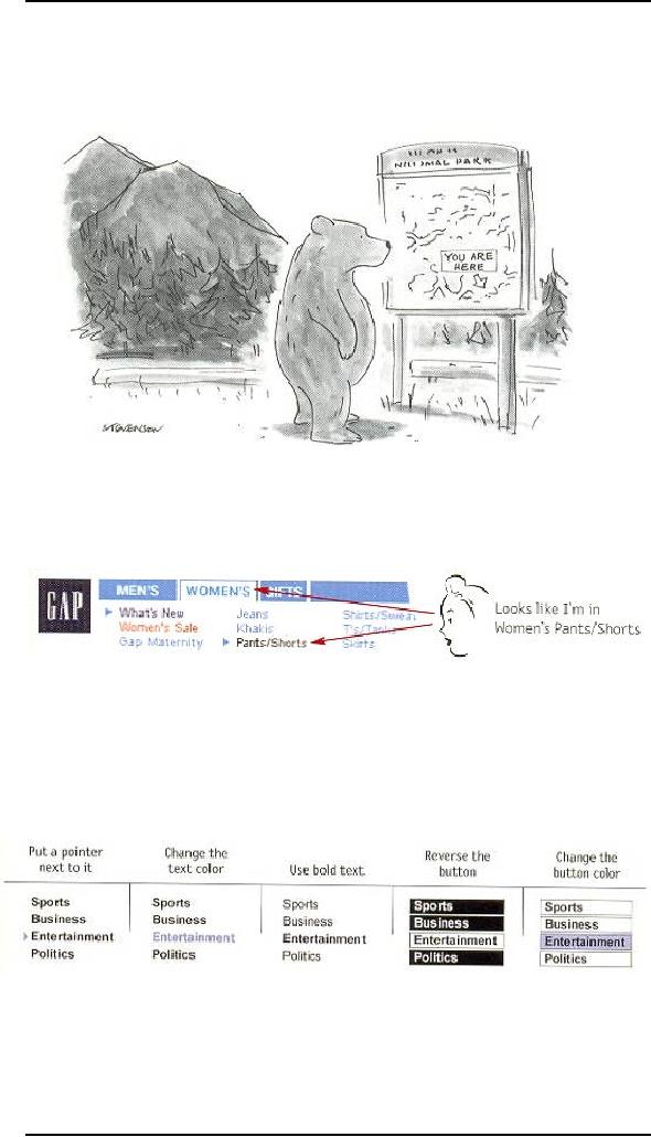
that a "You are
here"
indicator
does on the map in a shopping
mall--or a National
Park.
On the
Web, this is accomplished by
highlighting my current location in
whatever
navigational
bars, lists, or menus appear on
the page.
In this
example, the current section
(Women's) and subsection
(Pants/Shorts) have
both been
"marked." There are a number
of ways to make the current
location stand
out:
The most
common failing of "You are
here" indicators is that
they're too subtle.
They
need to
stand out; if they don't,
they lose their value as
visual cues and end up
just
adding
more noise to the page. One way to
ensure that they stand
out is to apply more
than one
visual distinction--for instance, a
different color and
bold
text.
308

Human
Computer Interaction
(CS408)
VU
Breadcrumbs
Like
"You are here" indicators,
Breadcrumbs show you where
you are. (Sometimes
they
even include the words
"You are here.")
They're
called Breadcrumbs because
they're reminiscent of the
trail of crumbs Hansel
dropped
in the woods so he and
Gretel could End their
way back home.
Unlike
"You are here" indicators,
which show you where you
are in the context of
the
site's
hierarchy, Breadcrumbs only
show you the path
from the Home page to
where
you
are. (One shows you
where you are in the
overall scheme of things,
the other shows
you
how to get there--kind of
like the difference between
looking at a road map and
looking
at a set of turn-by-turn directions.
The directions can be very
useful, but you
can
learn more from the
map.)
You
could argue that bookmarks
are more like the fairy tale
breadcrumbs, since we
drop
them as
we wander, in anticipation of possibly
wanting to retrace our steps
someday.
Or you
could say that visited
links (links that have changed
color to show that
you've
clicked
on them) are more like
breadcrumbs since they mark
the paths we've
taken,
and if we
don't revisit them soon
enough, our browser (like
the birds) will
swallow
them
up.
309
Table of Contents:
- RIDDLES FOR THE INFORMATION AGE, ROLE OF HCI
- DEFINITION OF HCI, REASONS OF NON-BRIGHT ASPECTS, SOFTWARE APARTHEID
- AN INDUSTRY IN DENIAL, SUCCESS CRITERIA IN THE NEW ECONOMY
- GOALS & EVOLUTION OF HUMAN COMPUTER INTERACTION
- DISCIPLINE OF HUMAN COMPUTER INTERACTION
- COGNITIVE FRAMEWORKS: MODES OF COGNITION, HUMAN PROCESSOR MODEL, GOMS
- HUMAN INPUT-OUTPUT CHANNELS, VISUAL PERCEPTION
- COLOR THEORY, STEREOPSIS, READING, HEARING, TOUCH, MOVEMENT
- COGNITIVE PROCESS: ATTENTION, MEMORY, REVISED MEMORY MODEL
- COGNITIVE PROCESSES: LEARNING, READING, SPEAKING, LISTENING, PROBLEM SOLVING, PLANNING, REASONING, DECISION-MAKING
- THE PSYCHOLOGY OF ACTIONS: MENTAL MODEL, ERRORS
- DESIGN PRINCIPLES:
- THE COMPUTER: INPUT DEVICES, TEXT ENTRY DEVICES, POSITIONING, POINTING AND DRAWING
- INTERACTION: THE TERMS OF INTERACTION, DONALD NORMAN’S MODEL
- INTERACTION PARADIGMS: THE WIMP INTERFACES, INTERACTION PARADIGMS
- HCI PROCESS AND MODELS
- HCI PROCESS AND METHODOLOGIES: LIFECYCLE MODELS IN HCI
- GOAL-DIRECTED DESIGN METHODOLOGIES: A PROCESS OVERVIEW, TYPES OF USERS
- USER RESEARCH: TYPES OF QUALITATIVE RESEARCH, ETHNOGRAPHIC INTERVIEWS
- USER-CENTERED APPROACH, ETHNOGRAPHY FRAMEWORK
- USER RESEARCH IN DEPTH
- USER MODELING: PERSONAS, GOALS, CONSTRUCTING PERSONAS
- REQUIREMENTS: NARRATIVE AS A DESIGN TOOL, ENVISIONING SOLUTIONS WITH PERSONA-BASED DESIGN
- FRAMEWORK AND REFINEMENTS: DEFINING THE INTERACTION FRAMEWORK, PROTOTYPING
- DESIGN SYNTHESIS: INTERACTION DESIGN PRINCIPLES, PATTERNS, IMPERATIVES
- BEHAVIOR & FORM: SOFTWARE POSTURE, POSTURES FOR THE DESKTOP
- POSTURES FOR THE WEB, WEB PORTALS, POSTURES FOR OTHER PLATFORMS, FLOW AND TRANSPARENCY, ORCHESTRATION
- BEHAVIOR & FORM: ELIMINATING EXCISE, NAVIGATION AND INFLECTION
- EVALUATION PARADIGMS AND TECHNIQUES
- DECIDE: A FRAMEWORK TO GUIDE EVALUATION
- EVALUATION
- EVALUATION: SCENE FROM A MALL, WEB NAVIGATION
- EVALUATION: TRY THE TRUNK TEST
- EVALUATION – PART VI
- THE RELATIONSHIP BETWEEN EVALUATION AND USABILITY
- BEHAVIOR & FORM: UNDERSTANDING UNDO, TYPES AND VARIANTS, INCREMENTAL AND PROCEDURAL ACTIONS
- UNIFIED DOCUMENT MANAGEMENT, CREATING A MILESTONE COPY OF THE DOCUMENT
- DESIGNING LOOK AND FEEL, PRINCIPLES OF VISUAL INTERFACE DESIGN
- PRINCIPLES OF VISUAL INFORMATION DESIGN, USE OF TEXT AND COLOR IN VISUAL INTERFACES
- OBSERVING USER: WHAT AND WHEN HOW TO OBSERVE, DATA COLLECTION
- ASKING USERS: INTERVIEWS, QUESTIONNAIRES, WALKTHROUGHS
- COMMUNICATING USERS: ELIMINATING ERRORS, POSITIVE FEEDBACK, NOTIFYING AND CONFIRMING
- INFORMATION RETRIEVAL: AUDIBLE FEEDBACK, OTHER COMMUNICATION WITH USERS, IMPROVING DATA RETRIEVAL
- EMERGING PARADIGMS, ACCESSIBILITY
- WEARABLE COMPUTING, TANGIBLE BITS, ATTENTIVE ENVIRONMENTS