 |

Human
Computer Interaction
(CS408)
VU
Goal-Directed
Design seeks to bridge the
gap that currently exists in
the digital
product
development process, the gap
between user research and
design, through a
combination
of new techniques and known
methods brought together in
more
effective
ways.
Lecture
18
Lecture
18. Goal-Directed
Design
Methodologies
Learning
Goals
As the
aim of this lecture is to
introduce you the study of
Human Computer
Interaction,
so that after studying this
you will be able to:
Understand
different phases of Goal-Directed
Design Approach
·
Goal-Directed
Design Model
18.1
Underlying
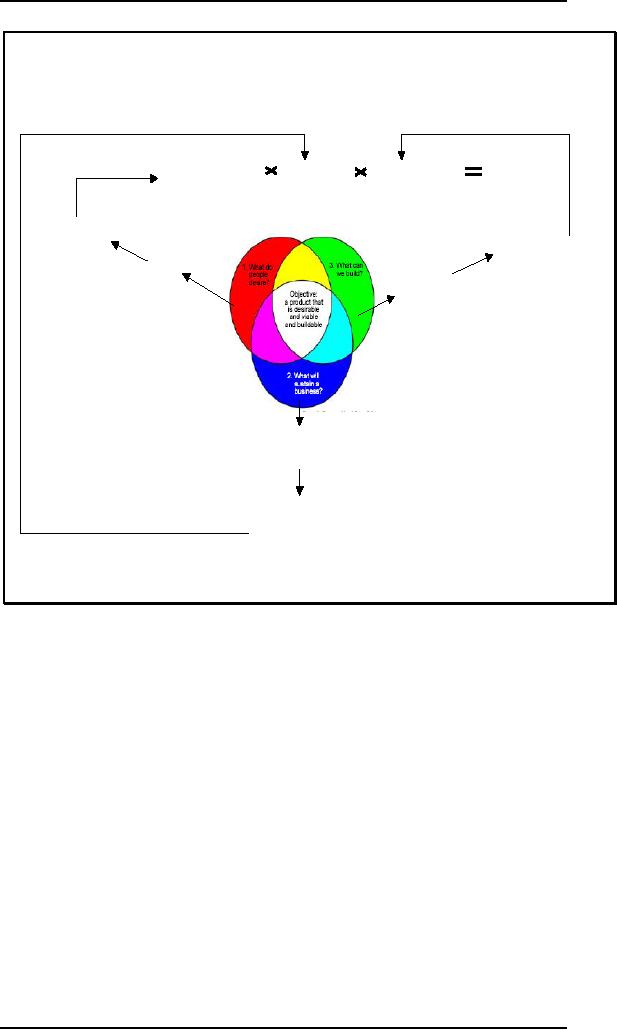
the goal-directed approach to
design is the premise that
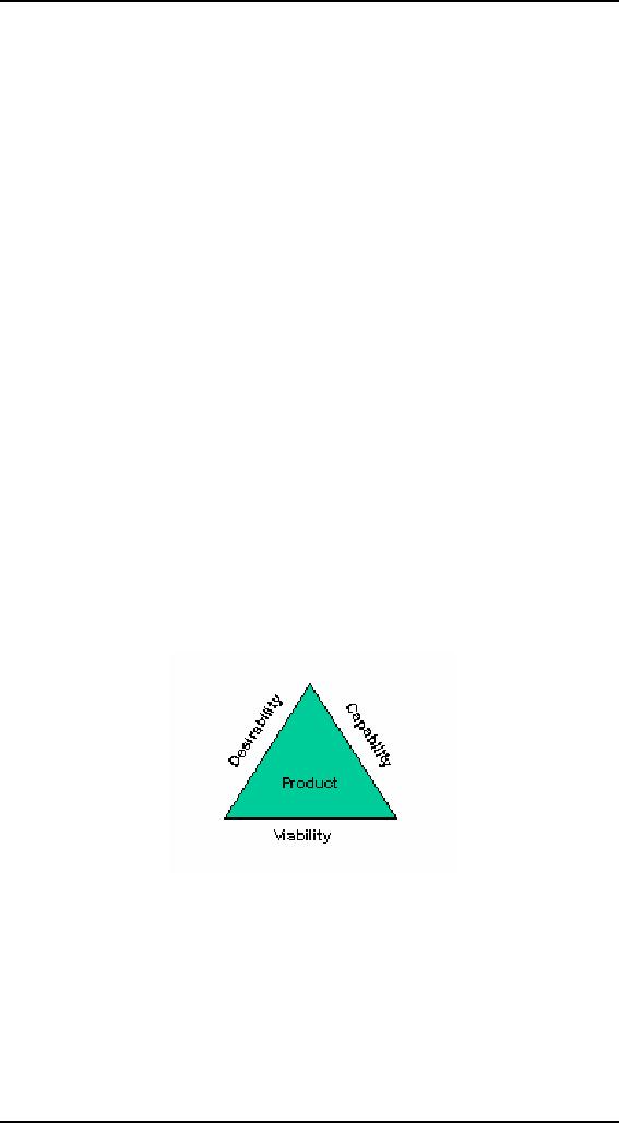
product must
balance
business and engineering
concerns with user
concerns.
You
begin by asking, "what do
people desire?" then you
ask, "of the things
people
desire,
what will sustain a business." And
finally you ask, "Of the
things people
desire,
that will also sustain the business,
what can we build?" a common
trap is to
focus on
technology while losing the
sight of viability and
desirability.
159

Human
Computer Interaction
(CS408)
VU
Overall
probability
Probabilityof
Probabilityof
Probability of
customer
Of product
success
·
Sustaining
business
Technical
completion
Adoption(once
the product
(delivery)
(up to
launchand
Has
launched)
Long
enoughafter
to build
revenue)
User
Plan
1.
Design
TechnologyPlanl
2.
schedule
1.
Engineering schedule
User
Model
2.
Engineering spec
3.
Formand
TechnologyModel
behavior
1.
Technologycomponents
1.
Context
spec
·
Historical
2.
Competitors
·
Social
·
Economic
3.
Build
vsbuy
buyvs
opensource
2.
User
·
Demographics
·
Psychographics
·
Technographics
3.
Values
Business
Model
1. Funding
model
4.
Goals
2.
Income/expense projections
etc.
5.
scenarios
Business
Plan
1. Marketing
plan
2.
Launchplan
3.
Distributionplan
Understanding
the importance of each
dimension is only the
beginning, which
understanding
must also be acted upon. We are
familiar with this process
along the
business
and technology dimension;
you create a business model
and then develop a
business
plan, and similarly create an
engineering model and
specification.
The
goal-directed design process is an
analog to these planning
processes. It results in
a solid
user model and a
comprehensive interaction
plan.
The
user plan determines the
probability that customer will adopt a
product. The
business
plan determine the
probability that business
can sustain itself up to
and
through
launch--and that sale will
actually support growth
thereafter. And
technology
plan
determines the probability
that the product can be
made to work and
actually
deliverable.
Multiplying
these three factors
determines the overall
probability that a product
will
be
successful.
A process
overview
18.2
Goal-Directed
Design combines techniques of
ethnography, stakeholder
interviews,
market
research, product/literature reviews,
detailed user model,
scenario-based
design,
and a core set of interaction
principles and patterns. It
provides solutions
that
160

Human
Computer Interaction
(CS408)
VU
meet the
needs and goals of users,
while also addressing
business/organizational and
technical
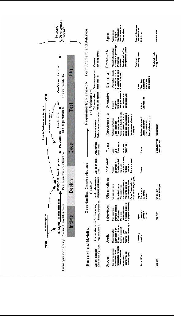
imperatives. This process
can be roughly divided into
five phases:
· Research
· Modeling
· Requirements
Definition
· Framework
Definition
· Refinement
Research
Modeling
Requirements
Framework
Refinement
User
and the
Users
and use
Definition of
user,
Definition of
design
Of behavior,
form&
domain
context
business&
technical needs
structure &
flow
content
These
phases follow the five
component activities of interaction
design identified by
Gillian
Crampton Smith and Philip
Tabor--understanding, abstracting,
structuring,
representing,
and detailing--with a greater
emphasis on modeling user
behaviors and
defining
system behaviors.
Research
The
research phase employs
ethnographic field study
techniques (observation
and
contextual
interviews) to provide qualitative data
about potential and/or
actual users
of the
product. It also includes
competitive product audits,
reviews of market
research
and
technology white papers, as well as
one-on-one interviews with
stakeholders,
developers,
subject matter experts
(SMEs), and technology
experts as suits the
particular
domain.
One of
the principles out comes of
field observation and user
interviews are an
emergent
set of usage patterns--identifiable
behaviors that help
categorize modes of
use of a
potential or existing product. These
patterns suggest goals and
motivations
(specific
and general desired outcomes of
using the product). In
business and
technical
domains, these behavior
patterns tend to map to professional
roles; for
consumer
product, they tend to
correspond to lifestyle choices. Usage patterns
and the
goals
associated with them drive
the creation of personas in
the modeling phase.
Market
search helps select and
filter for valid persons
that fit corporate
business
models.
Stakeholder interviews, literature
reviews, and product audits
deepen the
designers'
understanding of the domain
and elucidate business goals
and technical
constraints
that the design must
support.
Modeling
During
the modeling phase, usage
and workflow patterns
discovered through
analysis
of the
field research and
interviews are synthesized into
domain and user
models.
Domain
models can include
information flow and
workflow diagrams. User
models,
161

Human
Computer Interaction
(CS408)
VU
or
personas, are detailed composite
user archetypes that represent distinct
groupings
of
behavior patterns, goals,
and motivations observed and
identified during the
research
phase.
Personas
serves as the main
characters in a narrative scenario-based
approach to
design
that iterative generates
design concepts in the framework
definition phase,
provides
feedback that enforces
design coherence and appropriateness in
the
refinement
phase, and represents a
powerful communication tool
that helps
developers
and managers to understand
design rationale and to
prioritize features
based on
user needs. In he modeling
phase, designers employ a variety
of
methodological
tools to synthesize, differentiate, and
prioritize personas,
exploring
different
yupes of goals and mapping
personas across ranges of
behavior to ensure
there are
no gaps or duplications.
Specific
design targets are chosen
from the cast of personas
through a process of
comparing
goals and assigning a
hierarchy of priority based on
how broadly each
persona's
goals encompass the goals of
other personas. A process of
designating
persona
types determines the amount
of influence each persona has on
the eventual
form
and behavior of the
design.
Possible
user persona type designations
include:
· Primary:
the persona's needs are
sufficiently unique to require a
distinct
interface
form and behavior
· Secondary:
primary interface serves the
needs of the persona with a
minor
modification
or addition
· Supplement:
the persona's needs are
fully satisfied by a primary
interface
· Served:
the persona is not an actual
user of the product, but is
indirectly
affected
by it and its use
· Negative:
the persona is created as an explicit,
rhetorical example of
whom
not to
design for
Requirements
definition
Design
methods employed by teams during
the requirements definition
phase
provides
the much-needed connection
between user and other
models and the
framework
of the design. This phase
employs scenario-based design methods,
with
the
important innovation of focusing
the scenarios not on user
tasks in the abstract,
but
first and foremost of
meeting the goals and
needs of specific user
personas.
Personas
provide and understanding of
which tasks are truly
important and why,
leading
to an interface that minimize
necessary tasks while
maximizing return.
Personas
become the main characters of
these scenarios, and the designers
explore the
design
space via a form of
role-playing.
For
each interface/primary persona the
process of design in the
requirements
definition
phase involves an analysis of persona
data and functional needs,
prioritized
and
informed by persona goals, behaviors,
and interactions with other
personas in
various
contexts.
This
analysis is accomplished through an
iteratively refined context scenario
that start
with a
"day in the life" of the
persona using the product,
describing high-level
product
touch
points, and thereafter successively
defining detail at ever-deepening
levels. As
this
iteration occurs, both business
goals and technical
constraints are also considered
and
balanced with personas goals
and needs. The output of
this process is a
requirements
definition that balances
user, business, and
technical requirements of
the
design to
follow.
162

Human
Computer Interaction
(CS408)
VU
Framework
definition
In the
framework definition phase,
teams synthesize an interaction framework
by
employing
two other critical
methodological tools in conjunction
with context
scenarios.
The first is a set of
general interaction design
principles that, like
their
visual
design counterparts, provide
guidance in determining appropriate
system
behavior
in a variety of contexts
The
second critical methodological
tool is a set of interaction
design patterns that
encode
general solutions (with
variations dependent on context) to
classes of
previously
analyzed problems. These
patterns bear close resemblance to the
concept
of
architectural design patterns
developed by Christopher Alexander.
Interaction
design
patterns are hierarchically
organized and continuously
evolve as new
contexts
arise.
Rather than stifling
designer creativity, they
often provide needed leverage
to
approach
difficult problems with
proven design
knowledge.
After
data and functional needs
are described at this high
level, they are
translated
into
design elements according to interaction
principles and then
organized using
patterns
and principles into design
sketches and behavior
descriptions. The output
of
this
process is an interaction framework
definition, a stable design
concept that
provides
the logical and gross
formal structure for the
detail to come. Successive
iterations
of more narrowly focused
scenarios provide this
detail in ht refinement
phase.
The approach is often a
balance of top-down design
and bottom-up design.
Refinement
The
refinement phase proceeds
similarly to the framework
definition phase, but
with
greater
focus on task coherence, using key
path and validation
scenarios focused on
storyboarding
paths through the interface in
high detail. The culmination
of the
refinement
phase is the detailed
documentation of the design, a
form and behavior
specification,
delivered in either paper or
interactive media as context
dictates.
Goals,
not features, are key to
product success
Programmers
and engineers--people who
are intrigued by technology--share
a
strong
tendency to think about
products in terms of functions
and features. This is
only
natural, as this is how
developers build software:
function-by-function. The
problem
is that this is not how
users want to use
it.
The
decision about whether a
feature should be included in a
product shouldn't rest
on
its
technological understandings. The
driving force behind the
decision should never
be simply
that we have the technical
capability to do it. The
deciding factor should
be
whether
that feature directly, or
indirectly, helps to achieve
the goals of the user
while
still
meeting the needs of the
business.
The
successful interaction designer must be
sensitive to user's goals
amid the
pressures
and chaos of the
product-development cycle. The
Goal-Directed process,
with
its clear rationale for
design decisions, makes
persuading engineers easier, keeps
marketing
and management stakeholders in the
loop, and ensures that
the design in
question
isn't just guesswork, or a
reflection of the team members'
personal
preferences.
Most
computer users know all
too well that opening
the shrink wrap on a
new
software
product augurs several days of
frustration and disappointment spent
learning
the
new interface. On the other
hand, many experienced users
of a program may find
themselves
continually frustrated because
the program always treats
them like rank
163

Human
Computer Interaction
(CS408)
VU
beginners.
It seems impossible to find
the right balance between
catering to the needs
of the
first-timer and the needs of
the expert.
One of
the eternal conundrums of
interaction and interface
design is deciding how
to
address
the needs of both beginning
users and expert users
with a single
interface.
Some
programmers and designers choose to
abandon this idea
completely, choosing
instead
to create software with a
beginner mode and an expert
mode, the former
usually
being an oversimplified and
underpowered subset of the
latter. Of course,
nobody
wants to be caught dead using
software in beginner mode,
but the leap
from
there to
expert mode is usually off a
rather tall cliff into a
shark-infested moat of
implementation-model
design. What, then, is the
answer? The solution to
this
predicament
lies in a different understanding of
the way users master new
concepts
and
164

Human
Computer Interaction
(CS408)
VU
tasks.
165

Human
Computer Interaction
(CS408)
VU
Types of
users
18.3
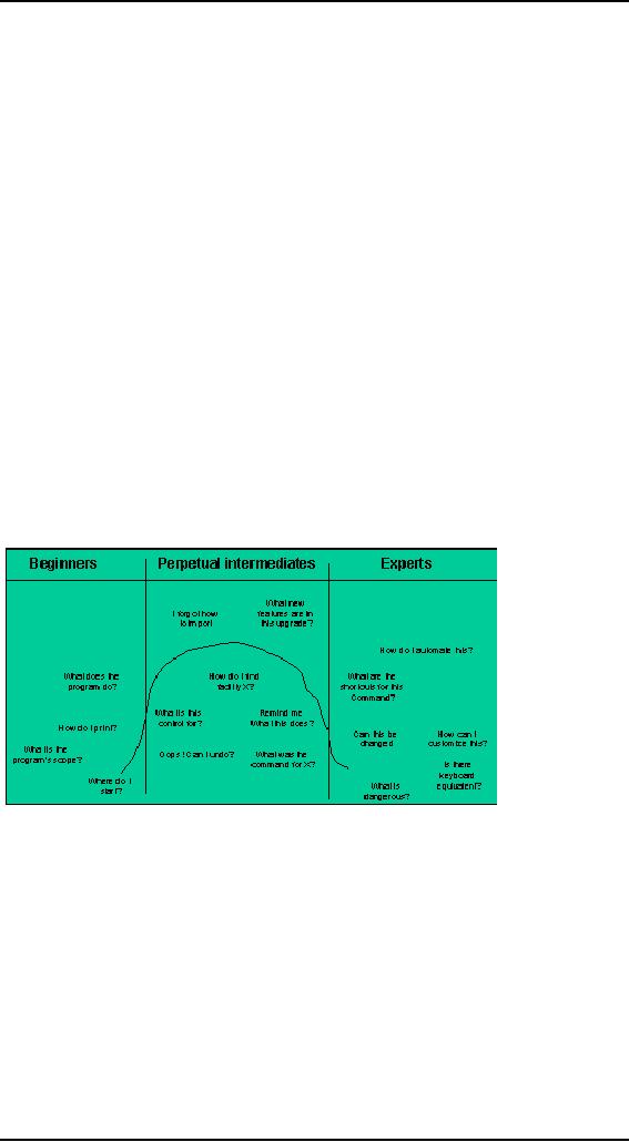
Most
users are neither beginners
nor experts; instead they
are intermediates.
The
experience level of people
performing an activity requiring
knowledge or skill, if
we graph
number of people against
skill level, a relatively
small number of
beginners
are on
the left side, a few
experts are on the right,
and the
majority--intermediate
users--are
in the center.
Statistics
don't tell the whole
story, however, the bell
curve is a snapshot in time,
and
although
most intermediate tend to stay in that
category, the beginners do
not remain
beginners
for very long. The
difficulty of maintaining a high
level of expertise
also
means
that experts come and go
rapidly, but beginners change
even more rabidly.
Both
beginners and experts tend
over time to gravitate
towards intermediacy.
Although
everybody spends some
minimum time as a beginner,
nobody remains in
that
state for long. People
don't like to be incompetent;
and beginners, by
definition,
are
incompetent. Conversely, learning
and improving is rewarding, so
beginners
become
intermediates very quickly--or
they drop out altogether.
All skiers, for
example,
send time as beginners, but
those who find they
don't rapidly progress
beyond
more-falling-than-skiing quickly abandon
the sport. The rest soon
move off of
the
bunny slopes onto the
regular runs. Only a few
ever make it onto the
double-black
diamond
runs for experts.
The
occupants of the beginner end of
the curve will either
migrate into the
center
bulge of
intermediates, or they will drop
off the graph altogether
and find some
product
or activity in which they
can migrate into
intermediacy. Most users
thus
remain in
a perpetual state of adequacy
striving for fluency, with
their skills ebbing
and
flowing like the tides
depending on how frequently
they use the program.
Larry
Constantine
first identified the
importance of designing for
intermediates, and in
his
book
Software for Use; he refers to
such users as improving
intermediates. The
term
perpetual
intermediates are preferred,
because although beginners
quickly improve to
become
intermediates, they seldom go on to
become experts.
166

Human
Computer Interaction
(CS408)
VU
A good
ski resort bas a gentle
slope for learning and a
few expert runs to
really
challenge
the serious skiers. But if
the resort wants to stay in business, it
will cater to
the
perpetual intermediate skier,
without scaring off the
beginner or insulting
the
expert.
The beginner must find it
easy to matriculate into the
world of intermediacy,
and
the expert must not find
his vertical runs obstructed by
aids for bewildered
perpetual
intermediates.
A
well-balanced user interface takes
the same approach. It
doesn't cater to the
beginner
or to the experts, but
rather devotes the bulk of
its efforts to satisfying
the
perpetual
intermediate. At the same
time, it avoids offending
either of its smaller
constituencies,
recognizing that they are
both vital.
Most
users in this middle state
would like to learn more
about the program but
usually
don't
have the time. Occasionally,
the opportunity to do so will surface.
Sometimes
these
intermediates use the
product extensively for
weeks at a time to complete a
big
project.
During this time, they
learn new things about
the program. Their
knowledge
grows
beyond its previous
boundaries.
Sometimes,
however, they do not use
the program for months at a
time and forget
significant
portions of what they knew.
When they return to the
program, they are not
beginners,
but they will need reminders to
jog their memory back to
its former state.
If a user
finds himself not
satisfactorily progressing beyond
the beginner stage
after
only a
few hours, he will often
abandon the program
altogether and find another
to
take
its place. No one is willing
to remain incompetent at a task
for long.
Optimizing
for intermediates
Now
let's contrast our bell
curve of intermediates with
the way that software
is
developed.
Programmers qualify as experts in the
software they code because
they
have to
explore every possible use
case, no matter how obscure
and unlikely, to create
program
code to handle it. Their
natural tendency is to design
implementation model
software
with every possible option
given equal emphasis in the
interaction, which
they, as
experts, have no problem
understanding.
All the
same, time, sales,
marketing, and management--none of
whom are likely to
be expert
users or even intermediates--demonstrate
the product to customers,
reporters,
partners, and investors who
are themselves unfamiliar with the
product.
Because
of their constant exposure to beginners,
these professionals have a
strongly
biased
view of the user community.
Therefore, it comes as no surprise that
sales and
marketing
folks lobby for bending
the interface to serve
beginners. They demand
that
training
wheels be attached to the product to
help out the struggling
beginner.
Programmers create
interaction suitable only
for experts, while the
marketers demand
interactions
suitable only for beginners,
but the largest, most
stable, and most
important
group of users is the
intermediate group.
It's
amazing to think that the
majority of real users are
typically ignored, but
more
often
than not that is the
case. You can see it in
many enterprise and
commercial
software-based
products. The overall design
biases them towards expert
users, while
at the
same time, cumbersome tools
like wizards and Clippy
are rafted on the meet
the
marketing
department's perception of new
users. Experts rarely use
them, and
beginners
soon desire these embarrassing reminders
of their ignorance. But
the
perpetual
intermediate majority is perpetually
stuck with them.
Our
goal should be neither to
pander to beginners nor to rush
intermediates into
expertise.
Our goal is threefold: to
rapidly and painlessly get
beginners into
167

Human
Computer Interaction
(CS408)
VU
intermediacy;
to avoid putting obstacles in the
way of those intermediates who
want
to become
experts; an most of all, to keep
perpetual intermediates happy as
they stay
firmly in
the middle of the skill
spectrum.
It is
required to spend more time
making our programs powerful
and easy to use
for
perpetual
intermediate users. Beginners
and experts are also
accommodated but not to
the
discomfort of the largest
segment of users.
What
perpetual intermediates
need
Perpetual
intermediates need access to tools.
They don't need scope and
purpose
explained
to them because they already
know these things. Tooltips
are the perfect
perpetual
intermediate idiom. Tooltips
say nothing about scope
and purpose and
meaning;
they only state function in
the briefest of idioms,
consuming the least
amount of
video space in the
process.
Perpetual
intermediates know how to
use reference materials.
They are motivated to
dig
deeper and learn, as long as
they don't have to tackle
too much at once.
This
means
that online help is a
perpetual intermediate tool.
They use it by way of
the
index, so
that part of help must be
very comprehensive.
Perpetual
intermediates will be establishing the
functions that they use
with regularity
and
those that they only
use rarely. The user
may experiment with obscure
features,
but he
will soon identify--probability subconsciously--his
frequently used
working
set.
The user will demand that
the tools in his working
set are placed
front-and-center
in the
user interface, easy to find
and to remember.
Perpetual
intermediates usually know
that advanced features
exist, even though
they
may
not need them or know how to
use them. But the
knowledge that they are
there is
reassuring to
the perpetual intermediate,
convincing him that he made
the right choice
investing
in this program. The average
skier may find it reassuring to
know that there
is a
really scary black diamond
expert run just beyond those
trees, even if she
never
intends
to use it. It gives her
something to aspire to and dream
about.
You
program's code must provide for
both rank amateurs and
all the possible cases
an
expert
might encounter. Don't let
this technical requirement
influence your design
thinking.
Yes, you must apply the
bulk of your talents, time,
and resources to
designing
the best interaction
possible for your most
representative users:
the
perpetual
intermediates.
168
Table of Contents:
- RIDDLES FOR THE INFORMATION AGE, ROLE OF HCI
- DEFINITION OF HCI, REASONS OF NON-BRIGHT ASPECTS, SOFTWARE APARTHEID
- AN INDUSTRY IN DENIAL, SUCCESS CRITERIA IN THE NEW ECONOMY
- GOALS & EVOLUTION OF HUMAN COMPUTER INTERACTION
- DISCIPLINE OF HUMAN COMPUTER INTERACTION
- COGNITIVE FRAMEWORKS: MODES OF COGNITION, HUMAN PROCESSOR MODEL, GOMS
- HUMAN INPUT-OUTPUT CHANNELS, VISUAL PERCEPTION
- COLOR THEORY, STEREOPSIS, READING, HEARING, TOUCH, MOVEMENT
- COGNITIVE PROCESS: ATTENTION, MEMORY, REVISED MEMORY MODEL
- COGNITIVE PROCESSES: LEARNING, READING, SPEAKING, LISTENING, PROBLEM SOLVING, PLANNING, REASONING, DECISION-MAKING
- THE PSYCHOLOGY OF ACTIONS: MENTAL MODEL, ERRORS
- DESIGN PRINCIPLES:
- THE COMPUTER: INPUT DEVICES, TEXT ENTRY DEVICES, POSITIONING, POINTING AND DRAWING
- INTERACTION: THE TERMS OF INTERACTION, DONALD NORMANâS MODEL
- INTERACTION PARADIGMS: THE WIMP INTERFACES, INTERACTION PARADIGMS
- HCI PROCESS AND MODELS
- HCI PROCESS AND METHODOLOGIES: LIFECYCLE MODELS IN HCI
- GOAL-DIRECTED DESIGN METHODOLOGIES: A PROCESS OVERVIEW, TYPES OF USERS
- USER RESEARCH: TYPES OF QUALITATIVE RESEARCH, ETHNOGRAPHIC INTERVIEWS
- USER-CENTERED APPROACH, ETHNOGRAPHY FRAMEWORK
- USER RESEARCH IN DEPTH
- USER MODELING: PERSONAS, GOALS, CONSTRUCTING PERSONAS
- REQUIREMENTS: NARRATIVE AS A DESIGN TOOL, ENVISIONING SOLUTIONS WITH PERSONA-BASED DESIGN
- FRAMEWORK AND REFINEMENTS: DEFINING THE INTERACTION FRAMEWORK, PROTOTYPING
- DESIGN SYNTHESIS: INTERACTION DESIGN PRINCIPLES, PATTERNS, IMPERATIVES
- BEHAVIOR & FORM: SOFTWARE POSTURE, POSTURES FOR THE DESKTOP
- POSTURES FOR THE WEB, WEB PORTALS, POSTURES FOR OTHER PLATFORMS, FLOW AND TRANSPARENCY, ORCHESTRATION
- BEHAVIOR & FORM: ELIMINATING EXCISE, NAVIGATION AND INFLECTION
- EVALUATION PARADIGMS AND TECHNIQUES
- DECIDE: A FRAMEWORK TO GUIDE EVALUATION
- EVALUATION
- EVALUATION: SCENE FROM A MALL, WEB NAVIGATION
- EVALUATION: TRY THE TRUNK TEST
- EVALUATION â PART VI
- THE RELATIONSHIP BETWEEN EVALUATION AND USABILITY
- BEHAVIOR & FORM: UNDERSTANDING UNDO, TYPES AND VARIANTS, INCREMENTAL AND PROCEDURAL ACTIONS
- UNIFIED DOCUMENT MANAGEMENT, CREATING A MILESTONE COPY OF THE DOCUMENT
- DESIGNING LOOK AND FEEL, PRINCIPLES OF VISUAL INTERFACE DESIGN
- PRINCIPLES OF VISUAL INFORMATION DESIGN, USE OF TEXT AND COLOR IN VISUAL INTERFACES
- OBSERVING USER: WHAT AND WHEN HOW TO OBSERVE, DATA COLLECTION
- ASKING USERS: INTERVIEWS, QUESTIONNAIRES, WALKTHROUGHS
- COMMUNICATING USERS: ELIMINATING ERRORS, POSITIVE FEEDBACK, NOTIFYING AND CONFIRMING
- INFORMATION RETRIEVAL: AUDIBLE FEEDBACK, OTHER COMMUNICATION WITH USERS, IMPROVING DATA RETRIEVAL
- EMERGING PARADIGMS, ACCESSIBILITY
- WEARABLE COMPUTING, TANGIBLE BITS, ATTENTIVE ENVIRONMENTS