 |
HCI PROCESS AND MODELS |
| << INTERACTION PARADIGMS: THE WIMP INTERFACES, INTERACTION PARADIGMS |
| HCI PROCESS AND METHODOLOGIES: LIFECYCLE MODELS IN HCI >> |

Human
Computer Interaction
(CS408)
VU
Lecture
16
Lecture
16. HCI
Process and Models
Learning
Goals
As the
aim of this lecture is to
introduce you the study of
Human Computer
Interaction,
so that after studying this
you will be able to:
understand
the need of new software
development models
�
understand
the importance of user
experience and usability in
design
�
It has
been said, "to err is human;
to really screw up, you need
a computer."
Inefficient
mechanical systems can waste
couple cents on every widget
you build, but
you
can lose your entire company
to bad information processes.
The leverage that
software-based
products---and the engineers
that build them---have on
your company
is
enormous.
Sadly,
our digital tools are
extremely hard to learn,
use, and understand, and
they
often
cause us to fall short of
our goals. This wastes
money, time, and
opportunity. As
a
business-savvy technologist/
technology-savvy businessperson, you
produce
software-based
products or consume them---probably both.
Having better,
easier-to-
learn,
easier-to-use high-tech products is in
your personal and
professional best
interest.
Better products don't take
longer to create, nor do they
cost more to build.
The
irony is that they don't
have to be difficult, but
are so only because our
process
for
making them is old-fashioned
and needs fixing. Only
long-standing traditions
rooted in
misconceptions keep us from
having better products in
today.
Consider
a scenario: a website is developed of
commerce system. The site
is
aesthetically
very beautiful, technically it
has no flaw and it has
wonderful animated
content
on it. But if user is unable
to find its desired
information about the
products or
even he
is unable to find the
product out of thousands of products, so
what of it's use.
It is
useless from the business
point of view.
Here
are some facts and
figures:
Users can
only find information 42% of
the time
Jared
Spool
62% of
web shoppers give up looking
for the item they
want to buy online
Zona Research
50% of
the potential sales from a
site are lost because
people cannot find the
item they
are
looking for
Forrester Research
143

Human
Computer Interaction
(CS408)
VU
40% of
the users who do not
return to a site do so because
their first visit resulted
in a
negative
experience
Forrester Research
80% of
software lifecycle costs
occur after the product is
released, in the maintenance
phase -
of that work, 80 % is due to
unmet or unforeseen user
requirements; only 20
% is due
to bugs or reliability problems.
- IEEE
Software
Around
63% of software projects exceed
their cost estimates. The
top four reasons
for
this
are:
Frequent requests for
changes from users
Overlooked tasks
Users'
lack of understanding of their
own requirements
Insufficient user-analyst communication
and understanding
-
Communications of the ACM
BOO.com,
a $204m startup fails
BBC
News
Poor
commercial web sites will kill
80% of Fortune 500 companies
within a decade
Jakob
Nielsen
So all
above given facts reveals
that the product with
the bad user experience
deserve
to
die!
Scenario
A
Scenario
B
Revenue
Potential
$100m
$100m
User
Experience
Good
Bad
Sales
Lost
0%
50%
Revenue
Lost
$0m
$50m
$100m
$50m
Actual
Revenue
All you
can see that the
real importance is of good
interaction design. In
above
example
you saw that whole
the systems which were
developed technically very
well
but
failed just because of bad
user experience, bad
usability.
144

Human
Computer Interaction
(CS408)
VU
So, what
if we design a system with
good usability and good
user experience. The
result
will be satisfaction and happiness.
People will be happy with
your product and
they will
buy your product, not
only they will buy but
also they will
recommend
others
for your product. And
other people will also
buy your product and
this will
result a
chain reaction. So, as you
saw how your product
can be successful if it
provides
a good user
experience.
Our
discussion has a simple
premise: if achieving the user's
goal is the basis of
our
design
process, the user will be
satisfied and happy. If the
user is happy, he will
gladly
pay us money (and recommend
that others do the same),
and then we will be
successful
as a business.
On the
surface, this premise sounds
quite obvious and
straightforward: make the
user
happy,
and your products will be a
success. Why then are so
many digital products
so
difficult
and unpleasant to use? Why
aren't we all either happy
or successful--or
both?
Most
digital products today emerge
form the development process
like a monster
emerging
from a bubbling tank.
Developers, instead of planning
and executing with
their
users in mind, end up
creating technological solutions
over which they
ultimately
have little control. Like a
mad scientists, they fail
because they have
not
imbued
their creations with
humanity.
We are
mainly concerned with software,
so, as we have stated earlier
the definition of
software
quality:
The
extent to which a software
product exhibits these
characteristics
� Functionality
Reliability
�
Usability
�
Efficiency
�
Maintainability
�
Portability
�
As you
can see there are many
characteristics to measure the quality of
a software and
the
usability is one of
them.
In fact,
we can understand the nature
of usability in two
aspects
� Strategic
Tactical
�
Strategic
aspect guides us to think
about user interface idioms
in other words,
the
way in
which the user and
the idiom interact.
Tactical
aspect give us hints and
tips about using and
creating user interface
idioms,
like
dialog boxes and
pushbuttons.
Integrating
the strategic and tactical
approaches is the key to designing
effective user
interaction
and interface. For example,
there is no such thing as an
objectively good
dialog
box--the quality depends on the
situation: who the user is
and what his
background
and goals are. Merely
applying a set of tactical
dictums makes user
interface
creation easier, but it doesn't
make the end result
better. Deep thoughts
about
how users should interact
with your system won't
improve the software,
either.
What
does work is maintaining a
strategic sensitivity for
how users actually
interact
145

Human
Computer Interaction
(CS408)
VU
with
specific software and having
at your command a tactical
toolbox to apply in
any
particular
situation.
Ignorance
about users
It is a
sad truth that the
digital technology industry
doesn't have a good
understanding
of what
it takes to make users happy. In
fact, most technology products
get built
without
much understanding of the
users. We might know what
market segment our
users
are in., how much
money they make, how
much money they like to
spend on
weekends,
and what sort of cars
they buy. May be we even
having a vague idea
what
kind of
jobs they have and
some of the major tasks
that they regularly perform?
But
does
any of this tell us how to
make them happy? Does it
tell us how they will
actually
use the product we are
building? Does it tell us why
they are doing
whatever
it is
they might need our product
for, why they might
want to choose our product
over
our
competitors, or how we can
make sure they do?
Unfortunately, it does
not.
Conflict
of Interest
A second
problem affects the ability
of vendors and manufacturers to
make users
happy.
There is an important conflict of
interest in the world of
digital product
development:
the people who build
the products--programmers--are usually
also the
people
who design them. Programmers are
often required to choose
between ease of
coding
and ease of use. Because
programmers' performance is typically
judged by
their
ability to code efficiently and meet
incredibly tight deadlines, it
isn't difficult to
figure
out what direction most
software-enabled products take.
Just as we would
never
permit the prosecutor in a
legal trial to also
adjudicate the case, we
should make
sure
that those designing a product are
not the same people
building it. It simply
isn't
possible
for a programmer to advocate
for the user, the
business, and the
technology
at the
same time.
How can
you achieve success?
The
third reason that digital
technology industry isn't
cranking out
successful
products
is that it has no reliable
process for doing so.
Or, to be more accurate, it
doesn't
have a complete process for
doing so. Engineering
departments follow--or
should
follow--rigorous engineering methods
that ensure the feasibility
and quality of
the
technology. Similarly, marketing,
sales, and other business
units follow their
own
well-established
methods for ensuring the
commercial viability of new
products.
What's
left out is a repeatable,
analytical process for
transforming and
understanding
of users
into products that both meet
their needs and excite
their imaginations.
While
thinking about complex
mechanical devices, we take
for granted that they
have
been
carefully designed for use,
in addition to being engineered.
Most manufactured
objects
are quite simple, and even
complex mechanical products
are quite simple
when
compared to most software and
software-enabled products that
can sport in
excess of
one million lines of code.
Yet more software have
never been undergone a
rigorous
design process from a user-centered
perspective. The current
process of
determining
what software will do and
how it will communicate with
the user is today
closely
intertwined with its
construction. Programmers, deep in their
thoughts of
algorithms
and code, "design" user
interface the same way
that miners "design"
the
landscape
with their cavernous pits
and enormous tailing piles.
The software
interface
design
process alternates between
the accidental and the
non-existent.
146

Human
Computer Interaction
(CS408)
VU
Many
programmers today embrace the
notion that integrating
users directly into
the
programming
process on a frequent bias--weekly, or
sometimes even daily--can
solve
design problems. Although
this has the salutary
effect of sharing the
responsibility
for design with the
user, it ignores a serious methodological
flaw: a
confusion
of domain knowledge with
design knowledge. Users although
they might
be able
to articulate the problems
with an interaction, are not
often capable of
visualizing
the solutions to those problems.
Design is a specialized skill,
just like
programming.
Programmer would never ask
users to help them code;
design problems
should be
treated no differently.
Evolution
of Software Development
Process
Originally
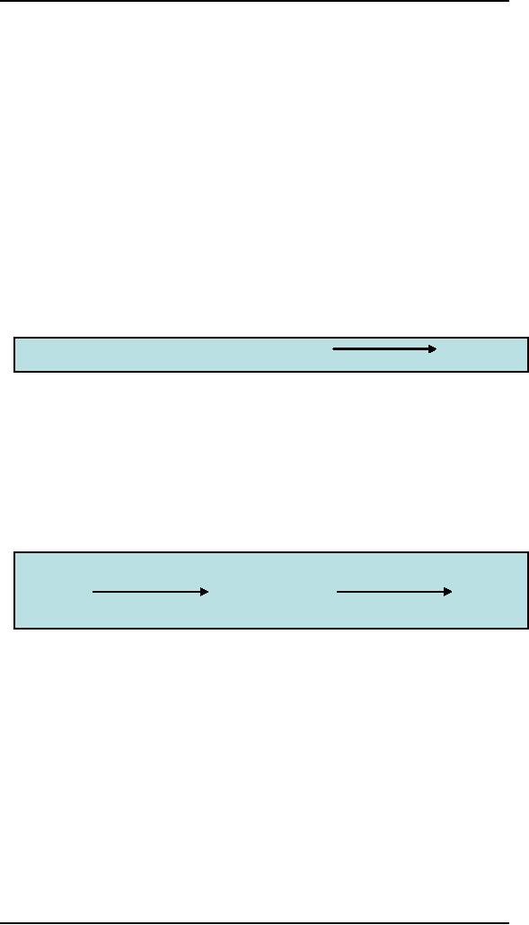
programmers did it all
In the
early days of software industry smart
programmers dreamed up useful
software,
wrote
and even tested it on their
own. But as their businesses
grew, the software
business
and software business and
software products became
more complicated.
programmers
Code/test
ship
Managers
brought order
Inevitably,
professional managers were
brought in. Good product
managers
understand
the market and competitors.
They define software product
by creating
requirements
documents. Often, however, requirements
are little more than a
list of
features
and managers find themselves
having to give up features in
order to meet
schedule.
manager
programmer
s
s
initiate
Code/test
ship
Testing
and design became separate
steps
As the
industry matured, testing
became a separate discipline
and separate step in
the
process.
In the move from
command-line to graphical user
interface, design and
usability
also became involved in the
process, though often only
at the end, and
often
only
affecting visual presentation.
Today common practice
includes simultaneous
coding
and design followed by bug
and user testing and
then revision.
Design
must precede the programming
effort
A goal
directed design approach to
software development means
that all decisions
proceed
from a format definition of
the user and his or
her goals. Definition of
the
147

Human
Computer Interaction
(CS408)
VU
user
and user goals is the
responsibility of the designer,
thus design must precede
programming.
QA
Bug
test
initiate
design
code
ship
User
test
User
experts
Design
Design,
according to industrial designer
Victor Papanek, is the conscious and
intuitive
effort to
impose meaningful order.
Cooper proposes a somewhat detailed
definition:
� Understanding
the user's wants, needs,
motivations, and
contexts
Understanding
business, technical, and
domain requirements and
constraints
�
Translating
this knowledge into plans
for artifacts whose form
content, and
�
behavior
is useful, usable and desirable, as
well as economically viable
and
technically
feasible.
This
definition applies across
all design disciples,
although the precise focus on
form
versus
content versus behavior
varies by design
discipline.
When
performed using the
appropriate methods, design can
provide the missing
human
connection in technological product.
But clearly, the currently
approach to the
design of
digital products either
isn't working or isn't
happening as advertised.
Three
dimensions of designs
Interaction
design focuses on an area
that traditional design
disciplines do not
often
explore:
the design of
behavior.
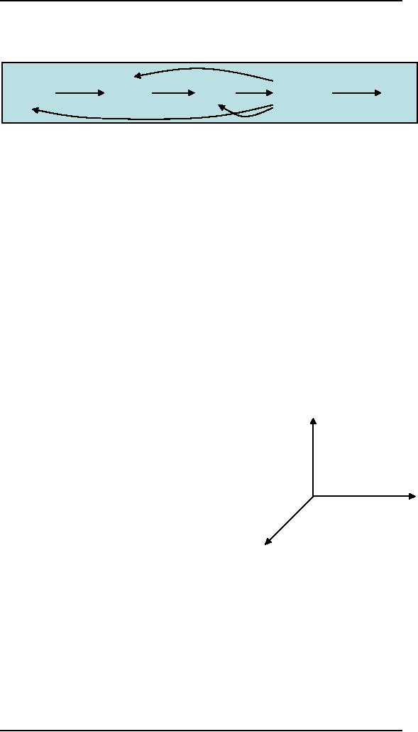
form
All
design affects human
behavior:
architecture
is about how people use
spaces
as much
as it is about form and
light. And
what
would be the point of a poster if no
one
meaning
acted on
the information it presented?
However,
it is only with the
introduction of
interactive
technologies courtesy of
the
computer
that the design of the
behavior of
artifacts
and how this behavior
affects and
behavior
supports
human goals and desires,
has
become a
discipline worthy of
attention.
One
way of making sense of he
difference is
focus
between interaction design
and more
traditional
design is through a
historical
lens. In
the first half of the
twentieth century, designers focused
primarily on form.
Later
designers became increasingly concerned
with meaning; for example,
product
designers
and architects introduced
vernacular and retro forms
in the 70s. The trend
continues
today with retro-styled
automobiles such as the PT
Cruiser. Today,
148

Human
Computer Interaction
(CS408)
VU
information
designers continue the focus on
meaning to include the
design of usable
content.
Within
the last fifteen years a
growing group of designers have
begun to talk about
behavior:
the dynamic ways that
software-enabled products interact
directly with
users.
These concerns
(form, meaning and behavior)
are not exclusive.
Interactive products
must have
each in some measure;
software applications focus
more on behavior and
form,
with less demand on content;
web sites and kiosks
focus more on content
and
form,
with less sophisticated
behaviors.
Definition
interaction design
Simply
put, interaction design is
the definition and design of
the behavior of
artifacts,
environment,
and systems, as well as the
formal elements that communicate
that
behavior.
Unlike, traditional design
disciplines, whose focus has
historically been on
form
and, more recently, on
content and meaning,
interaction design seeks
first to
plan
and describe how things
behave and then, as
necessary, to describe the most
effective
form to communicate those
behaviors.
149
Table of Contents:
- RIDDLES FOR THE INFORMATION AGE, ROLE OF HCI
- DEFINITION OF HCI, REASONS OF NON-BRIGHT ASPECTS, SOFTWARE APARTHEID
- AN INDUSTRY IN DENIAL, SUCCESS CRITERIA IN THE NEW ECONOMY
- GOALS & EVOLUTION OF HUMAN COMPUTER INTERACTION
- DISCIPLINE OF HUMAN COMPUTER INTERACTION
- COGNITIVE FRAMEWORKS: MODES OF COGNITION, HUMAN PROCESSOR MODEL, GOMS
- HUMAN INPUT-OUTPUT CHANNELS, VISUAL PERCEPTION
- COLOR THEORY, STEREOPSIS, READING, HEARING, TOUCH, MOVEMENT
- COGNITIVE PROCESS: ATTENTION, MEMORY, REVISED MEMORY MODEL
- COGNITIVE PROCESSES: LEARNING, READING, SPEAKING, LISTENING, PROBLEM SOLVING, PLANNING, REASONING, DECISION-MAKING
- THE PSYCHOLOGY OF ACTIONS: MENTAL MODEL, ERRORS
- DESIGN PRINCIPLES:
- THE COMPUTER: INPUT DEVICES, TEXT ENTRY DEVICES, POSITIONING, POINTING AND DRAWING
- INTERACTION: THE TERMS OF INTERACTION, DONALD NORMAN’S MODEL
- INTERACTION PARADIGMS: THE WIMP INTERFACES, INTERACTION PARADIGMS
- HCI PROCESS AND MODELS
- HCI PROCESS AND METHODOLOGIES: LIFECYCLE MODELS IN HCI
- GOAL-DIRECTED DESIGN METHODOLOGIES: A PROCESS OVERVIEW, TYPES OF USERS
- USER RESEARCH: TYPES OF QUALITATIVE RESEARCH, ETHNOGRAPHIC INTERVIEWS
- USER-CENTERED APPROACH, ETHNOGRAPHY FRAMEWORK
- USER RESEARCH IN DEPTH
- USER MODELING: PERSONAS, GOALS, CONSTRUCTING PERSONAS
- REQUIREMENTS: NARRATIVE AS A DESIGN TOOL, ENVISIONING SOLUTIONS WITH PERSONA-BASED DESIGN
- FRAMEWORK AND REFINEMENTS: DEFINING THE INTERACTION FRAMEWORK, PROTOTYPING
- DESIGN SYNTHESIS: INTERACTION DESIGN PRINCIPLES, PATTERNS, IMPERATIVES
- BEHAVIOR & FORM: SOFTWARE POSTURE, POSTURES FOR THE DESKTOP
- POSTURES FOR THE WEB, WEB PORTALS, POSTURES FOR OTHER PLATFORMS, FLOW AND TRANSPARENCY, ORCHESTRATION
- BEHAVIOR & FORM: ELIMINATING EXCISE, NAVIGATION AND INFLECTION
- EVALUATION PARADIGMS AND TECHNIQUES
- DECIDE: A FRAMEWORK TO GUIDE EVALUATION
- EVALUATION
- EVALUATION: SCENE FROM A MALL, WEB NAVIGATION
- EVALUATION: TRY THE TRUNK TEST
- EVALUATION – PART VI
- THE RELATIONSHIP BETWEEN EVALUATION AND USABILITY
- BEHAVIOR & FORM: UNDERSTANDING UNDO, TYPES AND VARIANTS, INCREMENTAL AND PROCEDURAL ACTIONS
- UNIFIED DOCUMENT MANAGEMENT, CREATING A MILESTONE COPY OF THE DOCUMENT
- DESIGNING LOOK AND FEEL, PRINCIPLES OF VISUAL INTERFACE DESIGN
- PRINCIPLES OF VISUAL INFORMATION DESIGN, USE OF TEXT AND COLOR IN VISUAL INTERFACES
- OBSERVING USER: WHAT AND WHEN HOW TO OBSERVE, DATA COLLECTION
- ASKING USERS: INTERVIEWS, QUESTIONNAIRES, WALKTHROUGHS
- COMMUNICATING USERS: ELIMINATING ERRORS, POSITIVE FEEDBACK, NOTIFYING AND CONFIRMING
- INFORMATION RETRIEVAL: AUDIBLE FEEDBACK, OTHER COMMUNICATION WITH USERS, IMPROVING DATA RETRIEVAL
- EMERGING PARADIGMS, ACCESSIBILITY
- WEARABLE COMPUTING, TANGIBLE BITS, ATTENTIVE ENVIRONMENTS