 |

Human
Computer Interaction
(CS408)
VU
Lecture
14
Lecture
14. Interaction
Learning
Goals
As the
aim of this lecture is to
introduce you the study of
Human Computer
Interaction,
so that after studying this
you will be able to:
� Define
interaction
� Discuss
interaction styles keeping in view
different aspects of HCI
In the
previous lectures we have
studied the detailed
introduction of human side
and
computer
side. These are two
participant of our course
Human Computer
Interaction.
As the
name of the course reveals
that both of these complex
entities are not in
isolation
rather they come in contact
with each other. Human
communicate with
computers.
There are
a number of ways in which
human can communicate with
the system. If we
look at
the beginning, batch input
system was used, in which
the user provides all
the
information
to the computer in form of
batch. Now a day it is the
age of virtual
reality
and
ubiquitous computing. Here
user constantly interacts
with computers in his
surroundings.
Today there is richer
interaction.
The terms of
Interaction
14.1
Domain
A domain
defines an area of expertise
and knowledge in some
real-world activity.
Some
examples of domains are
graphic design, authoring
and process control in
a
factory.
A domain consists of concepts that
highlight its important
aspects. In a
graphic
design domain, some of the
important concepts are geometric
shapes, a
drawing
surface and a drawing
Goals
utensil.
Task
Intention to
act
Evaluation of
the
Task
are the operation to
manipulate
Interpretations
the
concepts of a domain. A goal is
the
desired output from a
performed
sequence
of
Interpreting
the
task.
For example, one task
within
actions
perception
the
graphic design domain is
the
construction
of a specific geometric
shape
with particular attributes
on
execution
of
Perceiving
the state
the
drawing surface.
The
action sequence
of the
world
Goal
A related
goal would be to produce
a
solid
red triangle centered on
the
canvas. So,
goal is ultimate
result,
THE
WORLD
which
you want to achieve
after
performing
some specific tasks.
123

Human
Computer Interaction
(CS408)
VU
Donald Norman's
Model
14.2
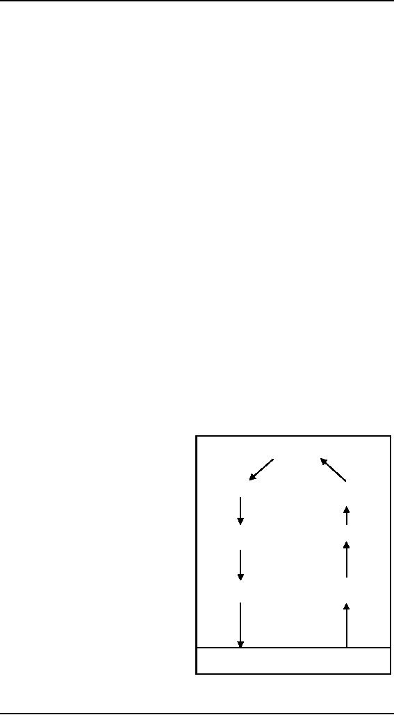
We have
already studied Donald
Norman's Model of interaction. In
which user
chooses a
goal, formulate a plan of
action, which is then
executed at the
computer
interface.
When the plan, or part of
the plan has been executed,
the user observes
the
computer
interface to evaluate the
result of the execution
plan, and to
determine
further
actions.
The
two major parts, execution
and evaluation, of interactive
cycle are further
subdivided
into seven stages, where
each stage is an activity of
the user. Seven
stages
of action
are shown in figure. To understand
these we see an example,
which was also
used by
Norman.
Imagine
you are sitting reading as
evening falls. You decide
you need more light;
that
is you
establish the goal to get
lighter. Form there you
form an intention to switch
on
the desk
lamp, and you specify
the actions required to reach
over and press the
lamp
switch.
If some one else is closer,
the intention may be
different-you may ask them
to
switch on
the light for you.
Your goal is the same
but the intention and
actions are
different.
When you have executed
the action you perceive
the result, either the
light
is on or it
isn't and you interpret
this, based on your
knowledge of the world.
For
example,
if the light does not
come on you may interpret
this as indicating he bulb
has
blown or
the lamp is not plugged
into the mains, you will
formulate the new
state
according
to the original goals is
there is now enough light?
It so, the cycle is
completed.
It not, you may formulate a
new intention to switch on
the main ceiling
light as
well.
Gulf of
execution and
evaluation
Norman
also describes the two
gulfs, which represent the
problems that are caused
by
some
interfaces to their
users.
Gulf of
execution
Gulf of
execution is the difference
between the user's formulation of
the actions to
reach the
goal and the actions
allowed by the system. If
the action allowed by
the
system
correspond to those intended by
the user, the interaction
will effective. The
interface
should therefore aim to reduce
this gulf of
execution.
Gulf of
evaluation
The
gulf of evaluation is the distance
between the physical
presentation of the
system
state
and the expectation of the
user. If the user can
readily evaluate the
presentation
in terms of
his goal, the gulf of
evaluation is small. The
more effort that is required
on
the
part of the user to
interpret the presentation,
the less effective the
interaction.
124

Human
Computer Interaction
(CS408)
VU
The
interaction framework
14.3
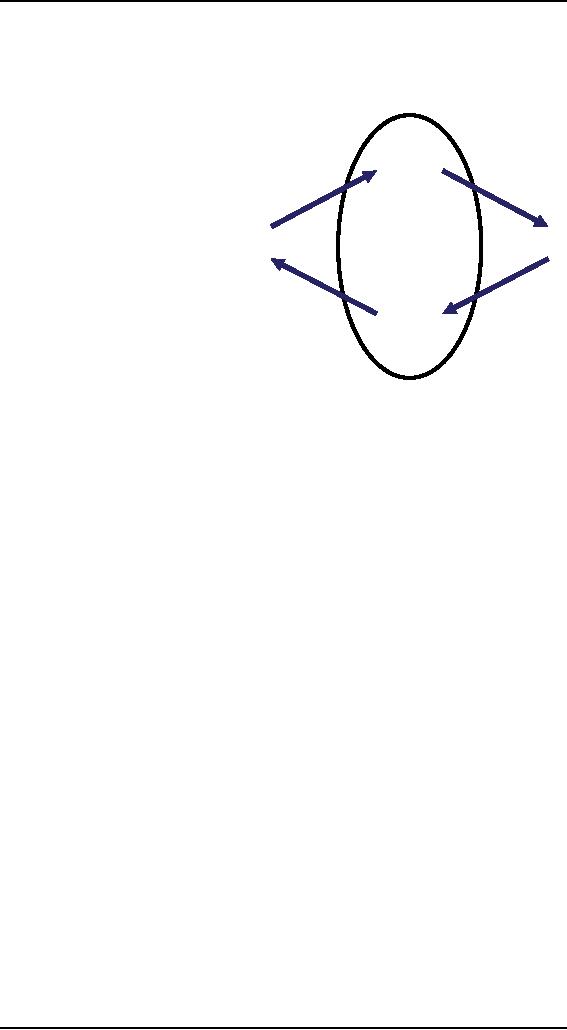
The
interaction framework breaks the
system into four main
components as shown in
figure.
The nodes represent
the
four major components
O
in an
interactive system
the
System, the User, the
presentation
output
observation
Input
and the Output. Each
component
has its own
S
U
language.
The system and
user
are each described by
means of
a language that core
task
can
express
concepts
I
articulation
relevant
in the domain of
performance
the
application.
The
input
system's
language
is
referred
as the core
language
and the user's
language
is referred as the task
language. The core language describes
computational
attributes
of the domain relevant to
the system state, whereas
the task language
describes
psychological attributes of the
domain relevant to the user
state. There are
also
languages for both the input
and output components. Input
and output together
form
the interface.
As the
interface sits between the
user and the system,
there are four steps in
the
interactive
cycle, each corresponding to a
translation from one
component to another,
as shown
by the labeled arcs in
figure. The user begins
the interactive cycle with
the
formulation
of a goal and a task o achieves that
goal. The only way
the user can
manipulate
the machine is through the
input, and so the task must
be articulated
within
the input language, the
input language is translated
into the core language
as
operations
to be performed by the system.
The system then transforms
itself as
described
by the operations; the
execution phase of the cycle
is complete and the
evaluation
phase now begins. The
system is in a new state,
which must now be
communicated
to the user. The current
values of system attributes
are rendered as
concepts or
features of the output. It is
then up to the user to observe
the output and
assess
the results of the interaction
relative to the original
goal, ending the
evaluation
phase
and, hence, the interactive
cycle. There are four
main translations involved
in
the
interaction: articulation, performance,
presentation and observation.
The user's
formulation
of the desired task to
achieve some goal needs to
be articulated in the
input
language. The tasks are
responses of the user and
they need to be translated to
stimuli
for the input. As pointed
out above, this articulation
is judged in terms of
the
coverage
from tasks to input and
the relative ease with
which the translation can
be
accomplished.
The task is phrased in terms of certain
psychological attributes
that
highlight
the important features of
the domain for the
user. If these
psychological
attributes
map clearly onto the
input language, then
articulation of the task will be
made much
simpler.
Frameworks and
HCI
14.4
125

Human
Computer Interaction
(CS408)
VU
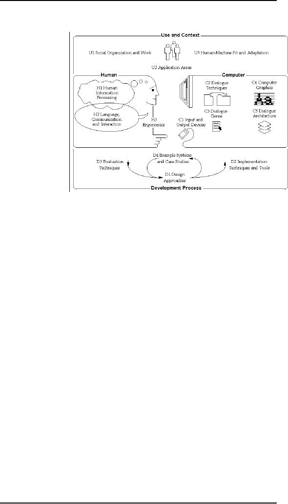
The ACM
SIGCHI Curriculum Development
Group presents a framework
and uses it
to place
different
areas
that relate to
HCI
As you
can see in
the
figure, the
field
of
ergonomics
addresses
issues
on the
user side of
the
interface,
covering
input and
output,
as well as
the
user's
immediate
context.
Dialog
design
and
interface
styles
can
be placed
particularly
along the input branch of
the framework, addressing both
articulation and
performance.
However, dialog is most usually
associated with the computer
and so is
biased to
that side of the framework.
Presentation and screen
design relates to the
output
branch of the framework. The
entire framework can be
placed within a
social
and
organizational context that
also affects the
interaction. Each of these areas
has
important
implications for the design
of interactive systems and
the performance of
the
user.
Let us
first take a brief
look.
Ergonomics
Ergonomics
(or human factors) is
traditionally the study of
the physical
characteristic
of the
interaction: how the
controls are designed, the
physical environment in
which
the
interaction takes place, and
the layout and physical
qualities of the screen.
A
primary
focus is on user performance
and how the interface
enhances or detracts from
this. In
seeking to evaluate these
aspects of the interaction,
ergonomics will
certainly
also
touch upon human psychology
and system constraints. It is a
large and
established
field, which is closely
related to but distinct from
HCI.
Physical
aspects of Interface are as
follow:
� Arrangement
of controls and
displays
� The
physical environment
� Health
issues
� Use
of colors
Arrangement
of controls and
displays
We
already have discussed in
previous lectures the
perceptual and cognitive
issues
that
affect the way we present
information on a screen and
provide control
mechanisms
to the user. In addition to
these cognitive aspects of
design, physical
aspects
are also important. The
user should group sets of
controls and parts of
the
display
logically to allow rapid
access. This may not
seem so important when we
are
considering
a single user of a spreadsheet on a PC,
but it becomes vital we turn
to
126

Human
Computer Interaction
(CS408)
VU
safety-critical
applications such as plant
control, aviation and air
traffic control. In
each of
these contexts, users are
under pressure and are
faced with a huge range
of
displays
and controls. Here it is
crucial that the physical
layout of these be
appropriate.
Indeed, returning to the
less critical PC application,
inappropriate
placement
of controls and displays can
lead to inefficiency and
frustration.
Industrial
Interface
The
interfaces to office systems
have changed dramatically since the
1980s. However,
some
care is needed in transferring the
idioms of office-based systems
into the
industrial
domain. Office information is
primarily textual and slow
varying, whereas
an
industrial interfaces may
require the rapid
assimilation of multiple
numeric
displays;
each of which is varying in
response to the environment.
Furthermore, the
environment
conditions may rule out
certain interaction
styles.
Consequently,
industrial interfaces raise some
additional design issues
rarely
encountered
in the office.
Glass
interfaces vs. dials and
knobs
The
traditional machine interface
consists of dials and knobs
directly wired or
piped
to the
equipment. Increasingly, some or
all of the controls are
replaced with a glass
interface,
a computer screen through
which the equipment is
monitored and
controlled.
Many of the issues are
similar for the two
kinds of interface, but
glass
interfaces
do have some special advantages
and problems. For a complex
system, a
glass
interface can be both cheaper
and more flexible, and it is
easy to show the
same
information
in multiple forms.
Indirect
manipulation
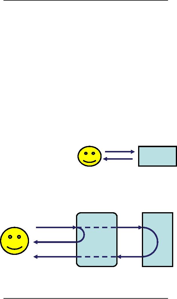
The
phrase `direct
manipulation,
system
dominates
office system design
as
shown in
figure (a). there
are
arguments
about its meaning
and
appropriateness
even there, but it is
certainly dependent on the
user being in primary
control
of the changes in the
interface. The autonomous
nature of industrial
processes
makes
this an inappropriate model. In a
direct manipulation system,
the user interacts
with an
artificial would inside the
computer.
In
contrast, an industrial interface is
merely an intermediary between
the operator and
the
real world. One implication
of this indirectness is that
the interface must
provide
feedback
at two levels as shown in
figure (b). at one level,
the user must receive
plan
interface
t
immediate
feedback
instrument
s
immediate
feedback, generated by the interface,
that keystrokes and other
actions
have been
received. In addition, the user's
action will have some effect
on the
equipment
controlled by the interface
and adequate monitoring must be provided
for
this.
127

Human
Computer Interaction
(CS408)
VU
The
indirectness also causes
problems with simple
monitoring tasks. Delays due
to
periodic
sampling, slow communication
and digital processing often
mean that the
data
displayed are somewhat out
of date. If the operator is
not aware of these
delays,
diagnoses of
system state may be wrong.
These problems are compounded if
the
interface
produces summary information displays. If
the data comprising such
a
display
are of different timeliness
the result may be
misleading.
The
physical environment of the
interaction
As well
as addressing physical issues in the
layout and arrangement of
the machine
interface,
ergonomics is concerned with
the design of the work
environment itself.
Where
will the system be used? By
whom will it be used? Will
users be sitting,
standing
or moving about? Again, this
will depend largely on the
domain and will be
more
critical in specific control
and operational setting s
than in general computer
use.
However,
the physical environment in
which the system is used
may influence how
will it is accepted
and even the health
and safety f its users. It
should therefore be
considered
in all design.
Health
issues
Perhaps
we do not immediately think of
computer use as a hazardous activity
but we
should
bear in mind possible
consequences of our designs on the
health and safety of
users.
Leaving aside the obvious
safety risks of poorly
designed safety-critical
systems.
There are a number of factors in
that may affect the
use of more general
computers.
Again these are factors in
the physical environment
that directly affect
the
quality
of the interaction and the
user's performance:
Physical
position
As we
discussed earlier users
should be able to reach all
controls comfortably and
see
all
displays. Users should not be
expected to stand for long
periods and, if
sitting,
should be
provided with back
support.
Temperature
Although
most users can adapt to
slight changes in temperature
without adverse
effect,
extremes of hot or cold will affect
performance and, in excessive cases,
health.
Lighting
The
lighting level will again
depend on the work
environment. However, adequate
lighting
should be provided to allow
users to see the computer
screen without
discomfort
or eyestrain. The light
source should also be
positioned to avoid
glare
affecting
the display.
Noise
Excessive
noise can be harmful to
health, causing the user
pain, and in acute
cases,
loss of
hearing. Noise level should
be maintained at a comfortable level in
the work
environment.
Time
The
time users spend using
the system should also be
controlled.
128

Human
Computer Interaction
(CS408)
VU
The
use of color
Ergonomics
has a close relationship to human
psychology in that it is also
concerned
with
the perceptual limitations of humans.
For example, the use of
color in displays is
an
ergonomics issue. The human
visual system has some
limitations with regard
to
color,
including the number of
colors that are distinguishable
and the relatively
low
blue
acuity. Color used in
display should be as distinct as
possible and the
distinction
should
not be affected by changes in
contrast. The colors used
should also
correspond
to common
conventions and user
expectation. However, we should
remember that
color
conventions are culturally
determined.
Interaction
styles
14.5
Interaction
is communication between computer
and human (user). For a
successful
enjoyable
communication interface style
has its own
importance.
There
are a number of common
interface styles
including
� Command
line interface
� Menus
� Natural
language
Question/answer
and query dialog
� Form
fills and
spreadsheets
� WIMP
� Point
and click
� Three-dimensional
interfaces.
Command
line interface
Command
line interface was the
first interactive dialog
style to be commonly
used
and, in
spite of the availability of
menu-driven interface, it is still
widely used. It
provides
a means of expressing instructions to
the computer directly, using
some
function
keys, single characters, abbreviations or
whole-word commands.
Command
line interface are powerful
in that they offer direct
access to system
functionality,
and can be combined to apply
a number of tools to the
same data. They
are also
flexible: the command often
has a number of options or parameters
that will
vary
its behavior in some way,
and it can be applied to
many objects at once,
making
it useful
for repetitive
tasks.
Menu
In
the
menu-driven
interface,
the set of
options
available to the
user is
displayed on the
screen
and selected using
the
mouse, or numeric or
alphabetic
keys. Since the
options
are visible they
are less
demanding of the
user,
relying
on
recognition
rather than
recall.
However, menu
129

Human
Computer Interaction
(CS408)
VU
options
still need to be meaningful and
logically grouped to aid
recognition. Often
menus
are hierarchically ordered
and the option required is
not available at the
top
layer of
the hierarchy. The grouping
and naming of menu options
then provides the
only
cue for the user to
find the required option.
Such systems either can be
purely
text
based, with the menu
options being presented as numbered
choices, or may have
a
graphical component in which
the menu appears within a
rectangular box and
choices
are made, perhaps by typing the
initial letter of the
desired selection, or by
entering
the associated number, or by
moving around the menu
with the arrow
keys.
This is
restricted form of a full WIMP
system.
Natural
Language
Perhaps
the most attractive means of
communicating with computers, at least at
first
glance,
is by natural language. Users unable to
remember a command or lost in
a
hierarchy
of menus, may long for the
computer that is able to
understand instructions
expressed
in everyday words. Unfortunately,
however, the ambiguity of
natural
language
makes it very difficult for
a machine to understand.
Question/answer
and query dialog
Question
and answer dialog is a simple mechanism
for providing input to
an
application
in
a
specific domain. The user is
asked a series of questions and so is
led through the
interaction
step by step. An example
would be the wizards as
shown in figure.
These
interfaces are easy to learn
and use, but are
limited in functionality and
power.
As such,
they are appropriate for
restricted domains and for
novice or casual users.
Query
languages, on the other
hand, are used to construct
queries to retrieve
information
from a database. They use
natural-language-style phrases, but in
fact
require
specific syntax, as well as
knowledge of database structure.
Queries usually
require
the user to specify an
attribute or attributes for
which to search the
database,
as well
as the attributes of interest to be
displayed. This is straightforward
where there
is a
single attribute, but
becomes complex when
multiple attributes are
involved,
particularly
of the user is interested in
attribute A or attribute B, or attribute
A and not
attribute
B, or where values of attributes
are to be compared. Most
query language do
not
provide direct confirmation of
what was requested, so that
the only validation
the
user
has is the result of the
search. The effective use of
query languages therefore
requires
some experience.
Form-fills
and spreadsheets
Form-filling
interfaces are used
primarily for data entry but
can be useful in data
retrieval
applications. The user is presented
with a display resembling a
paper form,
with
slots to fill in as shown in figure. Most
form-filling interfaces allow
easy
movement
around the form and
allow some fields to be left
blank. They also
require
correction
facilities, as users may change
their minds or make a
mistake about the
value
that belongs in each
field.
Spreadsheets
are sophisticated variation of
form filling. The
spreadsheet comprises a
grid of
cells, each of which can
contain a value or a formula.
The formula can
involve
130

Human
Computer Interaction
(CS408)
VU
the
value of other cells. Now a
days MS Excel is used widely. In
past VISICALC and
Lotus
123 had been used.
VISICALC
The WIMP
Interfaces
Currently
many common environments for
interactive computing are
examples of the
WIMP
interface style, often
simply called windowing
systems. WIMP stands
for
windows,
icons, menus, and pointers,
and is default interface
style for the majority
of
interactive
computer systems in use
today, especially in the PC
and desktop
workstation
arena.
Point
and Click interface
In most
multimedia systems and in
web browsers, virtually all
actions take only a
single
click of the mouse button.
You may point at a city on a
map and when you
click a
window opens, showing you
tourist information about
the city. You may
point
at a word
in some text and when
you click you see a
definition of the word. You
may
point at
a recognizable iconic button
and when you click
some action is
performed.
Three-dimensional
interfaces
There is
an increasing use of three-dimensional
effects in user interfaces.
The most
obvious
example is virtual reality,
but VR is only part of a range of 3D
techniques
available
to the interface
designer.
The
simplest technique is where
ordinary WIMP elements, buttons, scroll
bars, etc,,
are given
a 3D appearance using shading, giving
the appearance of being sculpted
out
of
stone.
131
Table of Contents:
- RIDDLES FOR THE INFORMATION AGE, ROLE OF HCI
- DEFINITION OF HCI, REASONS OF NON-BRIGHT ASPECTS, SOFTWARE APARTHEID
- AN INDUSTRY IN DENIAL, SUCCESS CRITERIA IN THE NEW ECONOMY
- GOALS & EVOLUTION OF HUMAN COMPUTER INTERACTION
- DISCIPLINE OF HUMAN COMPUTER INTERACTION
- COGNITIVE FRAMEWORKS: MODES OF COGNITION, HUMAN PROCESSOR MODEL, GOMS
- HUMAN INPUT-OUTPUT CHANNELS, VISUAL PERCEPTION
- COLOR THEORY, STEREOPSIS, READING, HEARING, TOUCH, MOVEMENT
- COGNITIVE PROCESS: ATTENTION, MEMORY, REVISED MEMORY MODEL
- COGNITIVE PROCESSES: LEARNING, READING, SPEAKING, LISTENING, PROBLEM SOLVING, PLANNING, REASONING, DECISION-MAKING
- THE PSYCHOLOGY OF ACTIONS: MENTAL MODEL, ERRORS
- DESIGN PRINCIPLES:
- THE COMPUTER: INPUT DEVICES, TEXT ENTRY DEVICES, POSITIONING, POINTING AND DRAWING
- INTERACTION: THE TERMS OF INTERACTION, DONALD NORMAN’S MODEL
- INTERACTION PARADIGMS: THE WIMP INTERFACES, INTERACTION PARADIGMS
- HCI PROCESS AND MODELS
- HCI PROCESS AND METHODOLOGIES: LIFECYCLE MODELS IN HCI
- GOAL-DIRECTED DESIGN METHODOLOGIES: A PROCESS OVERVIEW, TYPES OF USERS
- USER RESEARCH: TYPES OF QUALITATIVE RESEARCH, ETHNOGRAPHIC INTERVIEWS
- USER-CENTERED APPROACH, ETHNOGRAPHY FRAMEWORK
- USER RESEARCH IN DEPTH
- USER MODELING: PERSONAS, GOALS, CONSTRUCTING PERSONAS
- REQUIREMENTS: NARRATIVE AS A DESIGN TOOL, ENVISIONING SOLUTIONS WITH PERSONA-BASED DESIGN
- FRAMEWORK AND REFINEMENTS: DEFINING THE INTERACTION FRAMEWORK, PROTOTYPING
- DESIGN SYNTHESIS: INTERACTION DESIGN PRINCIPLES, PATTERNS, IMPERATIVES
- BEHAVIOR & FORM: SOFTWARE POSTURE, POSTURES FOR THE DESKTOP
- POSTURES FOR THE WEB, WEB PORTALS, POSTURES FOR OTHER PLATFORMS, FLOW AND TRANSPARENCY, ORCHESTRATION
- BEHAVIOR & FORM: ELIMINATING EXCISE, NAVIGATION AND INFLECTION
- EVALUATION PARADIGMS AND TECHNIQUES
- DECIDE: A FRAMEWORK TO GUIDE EVALUATION
- EVALUATION
- EVALUATION: SCENE FROM A MALL, WEB NAVIGATION
- EVALUATION: TRY THE TRUNK TEST
- EVALUATION – PART VI
- THE RELATIONSHIP BETWEEN EVALUATION AND USABILITY
- BEHAVIOR & FORM: UNDERSTANDING UNDO, TYPES AND VARIANTS, INCREMENTAL AND PROCEDURAL ACTIONS
- UNIFIED DOCUMENT MANAGEMENT, CREATING A MILESTONE COPY OF THE DOCUMENT
- DESIGNING LOOK AND FEEL, PRINCIPLES OF VISUAL INTERFACE DESIGN
- PRINCIPLES OF VISUAL INFORMATION DESIGN, USE OF TEXT AND COLOR IN VISUAL INTERFACES
- OBSERVING USER: WHAT AND WHEN HOW TO OBSERVE, DATA COLLECTION
- ASKING USERS: INTERVIEWS, QUESTIONNAIRES, WALKTHROUGHS
- COMMUNICATING USERS: ELIMINATING ERRORS, POSITIVE FEEDBACK, NOTIFYING AND CONFIRMING
- INFORMATION RETRIEVAL: AUDIBLE FEEDBACK, OTHER COMMUNICATION WITH USERS, IMPROVING DATA RETRIEVAL
- EMERGING PARADIGMS, ACCESSIBILITY
- WEARABLE COMPUTING, TANGIBLE BITS, ATTENTIVE ENVIRONMENTS