 |
DESIGN PRINCIPLES: |
| << THE PSYCHOLOGY OF ACTIONS: MENTAL MODEL, ERRORS |
| THE COMPUTER: INPUT DEVICES, TEXT ENTRY DEVICES, POSITIONING, POINTING AND DRAWING >> |

Human
Computer Interaction
(CS408)
VU
Lecture
12
Lecture
12. Design
Principles
Learning
Goals
As the
aim of this lecture is to
introduce you the study of
Human Computer
Interaction,
so that after studying this
you will be able to:
Understand
conceptual models
�
Discuss
design principles
�
Conceptual
Model
"The most
important thing to design is
the user's conceptual model.
Every thing else
should be
subordinated to making that
model clear, obvious, and
substantial. That is
almost
exactly the opposite of how
most software is designed." (David
Liddle)
By a
conceptual model is
meant:
A
description of the proposed
system in terms of a set of
integrated ideas and
concepts
about what it should do,
behave and look like,
that will be understandable by
the
users in the manner
intended.
To
develop a conceptual model
involves envisioning the
proposed product, based
on
the
user's needs and other
requirements identified. To ensure
that it is designed to be
understandable
in the manner intended
requires doing iterative
testing of the
product
as it is
developed.
A key
aspect of this design
process is initially to decide
what the user will be
doing
when
carrying out their tasks.
For example, will they be
primarily searching
for
information,
creating documents, communicating with
other users, recording
events,
or some
other activity? At this
stage, the interaction mode
that would best
supports
this need
to be considered. For example,
would allowing the users to
browse be
appropriate,
or would allowing them to
ask questions directly to the
system in their
native
language be more affective?
Decision about which kind of
interaction style use
(e.g.,
whether to use a menu-based system,
speech inputs, commands) should be
made
in
relation to the interaction
mode. Thus, decision about
which mode of interaction
to
support
differ from those made about
which style of interaction to
have; the former
being at
a higher level of abstraction.
The former are also
concerned with
determining
the
nature of the users' activities to
support, while the later are
concerned with the
selection
of specific kinds of
interface.
Once a
set of possible ways of
interacting with interactive
system has been
identified,
the
design of the conceptual
modal then needs to be
thought through in term of
actual
concrete
solution. This entail
working out the behavior of
the inter face, the
particular
interaction
style that will be used,
and the "look and
feel" of the interface. At
this
stage of
"fleshing out," it is always a
good idea to explore a
number of possible
designs
and to assess the merits
and problems of each
one.
102
Human
Computer Interaction
(CS408)
VU
Another
way of designing an appropriate
conceptual model is to interface
metaphor
this
can provide a basic structure
for the conceptual model
that is couched in
knowledge
users are familiar with.
Examples of well-known interface
metaphors are
the
desktop and search
engines
Software
has a behavioral face it shows to
the world that is created by
the
programmer
or designer. This representation is
not necessarily an accurate
description
of what
is really going on inside
the computer, although
unfortunately, it frequently
is.
This
ability to represent the computer
functioning independent of its
true actions is far
more
pronounced in software than in
any other medium. It allows
a clever designer to
hide
some of the more unsavory
facts of how the software is
really getting the
job
done.
This disconnection between
what is implemented and what
it offered as
explanation
gives rise to a third model
in the digital world, the
designer's represented
model--the
way the designer chooses to
represent a program's functioning to
the
user.
Donald Norman refers to this
simply as the designer's
model.
In the
world of software, a program's
represented model can be quite
different from
the
actual processing structure of the
program. For example, an
operating system can
make a
network file server look as
though it were a local disk.
The model does
not
represent
the fact that the
physical disk drive may be
miles away. This concept of
the
represented
model has no widespread
counterpart in the mechanical
world. The
representation
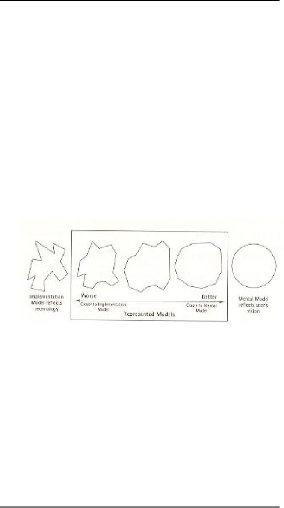
between the three models is
shown in Figure.
The
closer the represented model
comes to the user's mental
model, the easier he
will
find
the program to use and to
understand. Generally, offering a
represented model
that
follows the implementation
model too closely
significantly reduces the
user's
ability
to learn and use the
program, assuming that the user's
mental model of his
tasks
differs from the
implementation model of the
software.
We tend
to form mental models that
are simpler than reality; so
if we create
represented
models that are simpler than
the actual implementation
model, we help
the
user achieve a better
understanding. Pressing the
brake pedal in your car,
for
example,
may conjure a mental image
of pushing a lever that rubs
against the wheels
to slow
you down. The actual
mechanism includes hydraulic cylinders,
tubing, and
metal
pads that squeeze on a
perforated disk, but we
simplify all that out of
our minds,
creating
a more effective, albeit
less accurate, mental model. In
software, we imagine
that a
spreadsheet scrolls now
cells into view when we
click on the scrollbar.
Nothing
of the
sort actually happens. There is no
sheet of cells out there,
but a tightly packed
data
structure of values, with
various pointers between
them, from which the
program
synthesizes a
new image to display in
real-time.
103
Human
Computer Interaction
(CS408)
VU
Another
important thing is that
there are several gulfs
that separate mental states
from
physical
ones. Each gulf reflects
one aspect of the distance
between the mental
representation
of the person and the
physical components and
states of the
environment.
And these gulfs present
major problems for
users.
The Gulf of
Execution
Does the
system provide actions that
correspond to the intentions of
the person? The
difference
between the intentions and
allowable actions is the
gulf of execution. One
measure
of this gulf is how well
the system allows the person
to do the intended
actions
directly, without extra
effort: do the action
provided by the system
match
those
intended by the person?
The Gulf of
Evaluation
Does the
system provide a physical
representation that can be
directly perceived
and
that is
directly interpretable in terms of the
intentions and expectations of
the person?
The
Gulf of evaluation reflects
the amount of effort that
the person must exert to
interpret
the physical state of the
system and to determine how
well the expectations
and
intentions have been met.
The gulf is small when
the system provides
information
about
its state in a form that is
easy to get, is easy to
interpret, and matches the
way
the
person thinks of the
system.
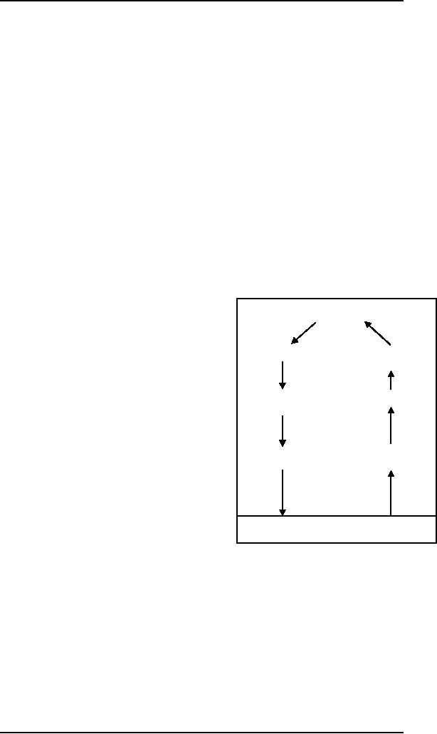
Goals
The Seven
Stages of Action as Design
aids
Intention to
act
Evaluation of
the
The
seven-stage structure can be a
valuable
Interpretations
design
aid, for it provides a basic
checklist
of
questions to ask to ensure
that the Gulfs
of
evaluation and execution are
bridged.
sequence
of
Interpreting
the
actions
perception
In
general each stage of action
requires its
own
special design strategies and, in
turn,
provides
its own opportunity for
disaster. It
execution
of
Perceiving
the state
would be
fun were it not also so
frustrating,
The
action sequence
of the
world
to look
over the world and
gleefully analyze
each
deficiency. On the whole, as
you can
see in
figure the questions for
each stage are
relatively
simple. And these, in turn,
boil
down to
the principles of good
design.
Principles
of good design are
discussed
THE
WORLD
bellow.
Design
Principles
12.1
A number
of design principles have been
promoted. The best known
are concerned
with
how to determine what users
should see and do when
carrying out their
tasks
using an
interactive product. Here we
briefly describe the most common
ones
Visibility
�
Affordance
�
Constraints
�
104
Human
Computer Interaction
(CS408)
VU
Mapping
�
Consistency
�
Feedback
�
Visibility
The
more visible functions are,
the more likely users will
be able to know what to
do
next. In
contrast, when functions are
"out of sight," it makes
them more difficult to
fid
and
knows how to use. Norman
describes the controls of a
car to emphasize this
point.
The
controls for different
operations are clearly
visible (e.g., indicator,
headlights,
horn,
hazard warning lights), indicating
what can be done. The
relationship between
the
way the controls have been
positioned in the car and
what they do makes it
easy
for
the deriver to find the
appropriate control for the
task at hand. For example,
one
problem
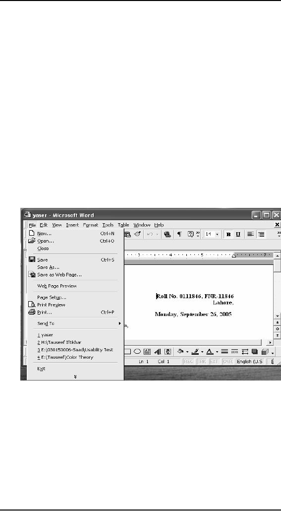
that I often encounter, in
word processing software I often needed
to set the
properties
of a word document. For this
logically option of properties
should be in the
File
menu, and I have often
seen it there. But once, I
opened the file menu I
could not
find it
there, I was confused. Look
at the figure
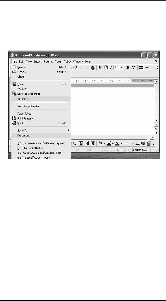
In
confusion, I looked through
all the menus but in
vain. At last, surprisingly I
was
again
looking at the file menu
when I noticed the arrow at
the bottom of the
menu,
when I
clicked on that I was able
to see that option again on
the menu. Look at
the
figure
bellow.
105
Human
Computer Interaction
(CS408)
VU
Affordance
Affordance
is a term used to refer to an
attribute of an object that
allows people to
know
how to use it. For
example, a mouse button
invites pushing by the way
it is
physically
constrained in its plastic
shell. At a very simple
level, to afford means
"to
give a
clue." When the affordances
of a physical object are
perceptually obvious it is
easy to
know how to interact with
it. For example, a door
handle affords pulling,
a
cup
handle affords grasping, and
a mouse button affords
pushing. Norman
introduced
this
concept in the late 80s in
his discussion of the design of
everyday objects.
Since
then, it
has been much popularized,
being what can be done to
them. For example,
graphical
elements like button, icon,
links, and scroll bars
are talked about
with
respect
to how to make it appear obvious
how they should be used:
icons should be
designed
to afford clicking, scroll
bars to afford moving up and
down, buttons to
afford
pushing.
There
are two kind of
affordance:
� Perceived
Real
�
Real
Physical
objects are said to have real
affordances, like grasping,
that are perceptually
obvious
and do not have to be
learned.
106

Human
Computer Interaction
(CS408)
VU
Perceived
User
interfaces that are screen-based are
virtual and do not make
sense to try to
design
for
real affordances at the
interface---except when designing
physical devices,
like
control
consoles, where affordance like
pulling and pressing are
helpful in guiding
the
user to
know what to do.
Alternatively screen based
interfaces are better
conceptualized
as perceived affordances, which
are essentially learned
conventions.
Constraints
The
design concept of constraining
refers to determining ways of
restricting the kind
of user
interaction that can take
place at a given moment.
There are various ways
this
can be
achieved. A common design
practice in graphical user
interfaces is to
deactivate
certain menu options by
shading them, thereby
restricting the user to
only
actions
permissible at that stage of
the activity. One of the
advantages of this form of
constraining
is it prevents the user from
selecting incorrect options
and thereby
refuses
the chances of making a
mistake. The use of
different kinds of
graphical
representations
can also constrain a
person's interpretation of a problem
or
information
space. For example flow
chart diagram show which
objects are related
to
which
thereby constraining the way
the information can be
perceived.
Norman
classified constraints into
three categories: physical,
logical, and
cultural.
Physical
constraints
Physical
constraints refer to the way
physical objects restrict
the movement of
things.
For
example, the way a external
disk can be placed into a
disk drive is
physically
constrained
by its shape and size, so
that it can be inserted in
only one way.
Likewise,
keys on a
pad can usually be pressed
in only one way.
Logical
constraints
Logical
constraints rely on people's
understanding of the way the
world works. They
rely on
people's common-sense reasoning
about actions and their
consequences.
Picking
up a physical marble and
placing it in another location on
the phone would be
expected
by most people to trigger something
else to happen. Making
actions and
their
effects obvious enables people to
logically deduce what further
actions are
required.
Disabling menu options when
not appropriate for the
task in hand provides
logical
constraining. It allows users to
reason why (or why
not) they have been
designed
this way and what
options are
available.
Culture
constraints
Culture
constraints rely on learned
conventions, like the use of
red for warning,
the
use of
certain kinds of signals for
danger, and the use of
the smiley face to represent
happy
emotions. Most cultural
constraints are arbitrary in the
sense that their
relationship
with what is being represented is
abstract, and could have
equally
evolved
to be represented in another form (e.g.,
the use of yellow instead of
red for
warning).
Accordingly, they have to be
learned. Once learned and accepted by
a
cultural
group, they become universally
accepted conventions. Two
universally
accepted
interface conventions are
the use of windowing for
displaying information
and
the use icons on the
desktop to represent operations and
documents.
107
Human
Computer Interaction
(CS408)
VU
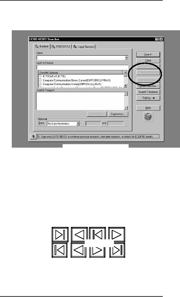
Example
of logical constraints
Mapping
This
refers to the relationship
between controls and their
effects in the world.
Nearly
all
artifacts need some kind of
mapping between controls and
effects, whether it is a
flashlight,
car, power plant, or cockpit. An
example of a good mapping
between
controls
are effect is the up and
down arrows used to represent
the up and down
movement
of the cursor, respectively, on a
computer keyboard. The
mapping of the
relative
position of controls and
their effects is also
important. Consider the
various
musical
playing devices. How are
the controls of playing
rewinding, and fast
forward
mapped
onto the desired effects?
They usually follow a common
convention of
providing
a sequence of buttons,
with
the play button in the
middle, the rewind button on
the left and the
fast-forward
on the
right. This configuration
maps directly onto the
directionality of the
actions.
Figure
a
Figure
b
Imagine
how difficult it would be if
the mapping in figure (a)
were used.
108

Human
Computer Interaction
(CS408)
VU
Consistency
This
refers to designing interfaces to
have similar operations and
use similar elements
for
achieving similar tasks. In
particular, a consistent interface is one
that follows
rules,
such as using the same
operation to select all objects.
For example, a consistent
operation
is using the same input
action to highlight any
graphical object at
the
interfaces,
such as always clicking the
left mouse button.
Inconsistent interfaces, on
the
other hand, allow exceptions
to a rule. An example of this is
where certain
graphical
objects (e.g., email
messages presented in a table) can be
highlighted using
the
right mouse button, while
all other operations are
highlighted using the left
button.
A problem
with this kind of
inconsistency is that is quite
arbitrary, making it
difficult
for
users to remember and making
the users more prone to
mistakes.
On of the
benefits of consistent interfaces,
therefore, is that they are
easier to learn
and
use. Users have to learn
only a single mode of
operation that is applicable to
all
objects.
This principle worked well
for simple interfaces with
limited operations,
like
mini CD
player with small number of
operations mapped onto
separate buttons.
Here
all
the user has to do is learn
what each button represents
and select accordingly.
However,
it can be more problematic to
apply the concept of consistency to
more
complex
interfaces, especially when
many different operations need to be
designed
for.
For example, consider how to
design an interface for an
application that
offers
hundreds
of operations. There is simply
not enough space for a
thousand buttons,
each
of which
maps onto an individual
operation. Even if there
were, it would be
extremely
difficult
and time consuming for
the user to search through
them all to find the
desired
operation.
A much
more effective design
solution is to create categories of commands
that can
be mapped
into subsets of operations.
For the word-processing
application, the
hundreds
of operation available are
categorized into subsets of
different menus. All
commands
that are concerned with file
operations are placed
together in the same
file
menu.
Another
problem with consistency is
determining what aspect of an
interface to make
consistent
with what else. There are
often many choices, some of
which can be
inconsistent
with other aspects of the
interface or ways of carrying
out actions.
Consider
the design problem of
developing a mechanism to let users
lock their files
on a
shared server. Should the
designer try to design it to be
consistent with the
way
people
lock things in the outside
world (called external
consistency) or with the
way
they
lock objects in the existing
system (called internal consistency)?
However, there
are many
different ways of locking
objects in the physical
world (e.g., placing in
a
safe,
using a padlock,
using a
key, using a child safety
lock), just as there are
different ways of
locking
electronically.
The problem facing designer
is knowing which one to be
consistent
with.
Feedback
Related
to the concept of visibility is
feedback. This is best
illustrated by an analogy
to what
everyday life would be like
without it. Imagine trying
to play a guitar,
slice
bread
using knife, or write a pen
if none of the actions
produced any effect for
several
seconds.
There would be an unbearable
delay before the music
was produced, the
bread
was cut, or the words
appeared on the paper, making it
almost impossible for
the
person to continue with the
next strum, saw, or
stroke.
109

Human
Computer Interaction
(CS408)
VU
Feedback
is about sending back
information about what
action has been done
and
what
has been accomplished, allowing
the person to continue with
the activity.
Various
kinds of feedback are available
for interaction design--audio,
tactile, verbal,
visual,
and combinations of these.
Deciding which combinations
are appropriate for
different
kinds of activities and
interactivities is central. Using
feedback in the right
way
can also provide the
necessary visibility for
user interaction.
110
Table of Contents:
- RIDDLES FOR THE INFORMATION AGE, ROLE OF HCI
- DEFINITION OF HCI, REASONS OF NON-BRIGHT ASPECTS, SOFTWARE APARTHEID
- AN INDUSTRY IN DENIAL, SUCCESS CRITERIA IN THE NEW ECONOMY
- GOALS & EVOLUTION OF HUMAN COMPUTER INTERACTION
- DISCIPLINE OF HUMAN COMPUTER INTERACTION
- COGNITIVE FRAMEWORKS: MODES OF COGNITION, HUMAN PROCESSOR MODEL, GOMS
- HUMAN INPUT-OUTPUT CHANNELS, VISUAL PERCEPTION
- COLOR THEORY, STEREOPSIS, READING, HEARING, TOUCH, MOVEMENT
- COGNITIVE PROCESS: ATTENTION, MEMORY, REVISED MEMORY MODEL
- COGNITIVE PROCESSES: LEARNING, READING, SPEAKING, LISTENING, PROBLEM SOLVING, PLANNING, REASONING, DECISION-MAKING
- THE PSYCHOLOGY OF ACTIONS: MENTAL MODEL, ERRORS
- DESIGN PRINCIPLES:
- THE COMPUTER: INPUT DEVICES, TEXT ENTRY DEVICES, POSITIONING, POINTING AND DRAWING
- INTERACTION: THE TERMS OF INTERACTION, DONALD NORMAN’S MODEL
- INTERACTION PARADIGMS: THE WIMP INTERFACES, INTERACTION PARADIGMS
- HCI PROCESS AND MODELS
- HCI PROCESS AND METHODOLOGIES: LIFECYCLE MODELS IN HCI
- GOAL-DIRECTED DESIGN METHODOLOGIES: A PROCESS OVERVIEW, TYPES OF USERS
- USER RESEARCH: TYPES OF QUALITATIVE RESEARCH, ETHNOGRAPHIC INTERVIEWS
- USER-CENTERED APPROACH, ETHNOGRAPHY FRAMEWORK
- USER RESEARCH IN DEPTH
- USER MODELING: PERSONAS, GOALS, CONSTRUCTING PERSONAS
- REQUIREMENTS: NARRATIVE AS A DESIGN TOOL, ENVISIONING SOLUTIONS WITH PERSONA-BASED DESIGN
- FRAMEWORK AND REFINEMENTS: DEFINING THE INTERACTION FRAMEWORK, PROTOTYPING
- DESIGN SYNTHESIS: INTERACTION DESIGN PRINCIPLES, PATTERNS, IMPERATIVES
- BEHAVIOR & FORM: SOFTWARE POSTURE, POSTURES FOR THE DESKTOP
- POSTURES FOR THE WEB, WEB PORTALS, POSTURES FOR OTHER PLATFORMS, FLOW AND TRANSPARENCY, ORCHESTRATION
- BEHAVIOR & FORM: ELIMINATING EXCISE, NAVIGATION AND INFLECTION
- EVALUATION PARADIGMS AND TECHNIQUES
- DECIDE: A FRAMEWORK TO GUIDE EVALUATION
- EVALUATION
- EVALUATION: SCENE FROM A MALL, WEB NAVIGATION
- EVALUATION: TRY THE TRUNK TEST
- EVALUATION – PART VI
- THE RELATIONSHIP BETWEEN EVALUATION AND USABILITY
- BEHAVIOR & FORM: UNDERSTANDING UNDO, TYPES AND VARIANTS, INCREMENTAL AND PROCEDURAL ACTIONS
- UNIFIED DOCUMENT MANAGEMENT, CREATING A MILESTONE COPY OF THE DOCUMENT
- DESIGNING LOOK AND FEEL, PRINCIPLES OF VISUAL INTERFACE DESIGN
- PRINCIPLES OF VISUAL INFORMATION DESIGN, USE OF TEXT AND COLOR IN VISUAL INTERFACES
- OBSERVING USER: WHAT AND WHEN HOW TO OBSERVE, DATA COLLECTION
- ASKING USERS: INTERVIEWS, QUESTIONNAIRES, WALKTHROUGHS
- COMMUNICATING USERS: ELIMINATING ERRORS, POSITIVE FEEDBACK, NOTIFYING AND CONFIRMING
- INFORMATION RETRIEVAL: AUDIBLE FEEDBACK, OTHER COMMUNICATION WITH USERS, IMPROVING DATA RETRIEVAL
- EMERGING PARADIGMS, ACCESSIBILITY
- WEARABLE COMPUTING, TANGIBLE BITS, ATTENTIVE ENVIRONMENTS